Afriquia
Afriquia, legendary forecourt with 600+ outlets across Morocco.


Afriquia - The National Moroccan forecourt offer, with 600 stations across the country.
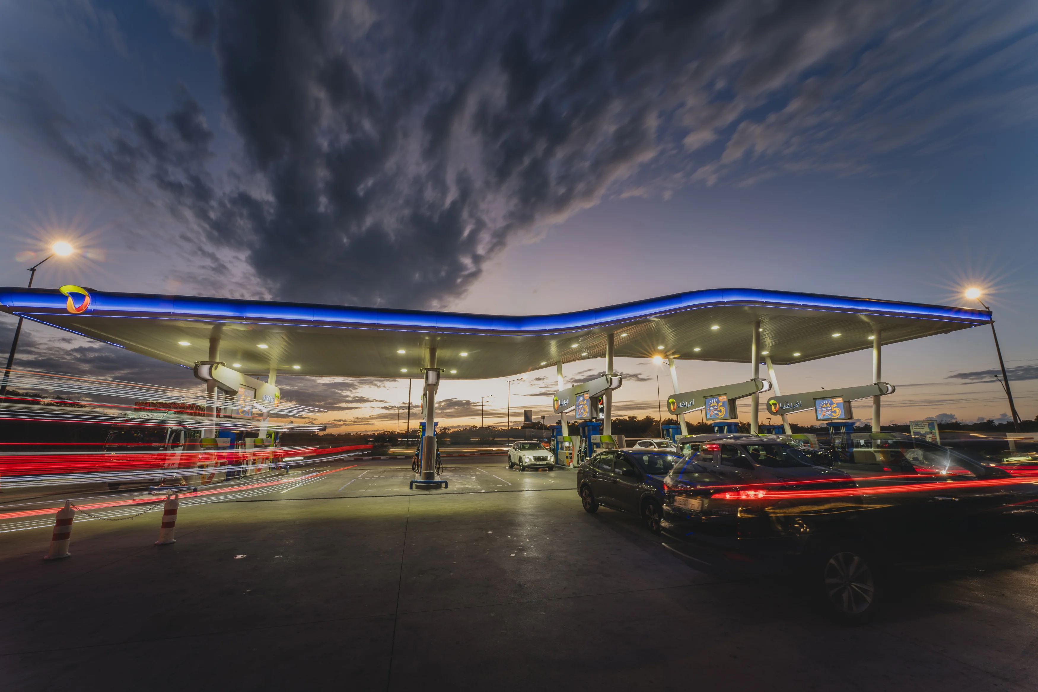
Afriquia is not a pit stop. It is a place to eat, shop, and spend time, with standards closer to hospitality than fuel retail. The existing wave canopy had become a national marker, but it was difficult to implement across wildly different site formats. The result was inconsistency and a tiered experience. Our brief was to modernise the brand and forecourt, keep the iconic wave, and build a modular system that could roll out nationwide with confidence.

A brand and forecourt designed as a system, not a one off, built to feel premium at any size and unmistakably Afriquia


Audit and benchmarks.
We started with a 2015 site audit, then ran global benchmarking across forecourt, QSR, and retail. The goal was simple, understand what best in class looks like, then translate it into something culturally specific to Morocco and true to Afriquia’s role as a social destination.
Strategy and architecture.
We clarified Afriquia’s offer beyond fuel, defining a brand strategy that could hold food, retail, services, and community in one coherent story. Brand architecture and naming created order across sub offers, so customers could recognise what was available before they even parked.
Modular forecourt design.
We redesigned the wave canopy as a modular kit of parts, engineered for consistency across different footprints. Totems, pumps, pump marketing, and wayfinding were designed as a single family, with clear hierarchy and repeatable rules. Premium, but practical.


We retained Afriquia’s multi colour equity and refreshed the palette for stronger contrast, better legibility, and cleaner reproduction at scale. Typography moved toward a contemporary, highly readable sans serif system with disciplined hierarchy. Photography shifted to real moments, families, food, and everyday Moroccan life, shot with warm light and confident composition. A clear grid and signage logic brought order. Tone of voice became welcoming, proud, and direct.


From canopy to campaign, Afriquia became one experience, expressed consistently across every touchpoint
The new system rolled through the full customer experience, from arrival cues and totems to pumps, POS, uniforms, and forecourt marketing. Site design guidelines ensured the wave canopy stayed iconic while finally becoming repeatable, regardless of site size. Digital and social templates gave the brand pace and consistency, while campaign work reinforced Afriquia’s role as a place to gather, not just refuel. The result felt familiar to Moroccans, yet sharper, more modern, and more premium.

A national icon, rebuilt as a scalable system, giving Afriquia one premium standard across Morocco
Afriquia’s wave canopy remained a recognisable national signature, but now with rules that protect consistency. The brand moved from a collection of site solutions to a coherent, repeatable experience. Clearer hierarchy across signage and communications reduced confusion and raised perceived quality, matching the reality of Afriquia’s food and hospitality standards.
The project delivered a modular canopy and forecourt kit designed for rollout across varied site formats, from single pump locations to large multi island sites. A unified set of templates for campaigns, social, and on site marketing reduced production friction and supported faster execution. The full programme was delivered over 10 months, from research through to design system outputs.
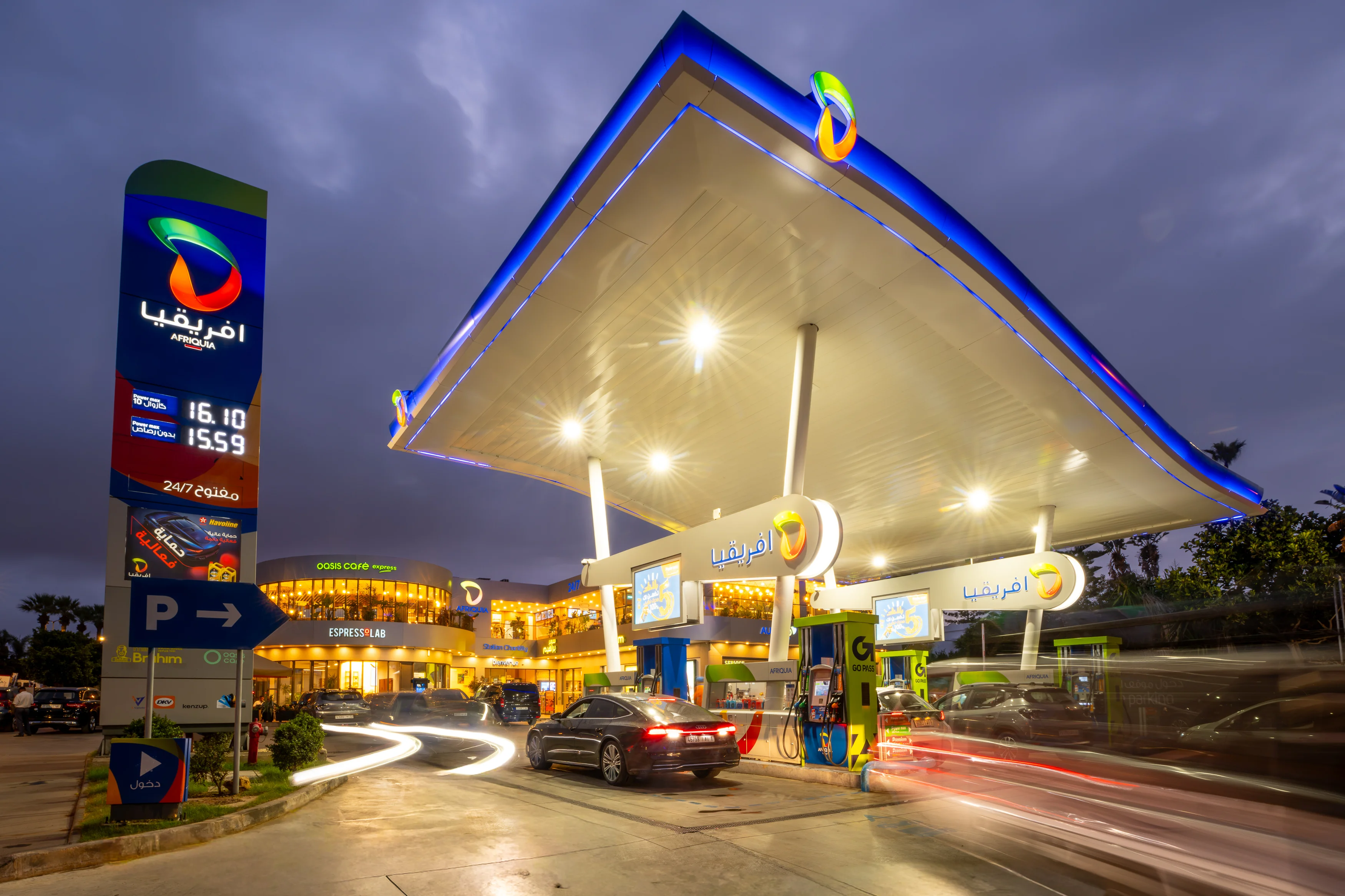
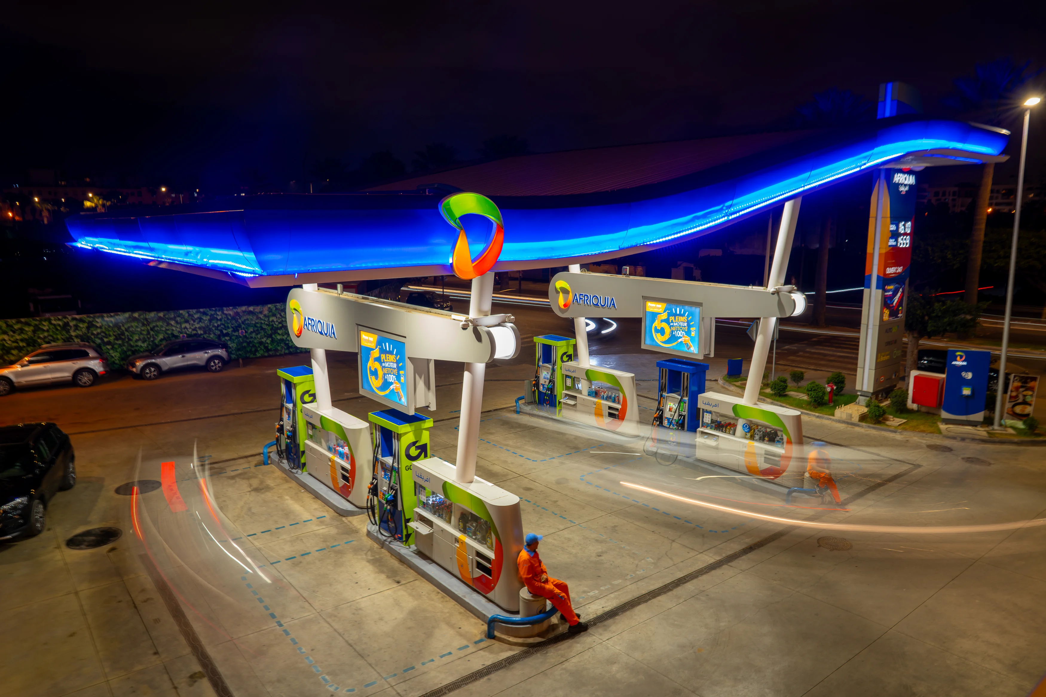
Delivered over 10 months, the work covered a full audit, benchmarking, strategy, brand architecture, naming, identity refresh, and a complete forecourt design system. Outputs included the modular canopy concept and guidelines, totems, pump design and pump marketing, uniforms, and a suite of marketing and digital assets for ongoing communications. The system was built to be implemented nationwide, with clear specifications and repeatable components that protect the icon while making rollout practical across Morocco.
 DISCIPLINES