Tu at Sainsbury’s
A complete refresh for Tu, from strategy to in-market implementation.
.avif)
From guidelines to shelf, screen, and campaign, making Tu feel consistent wherever customers met it
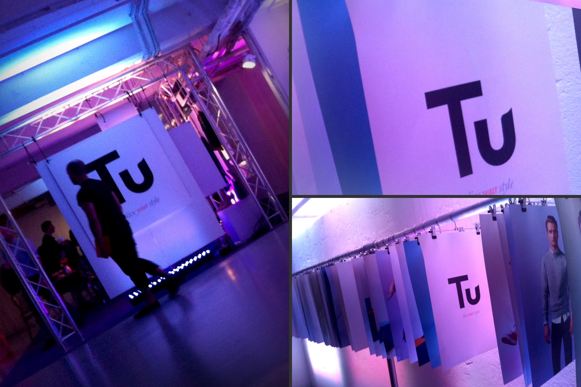
The refresh was implemented across the customer journey, with the identity expressed through packaging, labelling, photography, and comms language. We supported both above and below the line needs, ensuring the brand read as one story, not a set of disconnected assets. Alongside this, we developed an endorsement strategy and provided consultancy on celebrity endorsement and campaign structure, covering both primary and secondary levels so the brand could show up with clarity and control.

The challenge
Refresh Tu end to end, sharpen customer perception, and help Sainsbury’s non-food perform harder
Sainsbury’s asked for a complete brand refresh for Tu, their fashion brand, with the work anchored in commercial reality. Over 12 months with the London office, the brief covered research and customer perception, brand strategy, naming, customer journey design, and a new identity. It also needed to work in the details, packaging, labelling, photography, and comms language across above and below the line activity.
The details
A branding consultancy approach that started with evidence, then built the system to deliver consistently
1. Research and perception
We began by understanding customer perception and the role Tu needed to play within Sainsbury’s wider non-food offer. This gave the team a shared picture of what was working, what was being missed, and where the brand could credibly stretch.
2. Strategy and naming
From the findings, we shaped the brand strategy and naming work, then mapped the customer journey so the brand could feel coherent at every step. The goal was clarity, not complexity, with decisions that could hold up under day-to-day trading pressure.
3. Build and implement
As a branding agency, we carried the work through identity creation, rollout planning, and practical guidelines. We also developed the tools for teams to keep the brand consistent, from packaging and labelling through to photography direction and comms language.
The identity
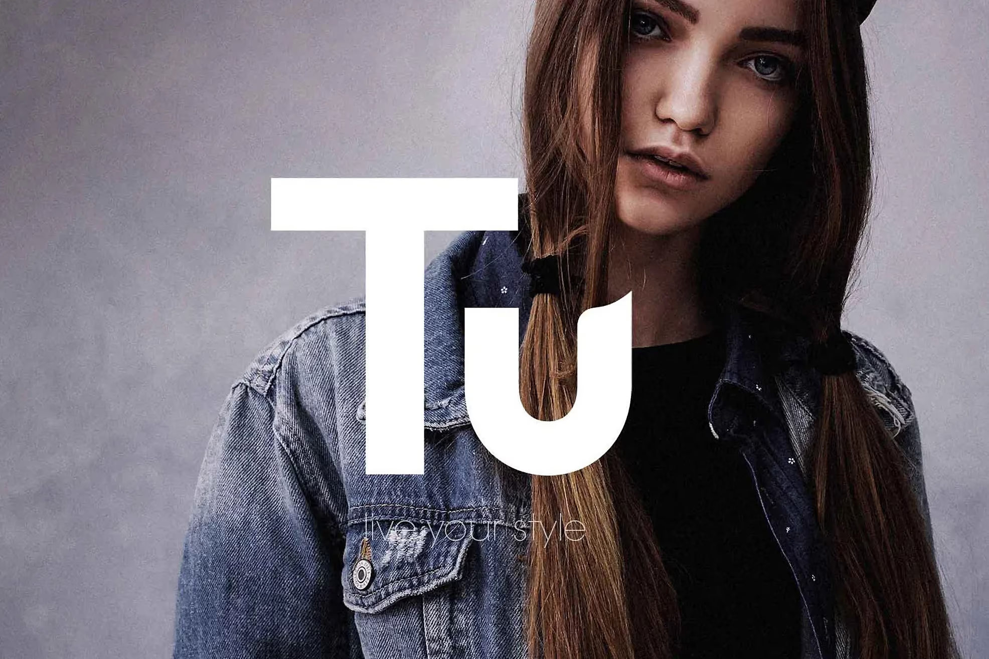
We created a refreshed identity system designed to work across fast-moving retail touchpoints. The work included clear guidance for typography and colour use, a considered photography style, and practical rules for layout and hierarchy. Tone of voice was defined for comms language across channels, with finishing details that translated into packaging and labelling. The result was a brand system teams could apply with confidence and consistency
The results
A clearer, better-run brand system that helped Tu support record growth for Sainsbury’s non-food
The refresh gave Tu a more coherent brand foundation, from strategy and naming through to how the brand behaves in customer moments. Teams had practical guidelines and a clearer customer journey to work from, which reduced ambiguity and improved consistency across creative and comms decisions. As a branding company, we focused on building something that could be used, not just admired.
Across the 12-month engagement, Sainsbury’s achieved record growth in their non-food sector. The work also put the building blocks in place for structured endorsement activity, with a defined approach to celebrity endorsement and campaign structure at both primary and secondary levels.
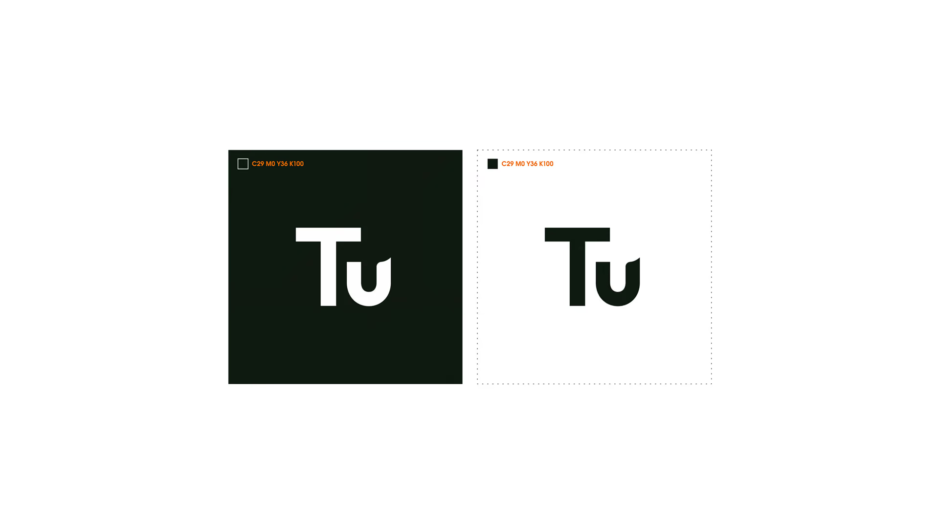


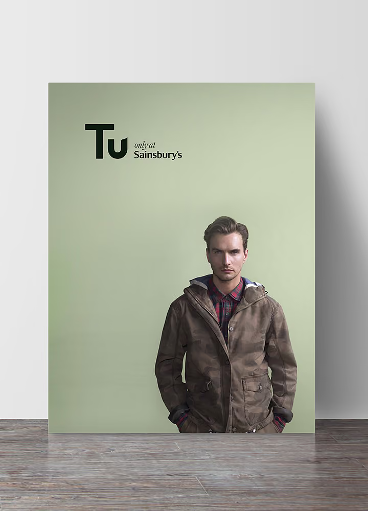
Delivered in close partnership with Sainsbury’s London office over 12 months, the programme ran from research and perception through to rollout support. The output included brand strategy, naming, customer journey work, identity creation, implementation planning, and clear guidelines for ongoing application. We also produced the practical retail assets, packaging, labelling, photography direction, and comms language for above and below the line activity, plus endorsement strategy consultancy to support future campaign planning.
 DISCIPLINES
