Mobily
Building a youth-led telecom brand for a fast-modernising Saudi Arabia.
Mobily needed to stop looking like a telecom, and start feeling like a symbol of modern Saudi life
Saudi Arabia’s telecom market was crowded, and the youngest audience was also the hardest to win. Mobily came to us for more than a refresh. They needed a distinctive identity with real cultural credibility, one that could respect tradition while speaking in a contemporary voice. The stakes were high: create a brand people would choose, wear, and belong to, then roll it out consistently across every touchpoint, from screens to stores.
A brand system rooted in culture and built for speed, consistency, and long-term growth
The Audience
Young, tech-savvy, ambitious. They expect clarity, confidence, and style from the brands they keep close. We shaped Mobily to feel like a lifestyle choice, not a utility, with cues that could travel across digital, retail, packaging, and people.
The Strategy
As a London branding consultancy working in Saudi Arabia, we started with research into behaviour, category codes, and cultural nuance. Then we positioned Mobily as progress you can join, a badge of belonging that stays respectful, but never stuck.
The Ecosystem
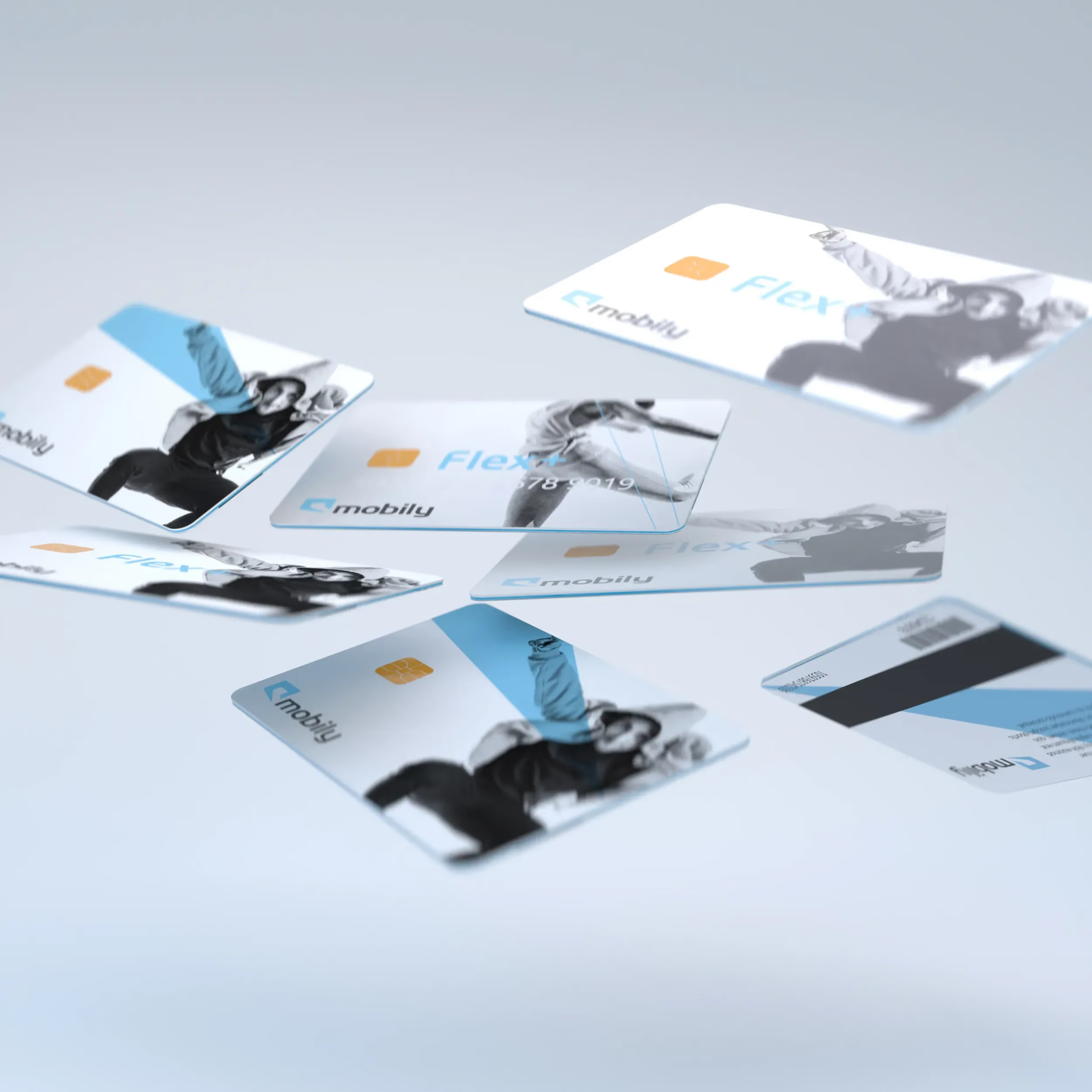
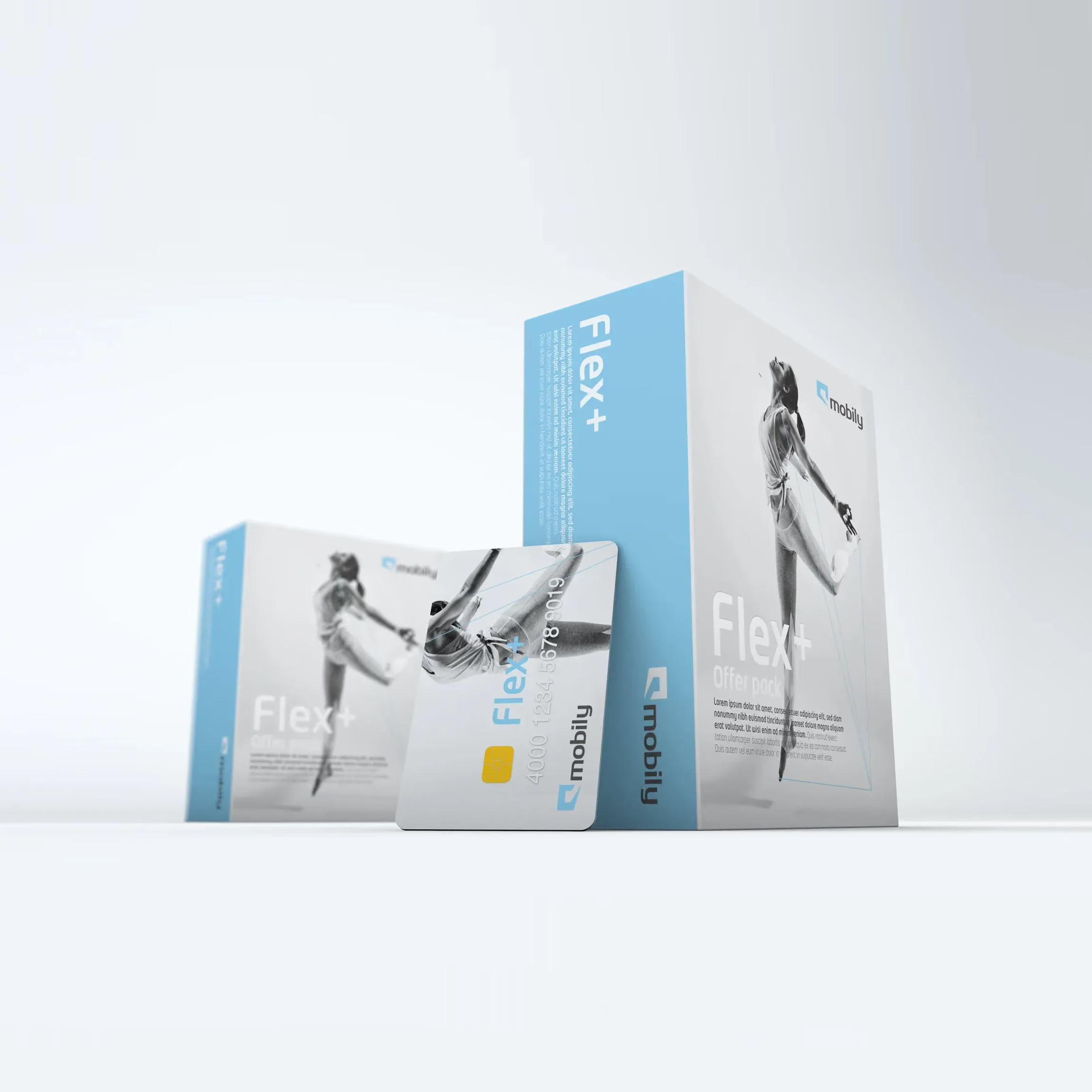
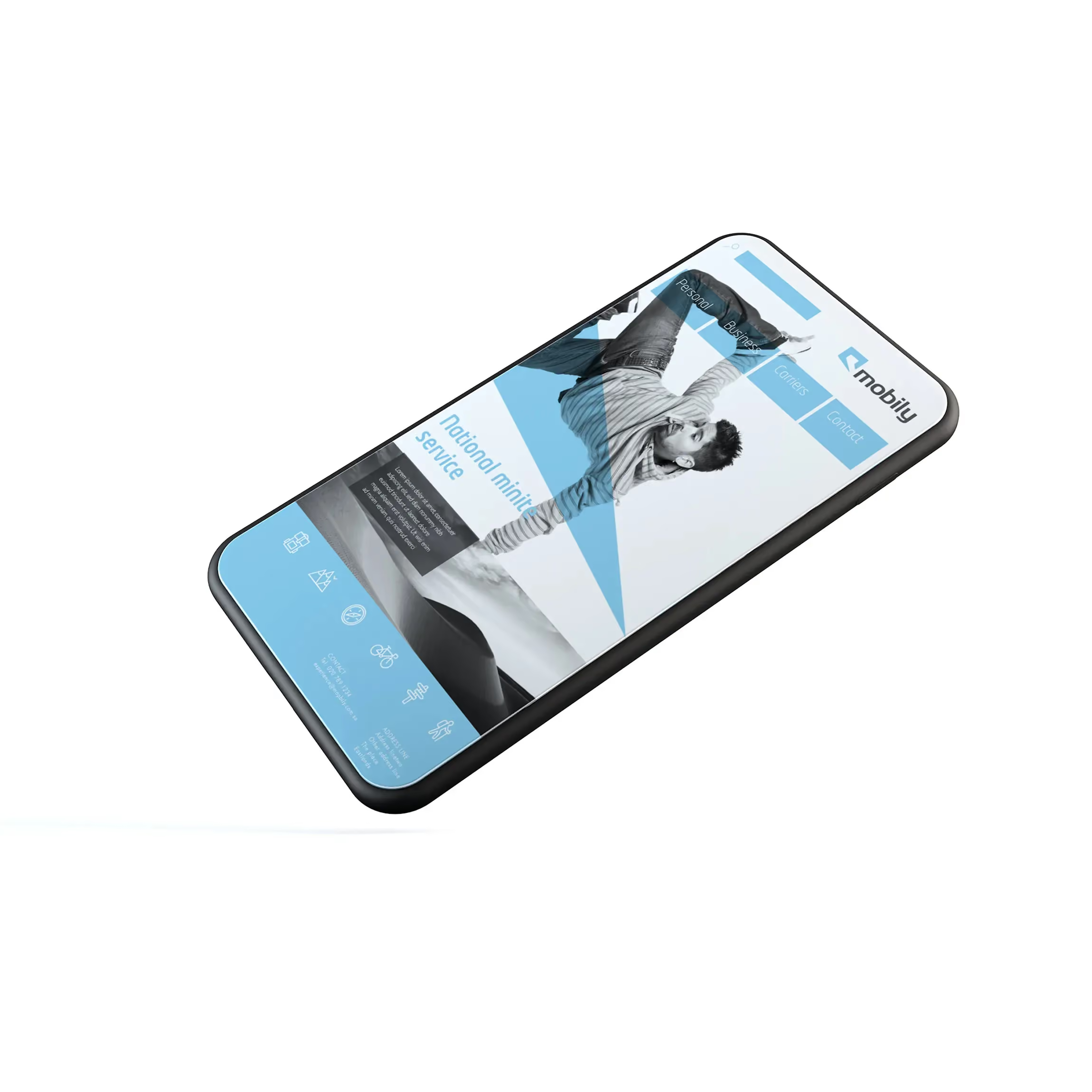
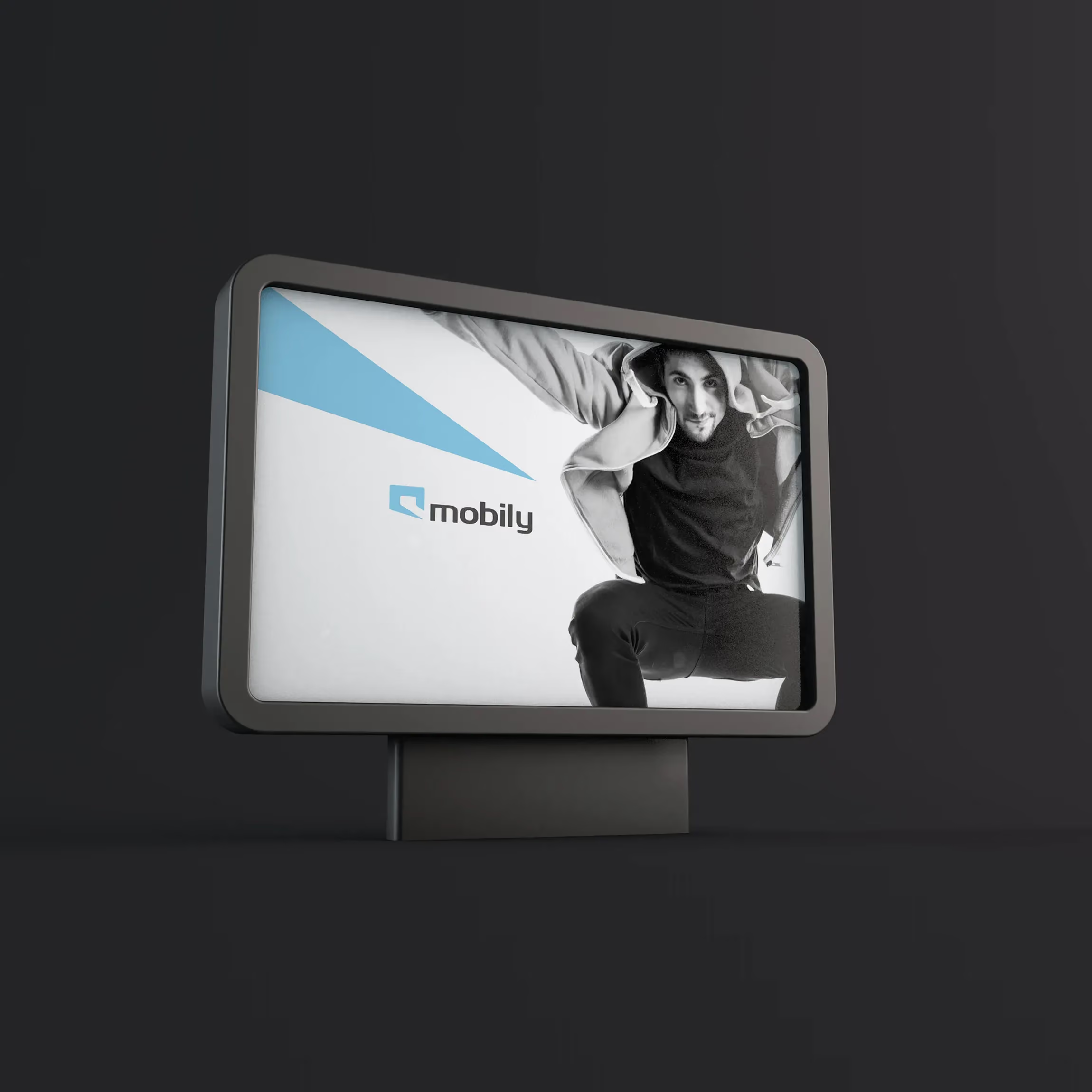
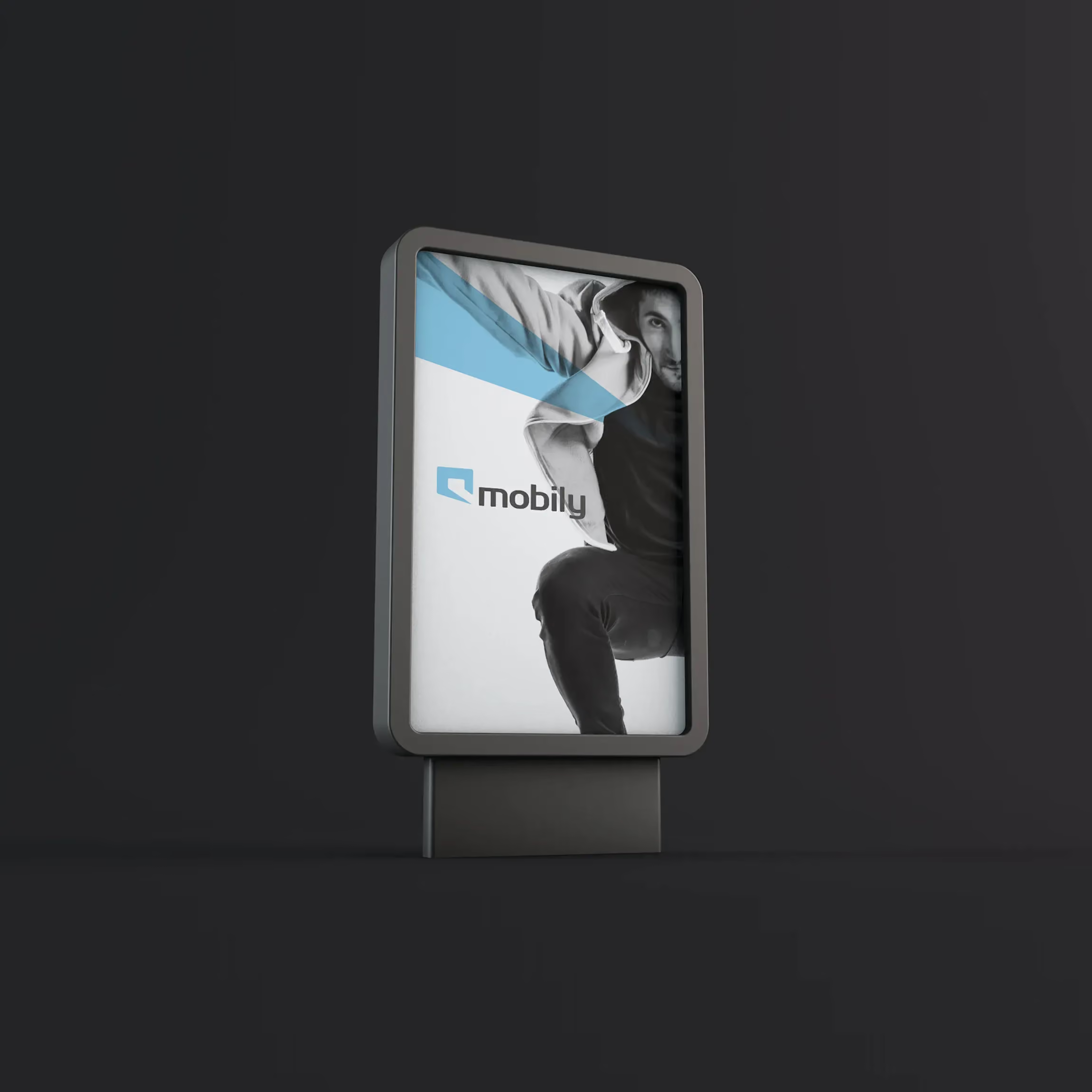
We built the identity around a logo that fuses an Arabic typographic letter with a stylised speech bubble, a simple idea with deep roots in language and communication. A clean, fresh colour palette signalled youth and optimism, helping Mobily stand apart from legacy telecom cues. A clear grid and flexible layout rules made the system easy to apply across formats. The tone of voice was direct, modern, and confident, designed to feel like a brand you choose, not a provider you tolerate.
We built the identity around a logo that fuses an Arabic typographic letter with a stylised speech bubble, a simple idea with deep roots in language and communication. A clean, fresh colour palette signalled youth and optimism, helping Mobily stand apart from legacy telecom cues. A clear grid and flexible layout rules made the system easy to apply across formats. The tone of voice was direct, modern, and confident, designed to feel like a brand you choose, not a provider you tolerate.
From iconic stores to everyday packaging, Mobily became a brand you could step into, carry, and recognise instantly
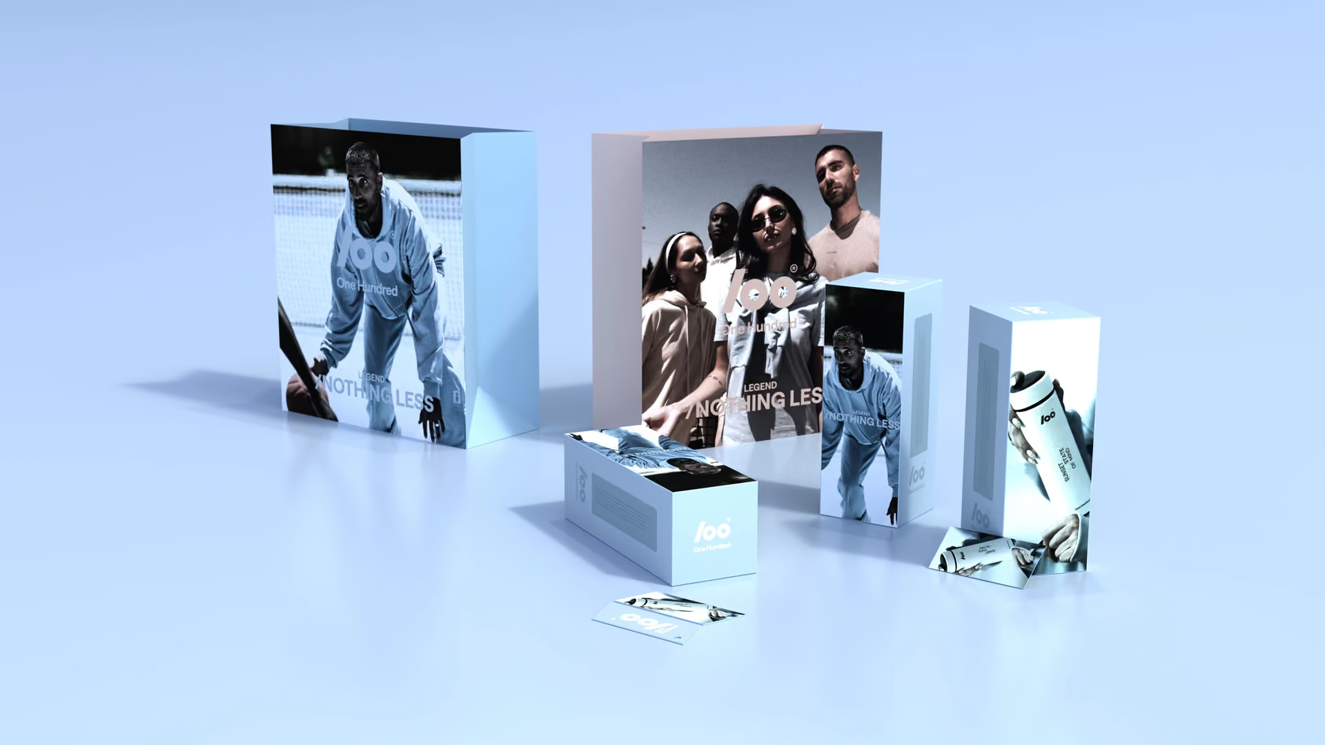
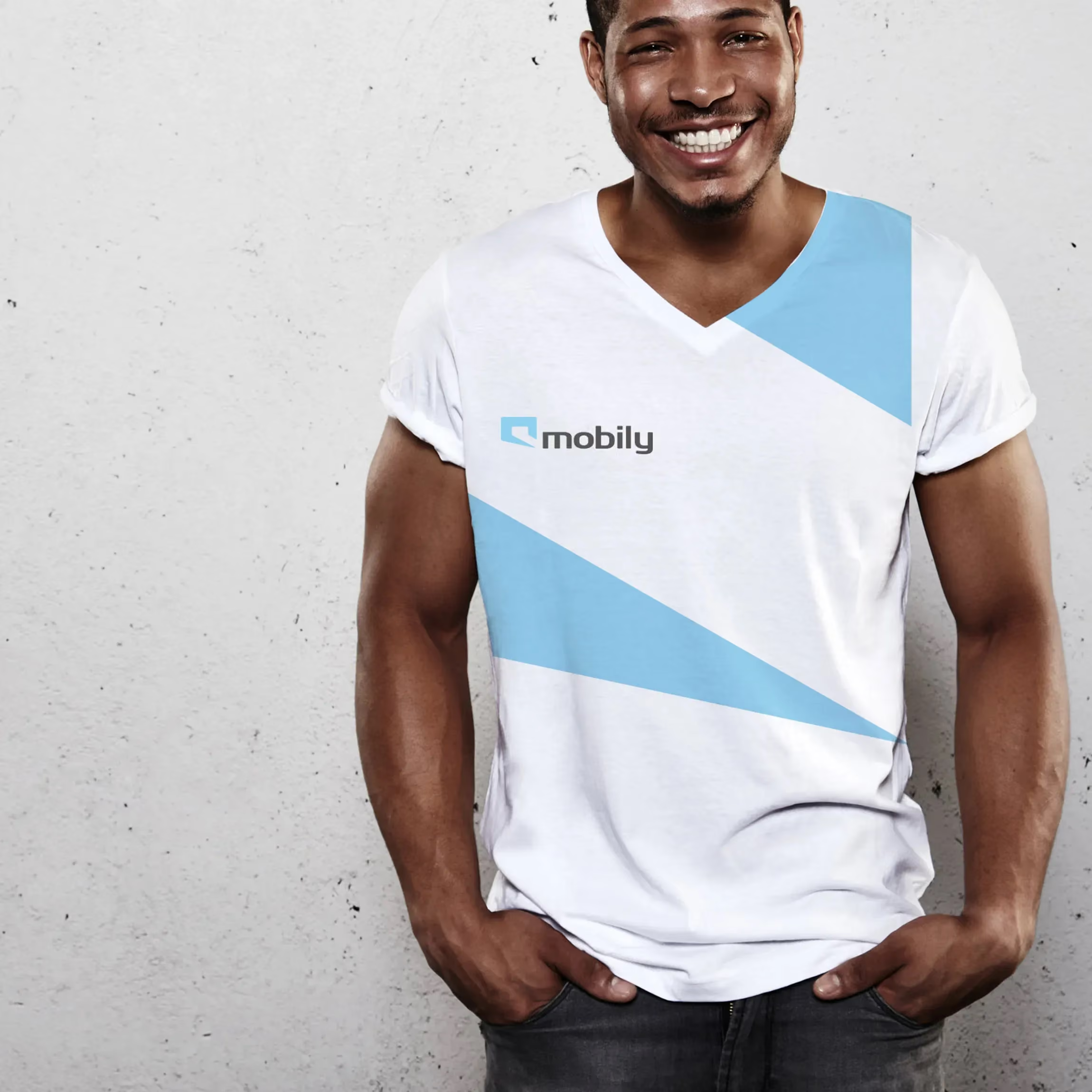
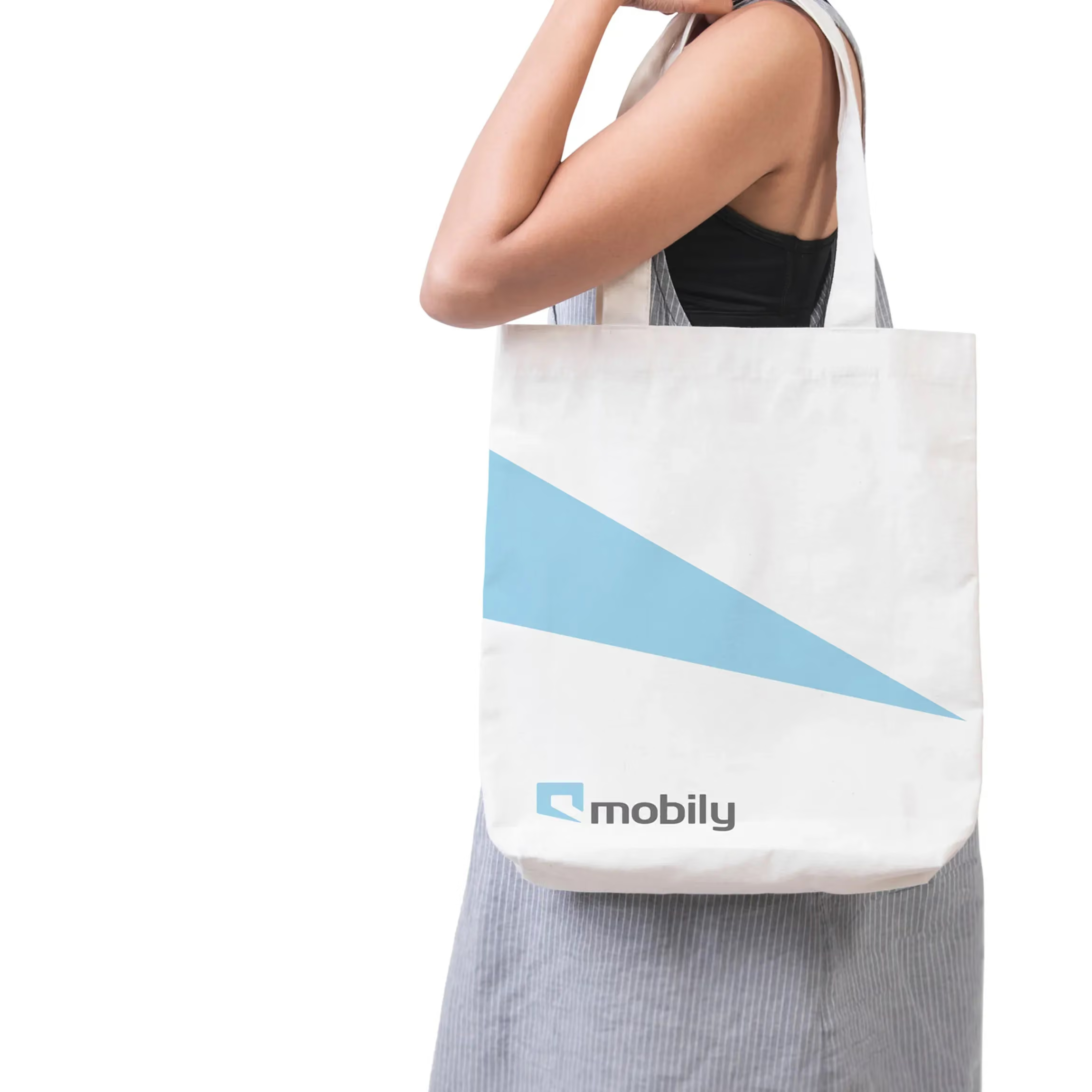
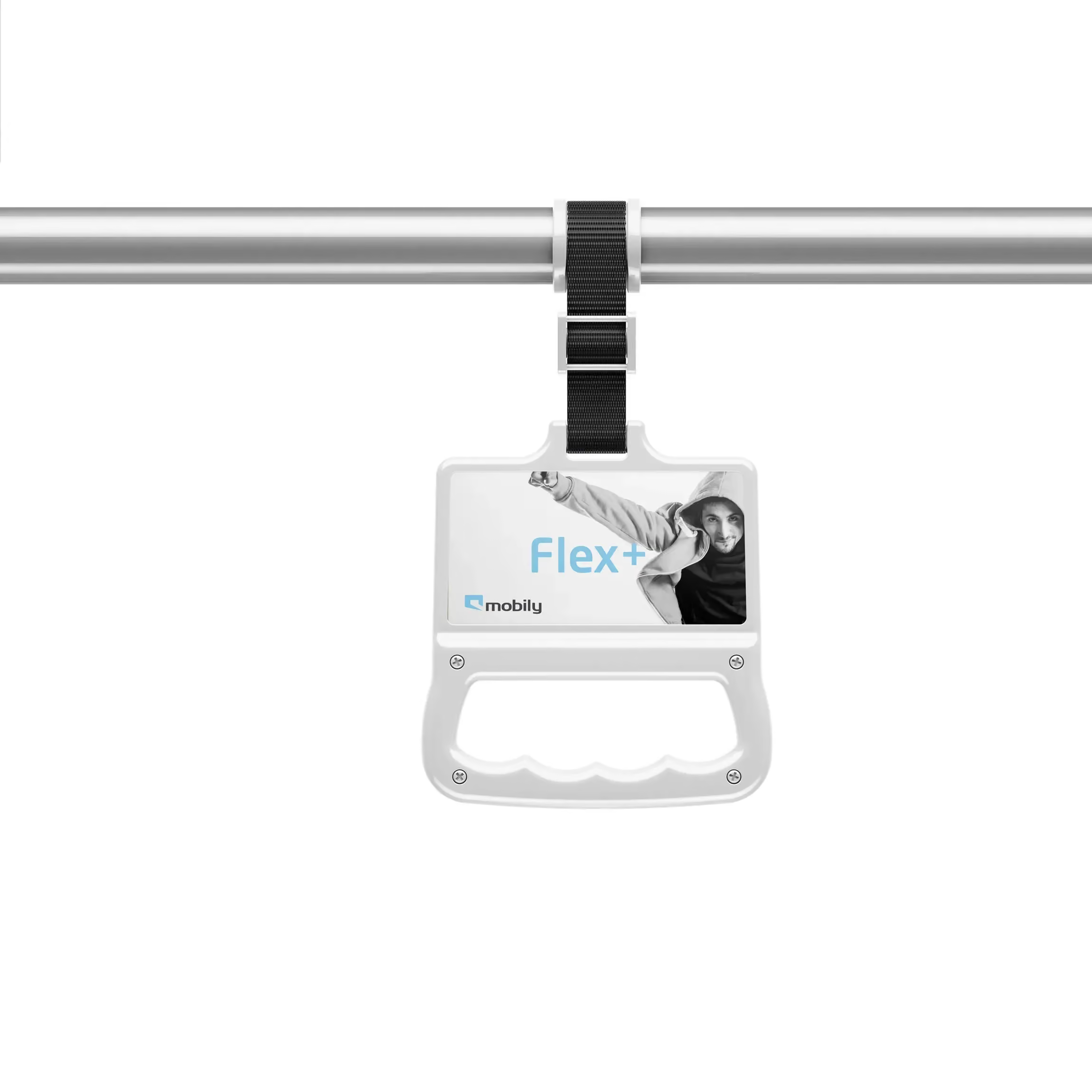
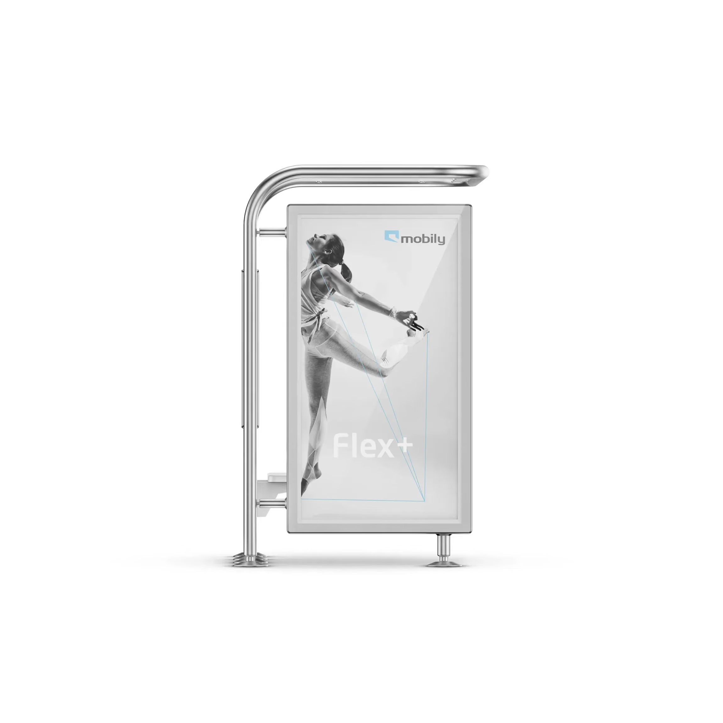
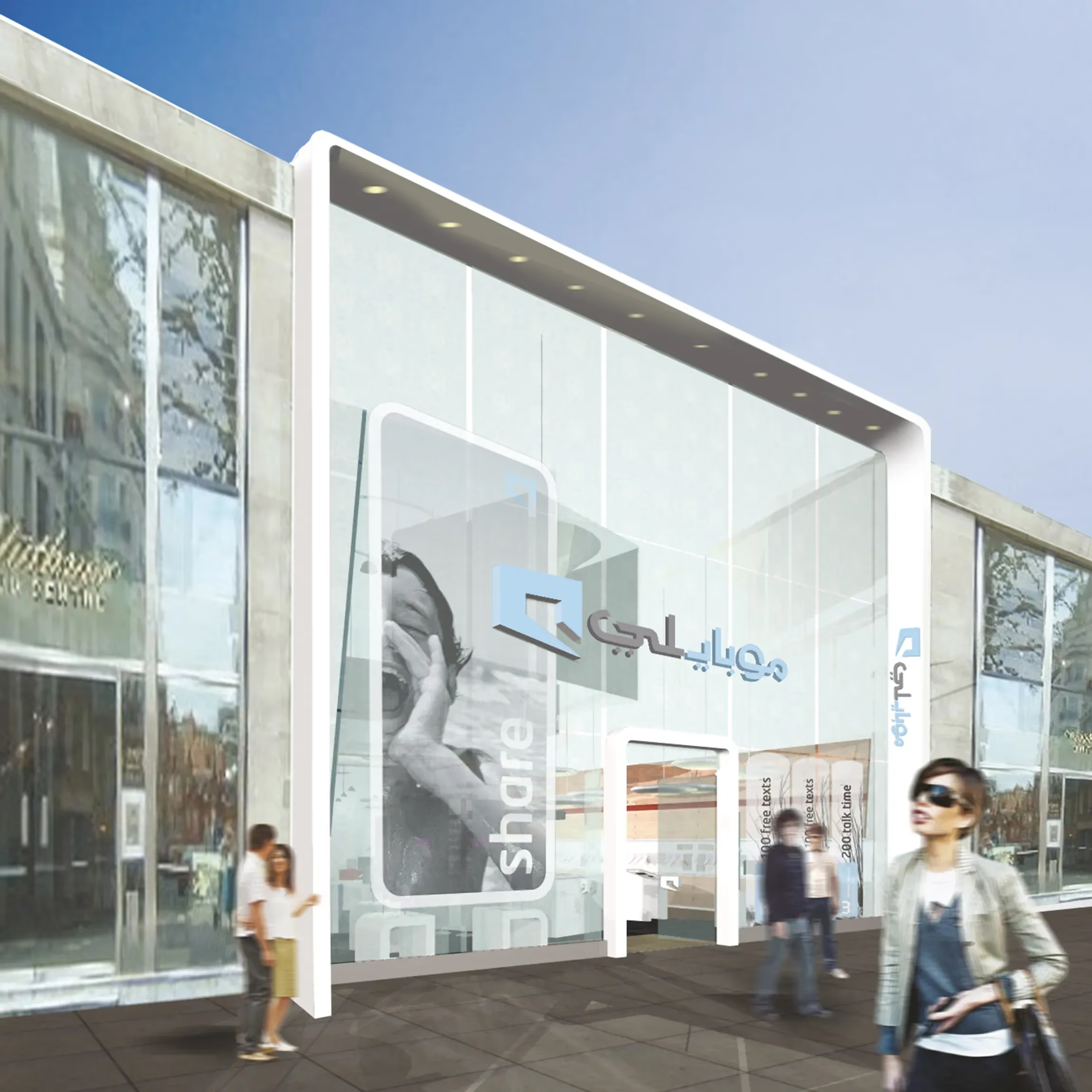
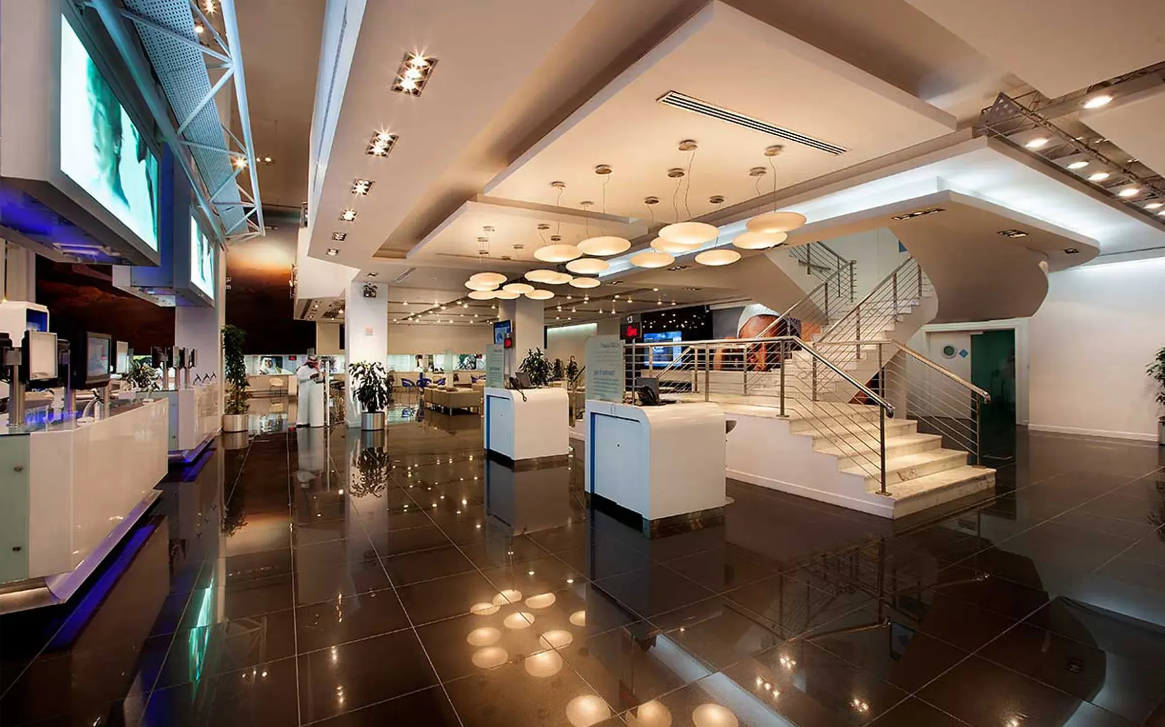
We translated the system into a full brand world. Retail spaces were designed as immersive destinations, with bold, recognisable cues that made the brand feel present before a single word was read. Packaging extended the experience into customers’ hands, using the same graphic clarity and colour confidence. Uniforms brought the identity to life through people, making every interaction feel consistent and current. Underpinning it all were guidelines and templates that helped teams apply the work reliably, day after day.

Result:
A telecom brand grown into a cultural marker, recognised, desired, and built to keep pace with Saudi Arabia
Mobily shifted from service provider to lifestyle signal. The identity gave the brand cultural resonance without relying on nostalgia, and modernity without feeling imported. The system brought clarity across touchpoints, helping every store, pack, and interaction feel like part of the same story. The result was a brand people could belong to, not just buy from.
Mobily grew into one of the biggest and most respected mobile operators in Saudi Arabia. The brand earned the “Nike of the Middle East” reputation, a clear indicator of mainstream recognition beyond category expectations. Retail environments became destinations in their own right, increasing visibility and engagement. Two years of rollout support helped maintain consistency at national scale.
Launch: Saudi Arabia, nationwide rollout. Timing: delivered and stewarded across a two-year partnership. Reach: designed for a predominantly young, mass-market audience across digital and physical channels. System: naming, core identity, colour system, layout rules, tone of voice, brand guidelines, and application templates. Touchpoints: retail environment design, packaging, staff uniforms, and ongoing rollout support. Role: end-to-end work by Garden, a global branding agency and branding company headquartered in London.
 DISCIPLINES