Native
Brand strategy and identity for a construction business built for complex places.
Native, a UK-founded construction and project management company, needed a strong, human and globally minded brand that could perform in complex environments. The identity was shaped around a clear proposition and a minimal system that balances straight-talking confidence with a culture-positive outlook, reflecting the idea that we are all natives of somewhere and citizens of the world.
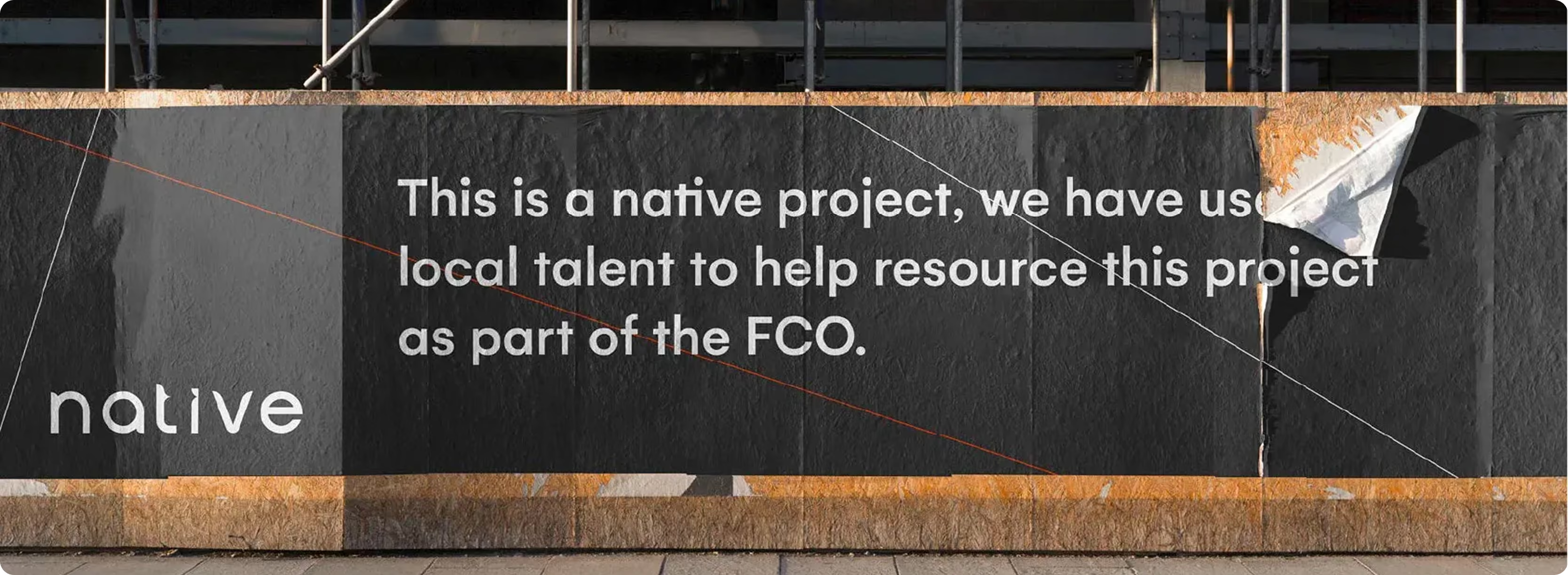
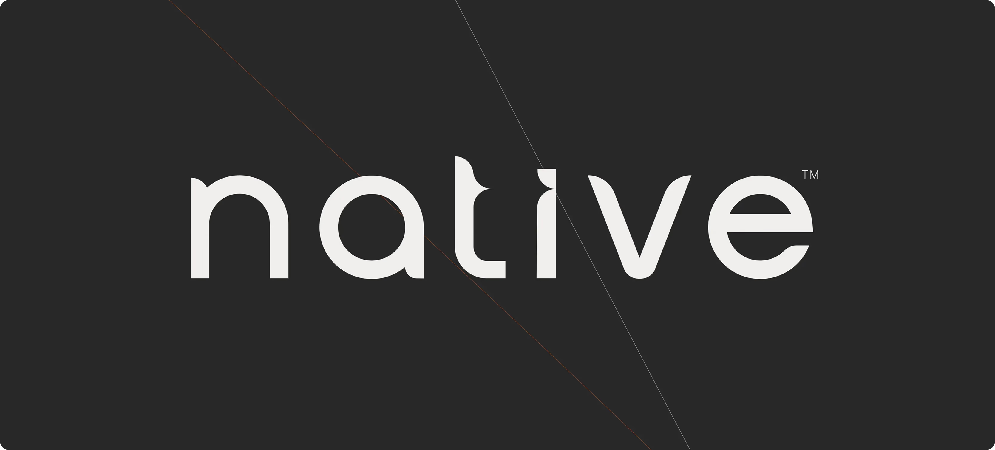
The identity is built around a stylised lowercase wordmark, deliberately modern and unforced. A linear visual system underpins communications, using abstract point-to-point shapes that always resolve into an N. The N is present, but not obvious, which keeps the brand intelligent rather than loud. The overall feel stays minimal and confident, designed to support a straightforward tone of voice and a culture-positive point of view.
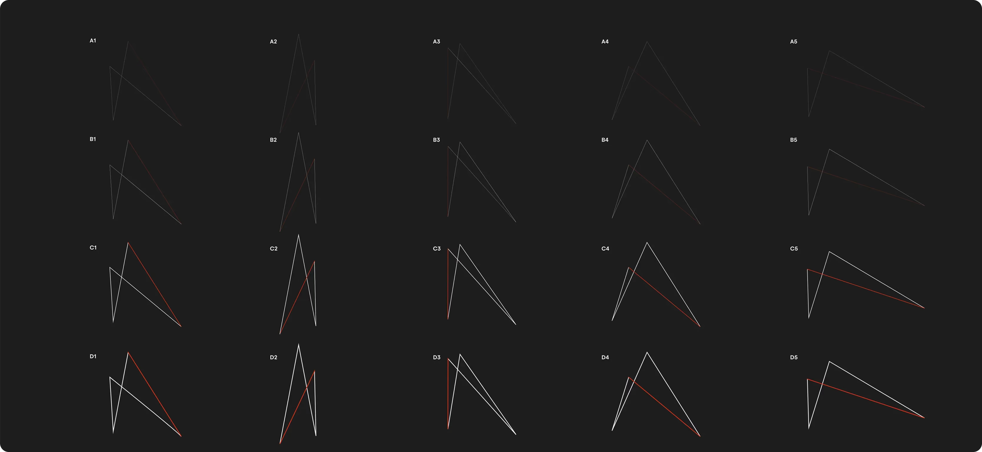
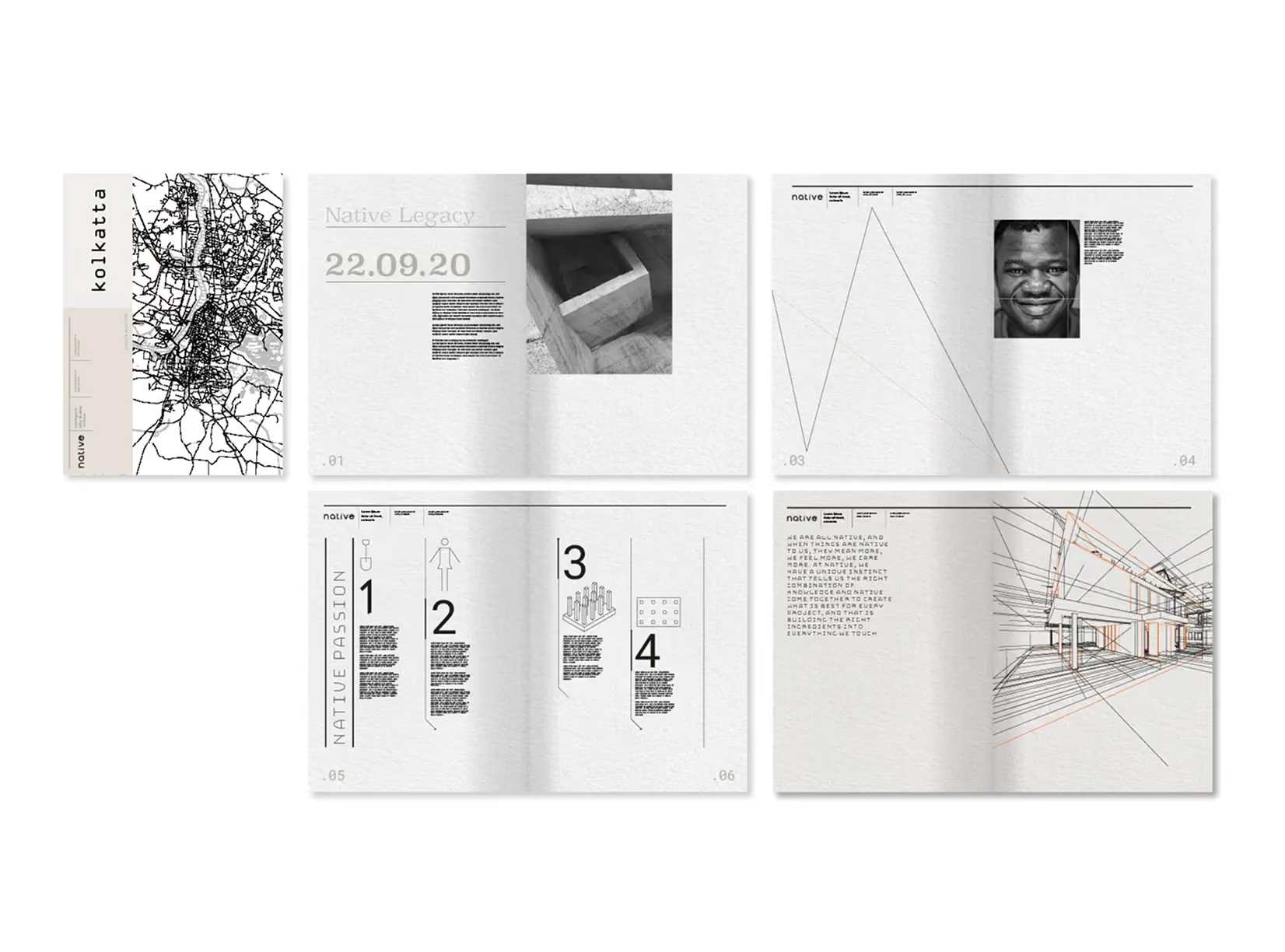
A flexible yet consistent system designed to adapt across Native’s varied environments. The wordmark ensures immediate recognition, while the linear “N” device adds a versatile graphic layer that can shift from quiet restraint to bold expression. The result is a clear, modern identity with a human edge rooted in local skills and people.

Founder interviews
We ran a focused interview series with the four founders to get beyond surface messaging. The aim was to capture how Native works, how it behaves on site, and what it refuses to compromise on. That gave us usable language, sharper priorities, and a clear sense of tone.
Benchmarking and positioning
We benchmarked the category to understand where construction brands tend to cluster, visually and verbally. That made space for a disruptor position with straightforward execution, different and strong, but still approachable. Global citizenship became the anchor, not a tagline.
Strategy to identity
As a branding consultancy, we translated the strategy into a tight identity concept, then tested multiple routes before committing. The final system is minimal, but not empty. It has enough structure to stay consistent, and enough nuance to feel considered in every application.
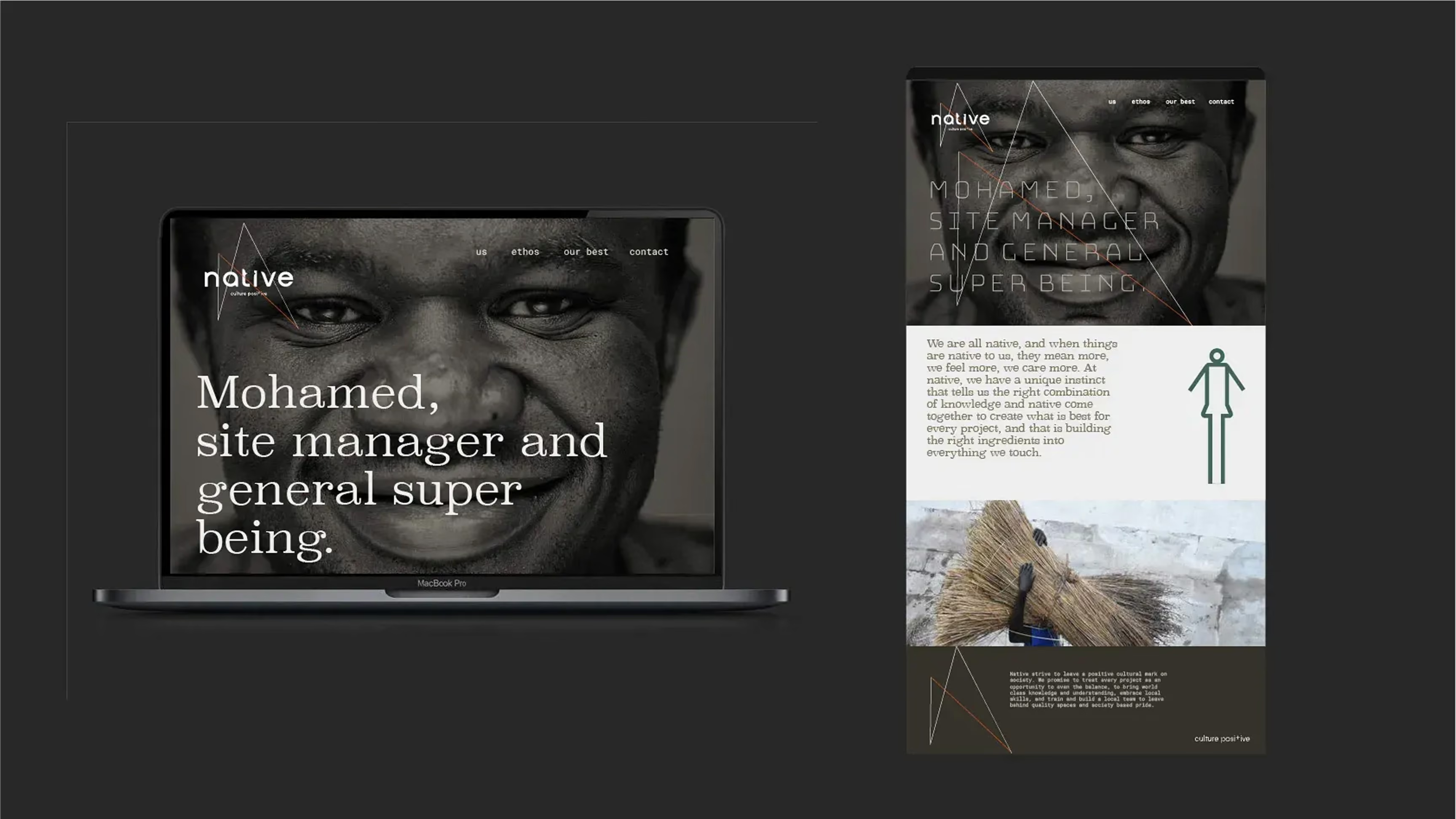

A clear proposition and confident identity give Native a distinct brand that balances global citizenship with construction credibility. The work aligned the founders around a shared purpose and created a stronger, more approachable expression that is designed to scale as the business grows. A streamlined brand architecture and repeatable visual system improve consistency and efficiency across communications. The abstract “N” device establishes recognisable brand codes, enabling fast, flexible rollout across materials without compromising clarity or cohesion.
Delivered as a full brand strategy and identity system, shaped through founder interviews, benchmarking, and proposition development. The output included positioning, purpose, and value proposition articulation, then a minimal visual identity centred on the lowercase wordmark and linear N graphic language. Built to support communications across multiple locations and project contexts, the system balances disruption with straightforward execution. A branding company approach, grounded in real operational needs, not theatre.

 DISCIPLINES