Electrical safety first
A research-led rebrand built for national cut-through and public recall
A campaigning charity with a growing remit, but a brand expression that had started to fragment
Electrical Safety First exists to protect the UK public from electrical risk, and that risk is only increasing as electricity becomes more embedded in everyday life. The brand had started to feel dated and, more importantly, inconsistent across campaigns, conferences and microsites. Before jumping to design, we ran a full audit, benchmarks, plus quantitative and qualitative research to understand the scale of the problem, and the opportunity if the charity chose to change.


The challenge
Electrical Safety First exists to protect the UK public from electrical risk, and that risk is only increasing as electricity becomes more embedded in everyday life. The brand had started to feel dated and, more importantly, inconsistent across campaigns, conferences and microsites. Before jumping to design, we ran a full audit, benchmarks, plus quantitative and qualitative research to understand the scale of the problem, and the opportunity if the charity chose to change.
The approach
We treated it like a campaigning brief, build distinctiveness, build memory, then build a system the team could actually use
1. Audit and research
We mapped the existing identity across touchpoints and pressure-tested it with research. The picture was clear, too many colours, illustration styles and tones of voice, which diluted recognition. Recall was low across most of the country, especially compared to better-known safety and campaigning organisations.
2. Ownable distinctive assets
AI-supported colour analysis helped us make a confident break from the category’s default red. We moved to electric green with a glow that cues “power on” and positive behaviour change. The new brand mark combines an “e” with the universal power symbol, simple, memorable, and built for modern channels.
3. System and architecture
The old wiring-inspired palette was smart on paper but weak in the real world. We replaced it with electric tones that work together and scale. We also created a clear sub-brand architecture, so campaigns and microsites can flex while still reading as Electrical Safety First.
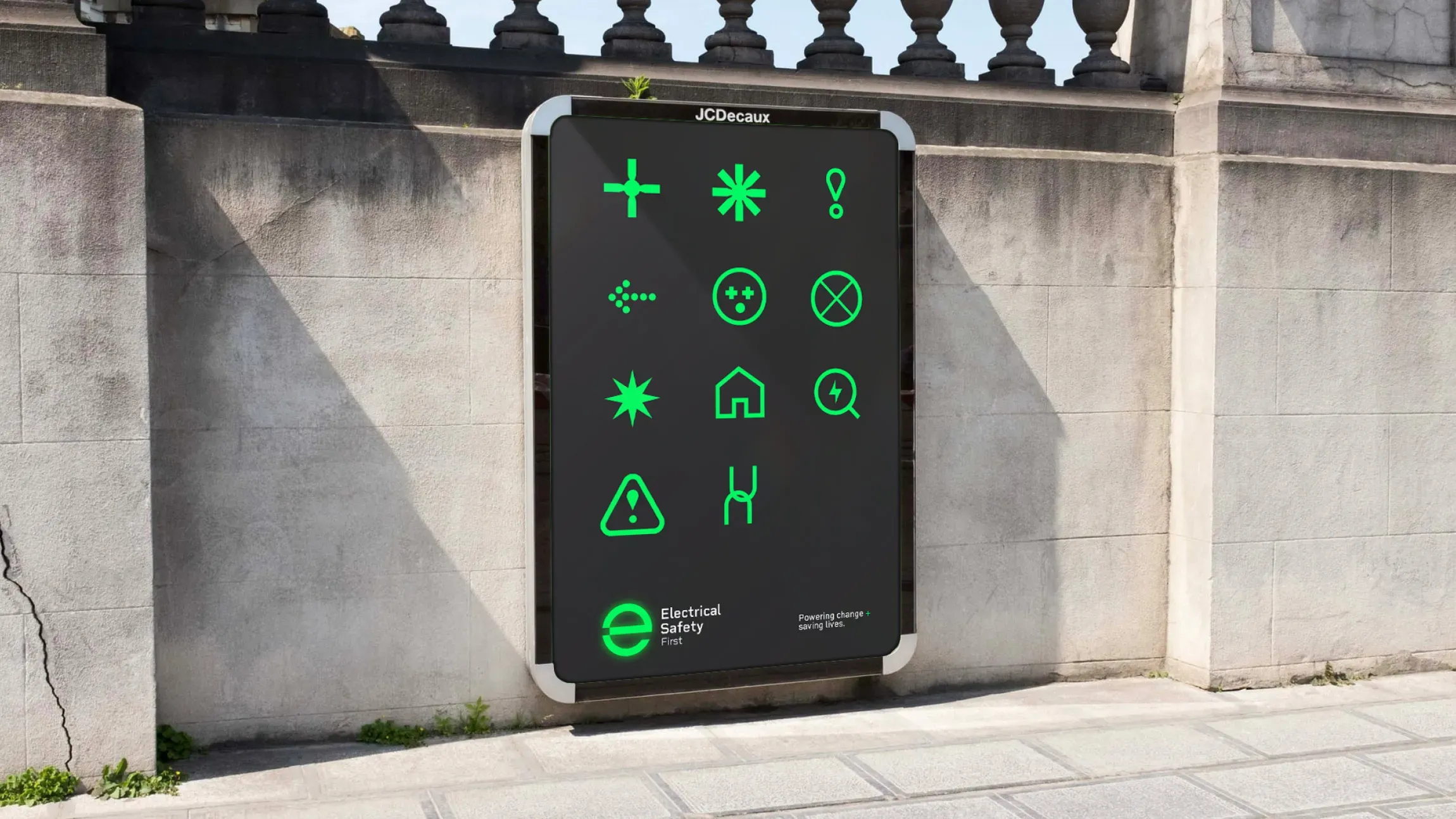
A modern typeface replaced the dated original, with a subtle nod to digital device displays to reinforce technical credibility. Electric green became the lead colour, supported by a vibrant secondary palette designed to work in combination, not in isolation. Photography uses grainy black and white for threat and realism, then a bold colour wash for contemporary energy and contrast. A suite of simple hazard icons was created for digital-first comms, built to animate for social and campaign use. The finishing detail is the “+” in the strapline, a positive charge that also reads fast.
A brand built to campaign, across conferences, comms, microsites and fast-turnaround public messaging
The system was designed to hold together wherever the charity shows up, from public-facing awareness to stakeholder-facing content for landlords, manufacturers and government. The new sub-brand architecture brings order to conferences, campaigns and microsites, so each activation benefits from the parent brand’s recognition. Animated iconography provides quick, familiar shorthand for common hazards, and the photography style creates a consistent tension between optimism and risk. As a branding agency and branding consultancy, we focused on giving the internal team tools they can deploy at speed without the work losing its edge.

The result
A clearer, more memorable campaigning identity, designed to earn attention and hold it
Electrical Safety First now has a cohesive set of distinctive assets that can be repeated, recognised, and built on. The identity brings consistency across previously disjointed outputs, and the new strapline gives the organisation a sharper way to talk about what it does, beyond restating the name. Accessibility was treated as a core requirement, with the identity tested against DDA and W3C standards and braille versions of the logotype developed.
Research identified low unprompted recall nationally, with prompted recall only slightly better, and this became a clear performance problem for the brand to solve. The work directly addressed the issues behind that, inconsistency, weak distinctiveness, and a tagline that added little meaning. We also responded to the context that over half of UK domestic fires are caused by electrical faults, with a brand built to support higher-frequency, higher-impact public awareness campaigning.


The project delivered a full identity system for a campaigning charity, including a new logo, colour palette, typography, photography direction, icon set with animation in mind, and a defined sub-brand architecture for campaigns and microsites. The strapline “Powering change + saving lives” anchors messaging across audiences while keeping the public as the priority. Accessibility was built in, not added later, with DDA and W3C checks and braille logotype versions. As a branding company working in the charity space, we paired the creative work with the audit and research so the final brand could be rolled out with confidence.
 DON'T TAKE OUR WORD FOR IT
 DISCIPLINES
You might also like
Branding and packaging for an activated-charcoal oral hygiene range, designed with a fun, friendly feel to engage a younger demographic.
Coco by Mist is a oral hygiene brand and packaging range that is based on activated charcoal teeth whitening, widely considered anti-fungal, and a more natural way to white teeth and freshen breath. The range came in different formats such as a pot or paste, and customers had a choice of different flavours such as berry, mint, peach and nude (plain). This was a quick turnaround project to test the market, taking 4 weeks from idea to completion and assets for distribution including animations, the design was positioned to feel fun and friendly to engage a younger demographic.