No1 Cotswolds
Brand creation for a new restaurant, deli and homeware experience.


Create a Cotswolds rooted brand that could flex across food, retail and hospitality, without losing warmth or detail
No.1 Cotswolds was launching as a new restaurant, deli and homeware destination. They needed a dynamic brand that felt local and considered, with a clear passion for food, people and the Cotswolds. The challenge was building a concept with enough character to feel like a place, not a product, while still working hard across packaging, print, menus and uniforms. Everything had to feel connected, even as the offer moved between experiences.

A brand concept designed to feel at home in the Cotswolds, then engineered to work everywhere customers meet it.


Core brand idea
We defined a central concept that could hold restaurant, deli and homeware together. It needed to feel rooted in the Cotswolds, but not reliant on clichés. The focus stayed on food, people and place, with a tone that felt welcoming and confident.
System for range
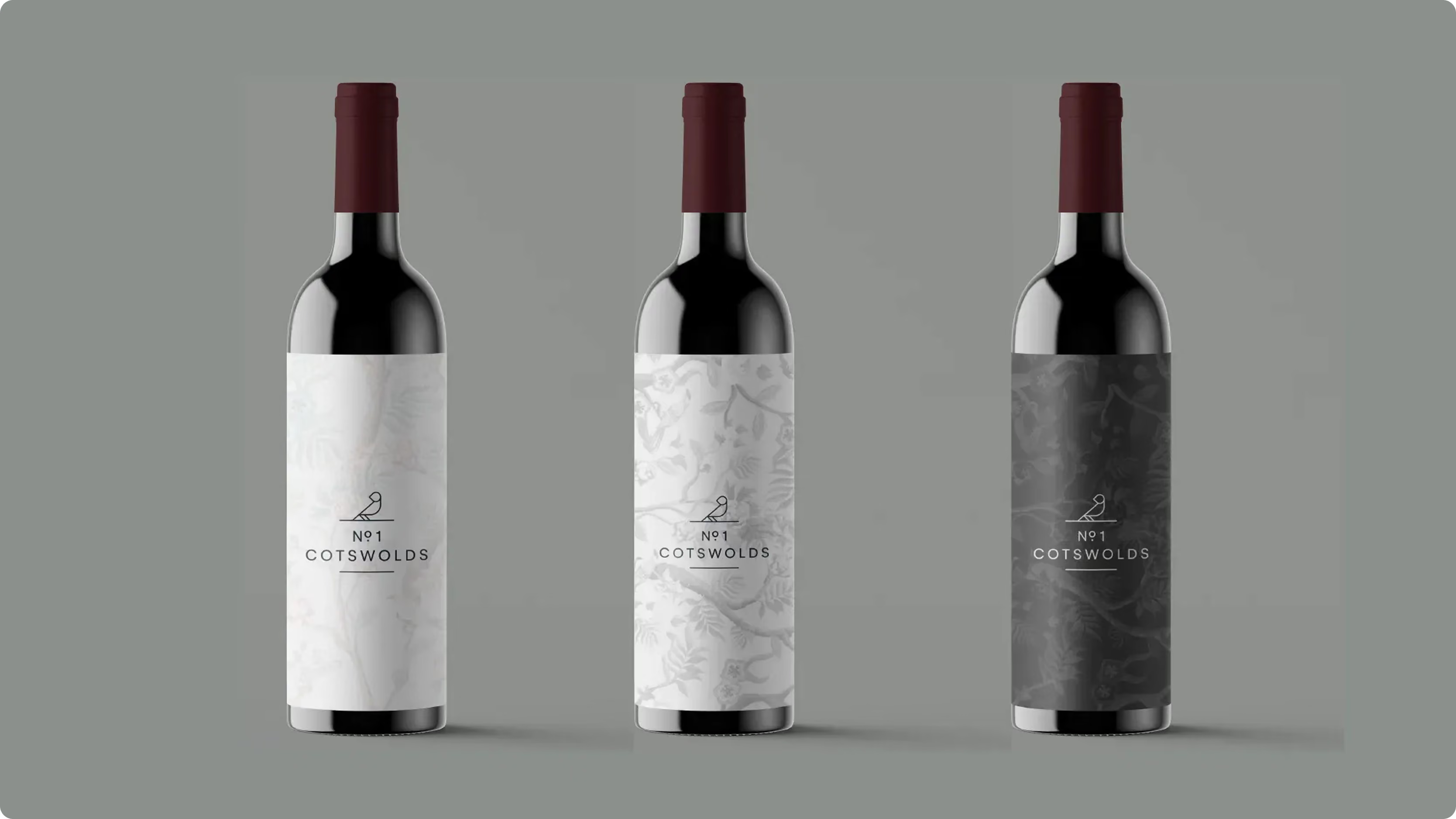
With an own range in scope, we built a brand system that could stretch across different products and formats. The aim was consistency without repetition, so every item felt part of No.1 Cotswolds, while still allowing the range to feel curated.
Hospitality first rollout
Menus, print and uniforms were treated as primary brand touchpoints, not afterthoughts. As a branding consultancy, we shaped the details to work in real service moments, from first glance to repeat visits, keeping the experience cohesive.


The identity was designed as a flexible kit of parts that could move between restaurant, deli and homeware. Typography balanced clarity with character, with a hierarchy that worked on menus and small pack formats. The colour palette took cues from the Cotswolds feel, natural and warm rather than loud. Photography direction focused on food, people and tactile details. Finishing touches carried through across print and packaging so the brand felt consistent in hand and in space.
The identity was designed as a flexible kit of parts that could move between restaurant, deli and homeware. Typography balanced clarity with character, with a hierarchy that worked on menus and small pack formats. The colour palette took cues from the Cotswolds feel, natural and warm rather than loud. Photography direction focused on food, people and tactile details. Finishing touches carried through across print and packaging so the brand felt consistent in hand and in space.
From packaging to uniforms, No.1 Cotswolds came to life in the moments customers actually notice We rolled the brand out across the full set of touchpoints, packaging for the own range, printed materials, menus and staff uniforms. Each application was designed to feel like part of one experience, whether someone was dining in, picking up deli items, or browsing homeware. As a branding agency and branding company, our job was to make the system practical, not precious, so it could hold up to daily use while still feeling special and distinctly Cotswolds.


The Result:
A cohesive, Cotswolds centred brand system built to support a new destination across hospitality, retail and product
No.1 Cotswolds launched with a clear, unified brand that connects the restaurant, deli and homeware offer. The concept gives the team a consistent way to show up, while still leaving room for seasonal change and range growth. The brand feels rooted in place, with warmth and confidence that suits the experience.
The system was delivered across key launch touchpoints including own range packaging, print, menus and uniforms. With a consistent structure in place, No.1 Cotswolds has the foundations to extend the range and add new applications without rethinking the brand each time.

Project scope covered brand creation and rollout across an own product range and hospitality touchpoints. We developed the core brand concept and identity system, then applied it to packaging, printed materials, menus and uniforms. The result is a practical brand architecture that keeps the experience connected across restaurant, deli and homeware, with enough flexibility to scale as the offer grows.
 DISCIPLINES