Night+day
A brand concept for a dual-purpose wellness drinks range, designed to clearly distinguish products that energise by day and help unwind by night while maintaining a connected brand experience.
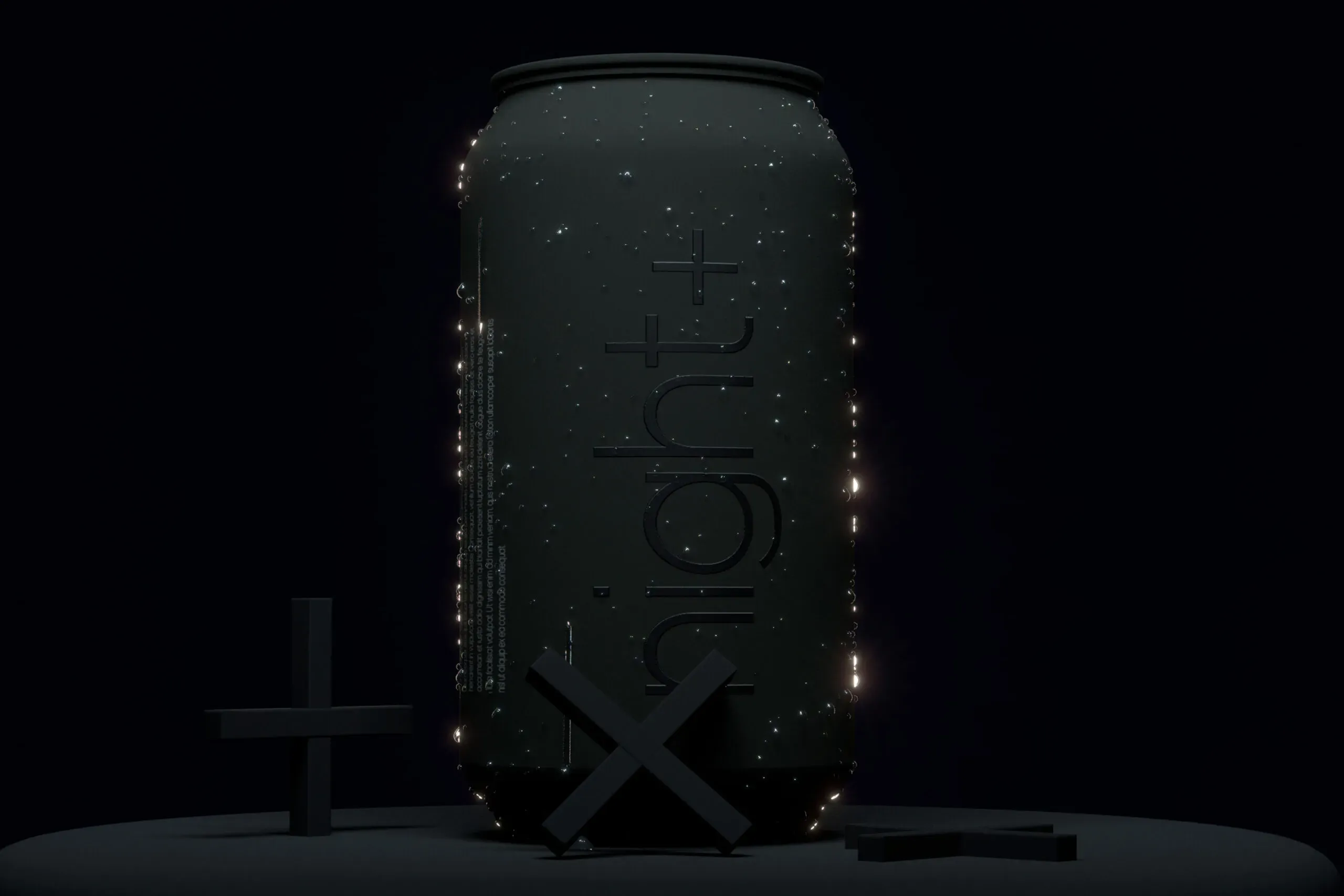

Night + Day was developed as a trial concept for a new drinks range built around health and wellbeing. The brief was to design a premium can system for two distinct moments, a day drink to support energy, and an evening drink to support relaxation and sleep. The challenge was clarity. Two products, two mindsets, one brand that still feels coherent and considered for people who care about what they put in their body.
The identity centres on contrast between Day and Night, expressed through a controlled palette and a clear typographic hierarchy. The can design uses a simple grid, generous negative space, and minimal supporting graphics to keep it feeling premium. Tone of voice is calm and assured, aimed at people who make intentional choices about what they consume. Finishing details are treated as part of the overall impression, not decoration.

A simple, premium system that signals function fast, while keeping the brand feel consistent across day and night


The brief
Create a premium can concept for a wellbeing drinks range that feels credible, modern, and easy to choose in a second
Night + Day was developed as a trial concept for a new drinks range built around health and wellbeing. The brief was to design a premium can system for two distinct moments, a day drink to support energy, and an evening drink to support relaxation and sleep. The challenge was clarity. Two products, two mindsets, one brand that still feels coherent and considered for people who care about what they put in their body
Project details
A simple, premium system that signals function fast, while keeping the brand feel consistent across day and night
1. Two moments, one brand
We set up a clear brand idea built around daily rhythm, then translated it into a packaging system that holds together as a pair. The goal was recognisable shelf presence without relying on loud claims or busy graphics.
2. Function led hierarchy
The can layout prioritises quick decision making. Day and Night are easy to spot, easy to understand, and still feel like part of the same family. This is the kind of packaging discipline a branding consultancy would push for when range clarity matters.
3. Premium by restraint
We kept the design confident and edited. The premium signal comes from proportion, spacing, and a calm visual tone. It is a useful reference point for any branding agency building concepts for modern wellbeing audiences.
Brand application
Bringing Night + Day to life on pack, with a system built for range growth
The concept is expressed through the can design, with Day and Night clearly differentiated while staying visually connected. The system is designed to work as a pair, supporting quick selection at point of purchase and a more considered read in hand. It is also structured to extend into future variants without losing clarity. For a branding company creating early stage concepts, this gives a strong base to test range logic, premium cues, and audience response.

The result:
A clear, premium packaging concept that frames wellbeing benefits without overstatement, and makes Day versus Night instantly legible
The outcome is a coherent two product system with a clear role for each drink. It balances functional clarity with a premium tone, and avoids the visual noise common in the category. As a concept, it gives a strong platform for further brand development, from messaging and naming architecture to future pack extensions.
This was a trial concept, so no commercial results were supplied. What it does provide is a practical tool for testing, a can design system that can be used to gather feedback on appeal, clarity, and perceived premium value with the intended health and wellbeing audience.

Night + Day was produced as a concept trial focused on packaging, with the can design acting as the primary brand expression. The work defines a clear Day versus Night architecture and a consistent system that can scale to additional variants. No launch activity, channels, or production specifications were supplied, and the concept is presented as a foundation for future development by a branding agency or branding consultancy once the range moves beyond trial.
 DISCIPLINES