The Origin Tea Collective
Brand and packaging system for premium and everyday Indian teas.
From plantation coordinates to shelf presence, a brand that feels premium in tubes and sharp in pouches.
The work covered brand creation, naming architecture for the two-tier model, and a packaging system built for scale. Premium SKUs were designed for tube formats with detailed origin callouts, including geolocation coordinates. The accessible range was created for pouch production with a simplified layout and strong shelf readability. Final assets were supplied as print-ready artwork with consistent grids, colour specifications and typographic styles, giving the client a clear toolkit to roll out new products with confidence. This is the kind of end-to-end build you expect from a branding company that understands both strategy and production realities.
The project
A simple idea that carries the whole brand, then a packaging system that scales across tubes, pouches and gifting.
1. Ownable origin device
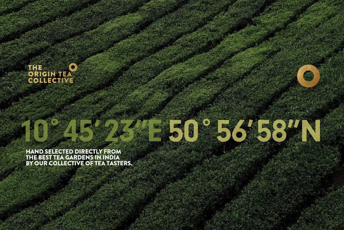
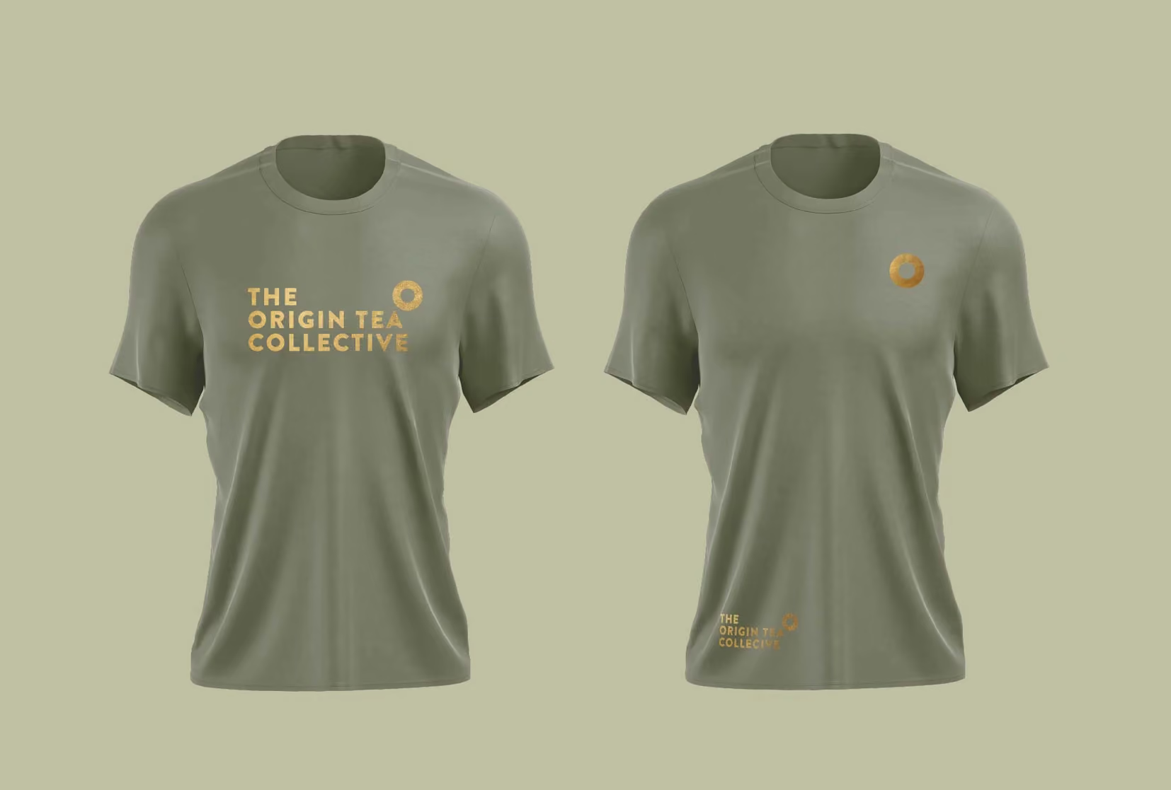
We built the identity around a circular emblem inspired by geolocation coordinates. It is simple, memorable, and it does a job. It points back to place. That meant the brand could talk about authenticity without over-explaining itself.
2. Two brands, one system
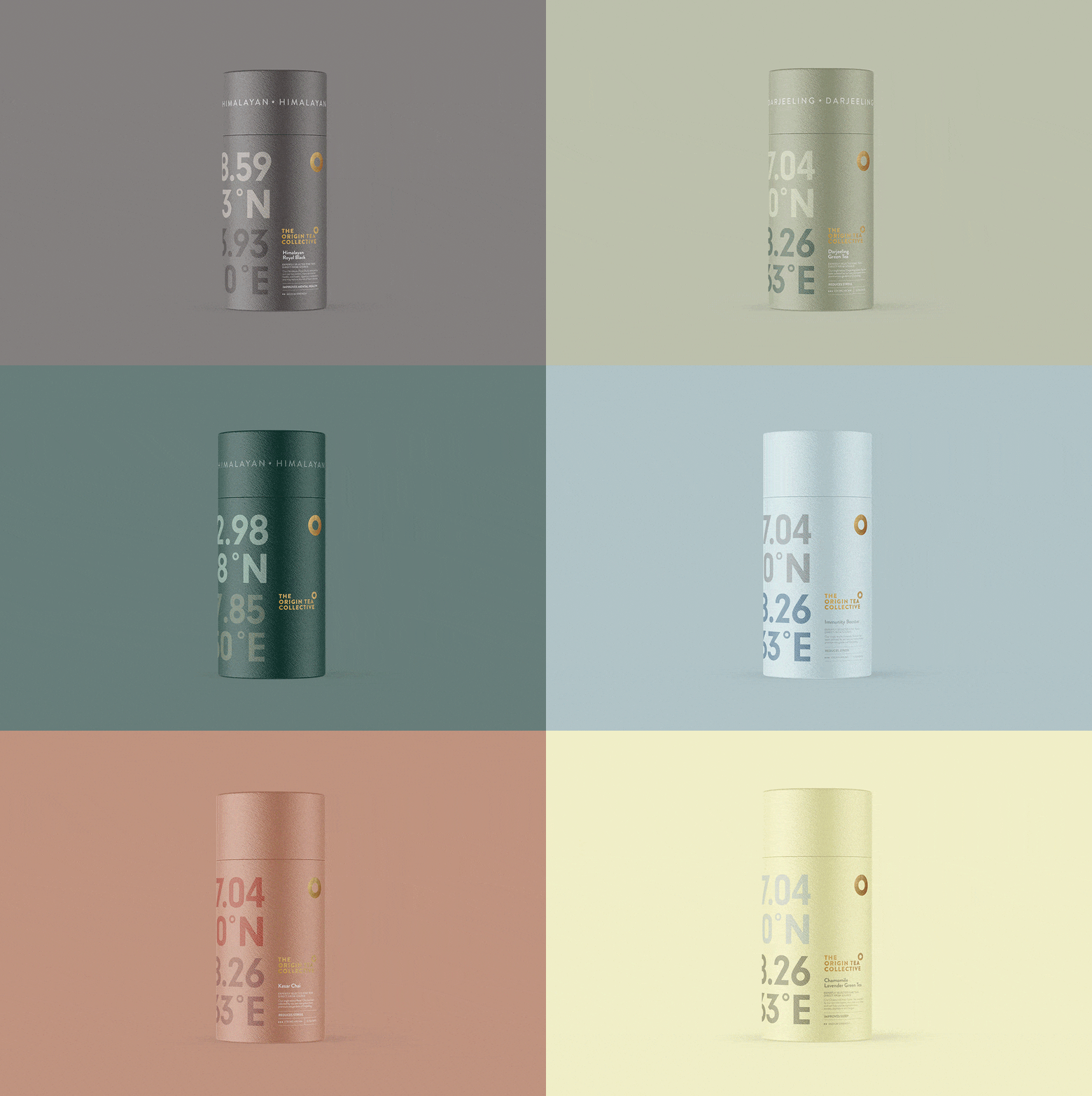
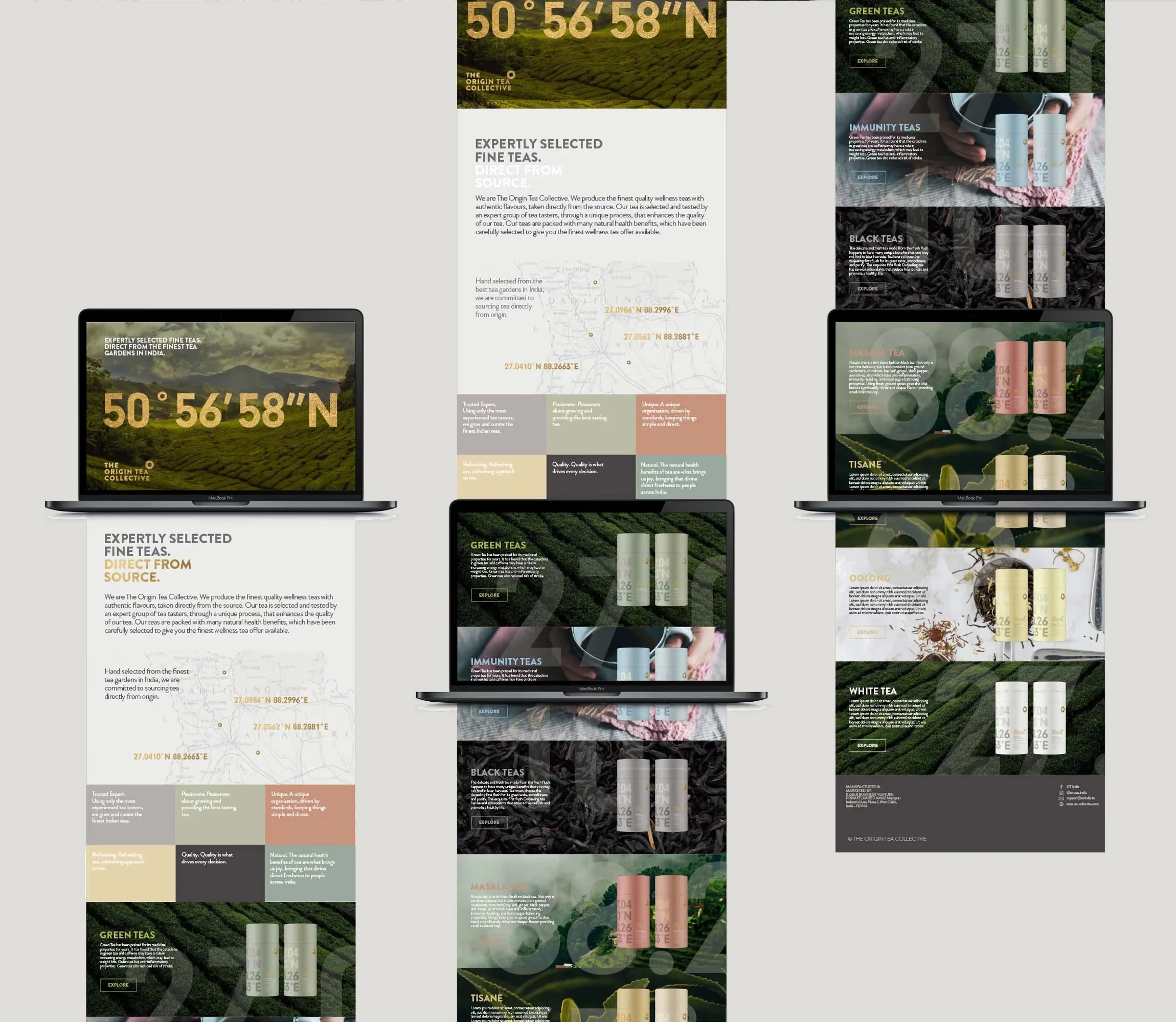
We created The Origin Tea Company for the premium range and OT India for the everyday range. Same core identity, different levels of detail and finish. The premium packs carry exact coordinates, the accessible range keeps it cleaner and more minimal.
3. SKU-ready packaging
With 49 SKUs for the premium tubes and 10 SKUs for the pouches, we designed a clear hierarchy for flavour, type and origin. It stays consistent, even when the range grows. The gifting line followed the same rules, just with more room to feel special.
Identity details
Typography was kept modern and confident, with a clean primary typeface and a supportive secondary for tasting notes and origin details. Colour works as a range organiser, with restrained, premium tones for The Origin Tea Company and a simpler palette for OT India. Photography focuses on real tea, texture, and a sense of place, not staged lifestyle. A tight grid keeps information calm. Finishing details included coordinate callouts, considered whitespace, and a tone of voice that is grounded, clear and proudly specific.
Brand application
The Origin Tea Company launched in premium tubes designed to feel like a gift even when you are buying for yourself. Coordinates and origin details are given pride of place, so the story is right there in your hands. OT India was built for daily purchase, minimal pouches, easy to shop, still recognisably part of the same family. We also created an exclusive gifting range to cover seasonal moments and higher-value occasions, without drifting away from the core identity.
The result:
Two clear tiers, one believable origin story, and packaging that makes a new tea brand feel established from day one.
The system gave the client a strong foundation, not just good-looking packs. The geolocation idea became the anchor for storytelling, pricing and range structure. As a branding consultancy, we focused on making the brand easy to understand quickly, especially on shelf. As a branding agency, we made sure the design language could stretch across dozens of SKUs without turning into noise.
Delivered 59 SKUs across both ranges, 49 premium tube designs for The Origin Tea Company and 10 pouch designs for OT India. Added an exclusive gifting range to extend the offer into higher-value moments. The packaging architecture makes future range additions straightforward, with clear rules for naming, hierarchy and variant differentiation, reducing design drift as the product line grows.


The work covered brand creation, naming architecture for the two-tier model, and a packaging system built for scale. Premium SKUs were designed for tube formats with detailed origin callouts, including geolocation coordinates. The accessible range was created for pouch production with a simplified layout and strong shelf readability. Final assets were supplied as print-ready artwork with consistent grids, colour specifications and typographic styles, giving the client a clear toolkit to roll out new products with confidence. This is the kind of end-to-end build you expect from a branding company that understands both strategy and production realities.
 DISCIPLINES