True English Tea
Modern British tea branding and packaging with a nostalgic twist.

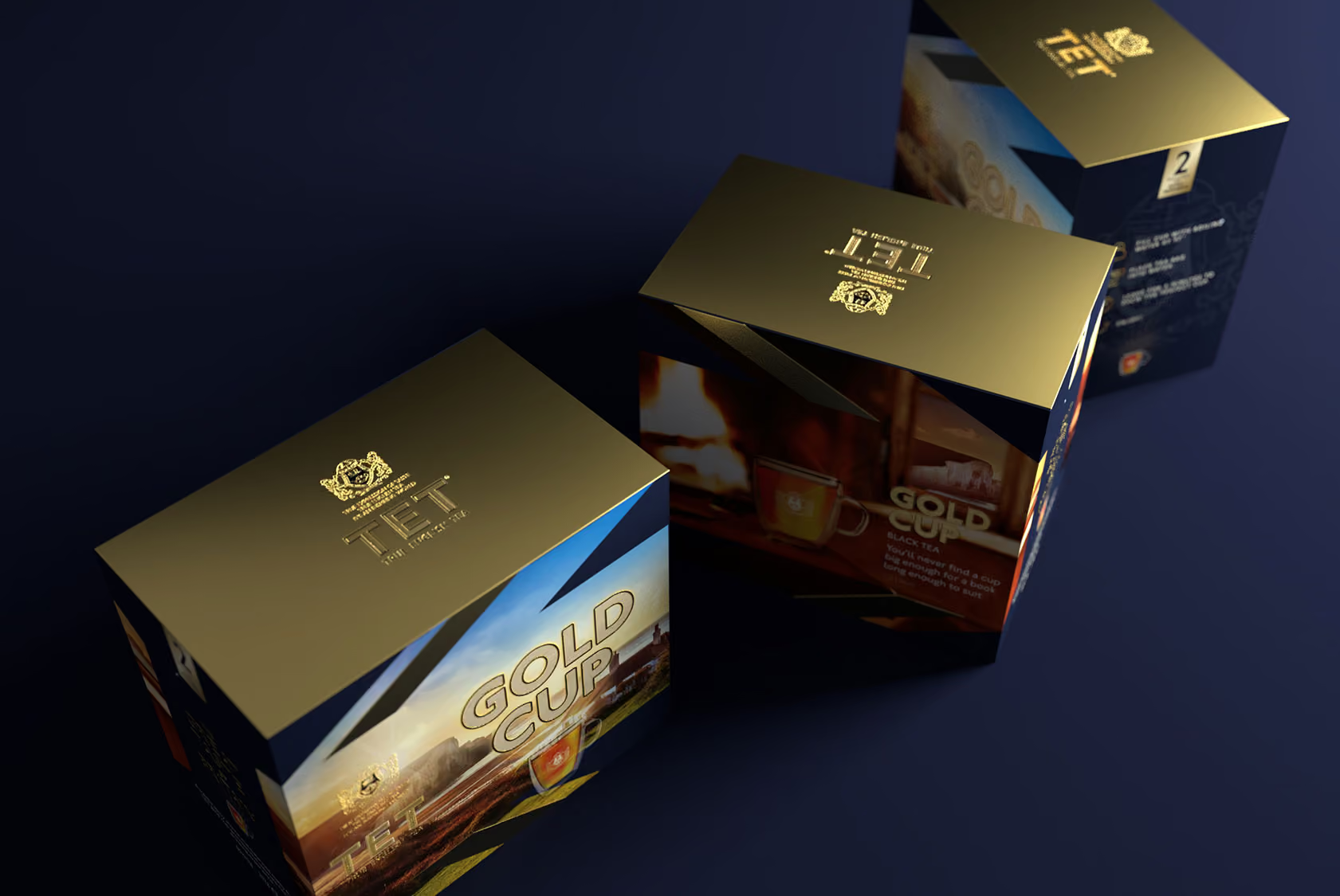
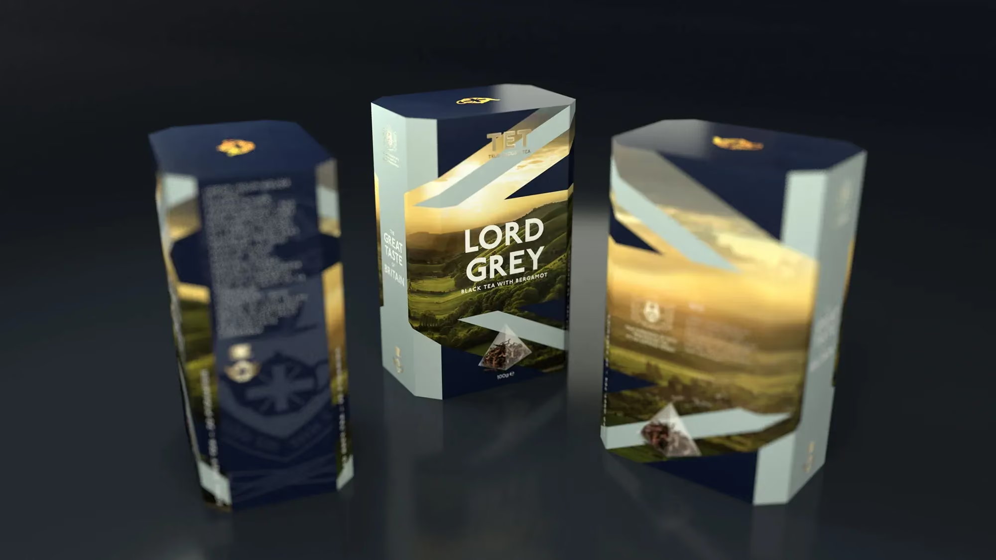
A contemporary pack system, built from cultural cues people already associate with a proper cup of tea.
A tasteful tea range that reads British at a glance, and modern up close The identity was designed to live primarily on pack, where most tea brands are won or lost. Each product carries the same underlying structure, so the range blocks together confidently, while the details do the storytelling. British cues are present, but never overworked, giving the brand a sense of distinction without drifting into parody. The result feels at home in a contemporary kitchen, while still tapping into the comfort and familiarity people expect from a proper cup of tea.
True English Tea needed branding and packaging design for a range of British teas. The challenge was baked into the category, tea is not grown in England, yet people still feel a strong affinity with “English” and “British” teas. Our job as a branding agency was to capture what that Britishness really means, without drifting into pastiche, flag waving, or heritage for heritage’s sake.
Project details
1. Define Britishness
We started by unpacking why tea feels so British. Not the origin story, but the role it plays, tradition, social connection, and that small, reliable pause in the day. Tea crosses class and context, which gave the brand permission to feel inclusive rather than exclusive.
2. Nostalgia, controlled
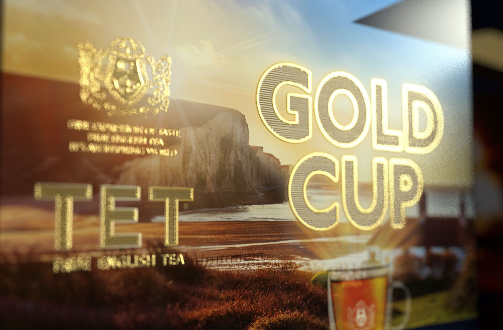
We explored cues that trigger a sense of home without turning the pack into a souvenir. That meant borrowing from lived moments, like returning to the UK and seeing rolling hills from above, and treating national symbols with restraint so they read as familiar, not loud.
3. Make it a range
The work needed to hold across multiple variants, from Earl Grey through to a Great British Breakfast. We built a clear hierarchy and repeatable layout so the range feels cohesive on shelf, while each blend still has its own presence.
Brand application
Typography is rooted in Johnston Sans, chosen for its unmistakably British tone and everyday familiarity. The pack design balances modern clarity with nostalgic signals, including references to British landscape and a restrained use of the Union Jack. Composition is clean and confident, with enough white space and structure to keep the range feeling fresh, not themed. The overall tone is warm, tasteful, and quietly proud.
The identity was designed to live primarily on pack, where most tea brands are won or lost. Each product carries the same underlying structure, so the range blocks together confidently, while the details do the storytelling. British cues are present, but never overworked, giving the brand a sense of distinction without drifting into parody. The result feels at home in a contemporary kitchen, while still tapping into the comfort and familiarity people expect from a proper cup of tea.
The result
A modern expression of British tea culture, packaged with restraint, warmth, and confidence
As a branding consultancy, we helped True English Tea articulate what “English” means in this category, not where tea is grown, but what tea represents in British life. The packaging strikes a careful balance, familiar enough to feel comforting, modern enough to feel considered. It gives the range a clear point of view without relying on clichés.
The outcome is a coherent pack system that supports a growing range, with a consistent structure that makes variants easy to recognise and shop. The design creates clear shelf presence through hierarchy and repetition, while leaving room for individual blends to stand apart. It is a practical, scalable foundation for a branding company to build on.
 DISCIPLINES