BOS
Norse mythology-led gin branding and bottle label design for a Europe launch.
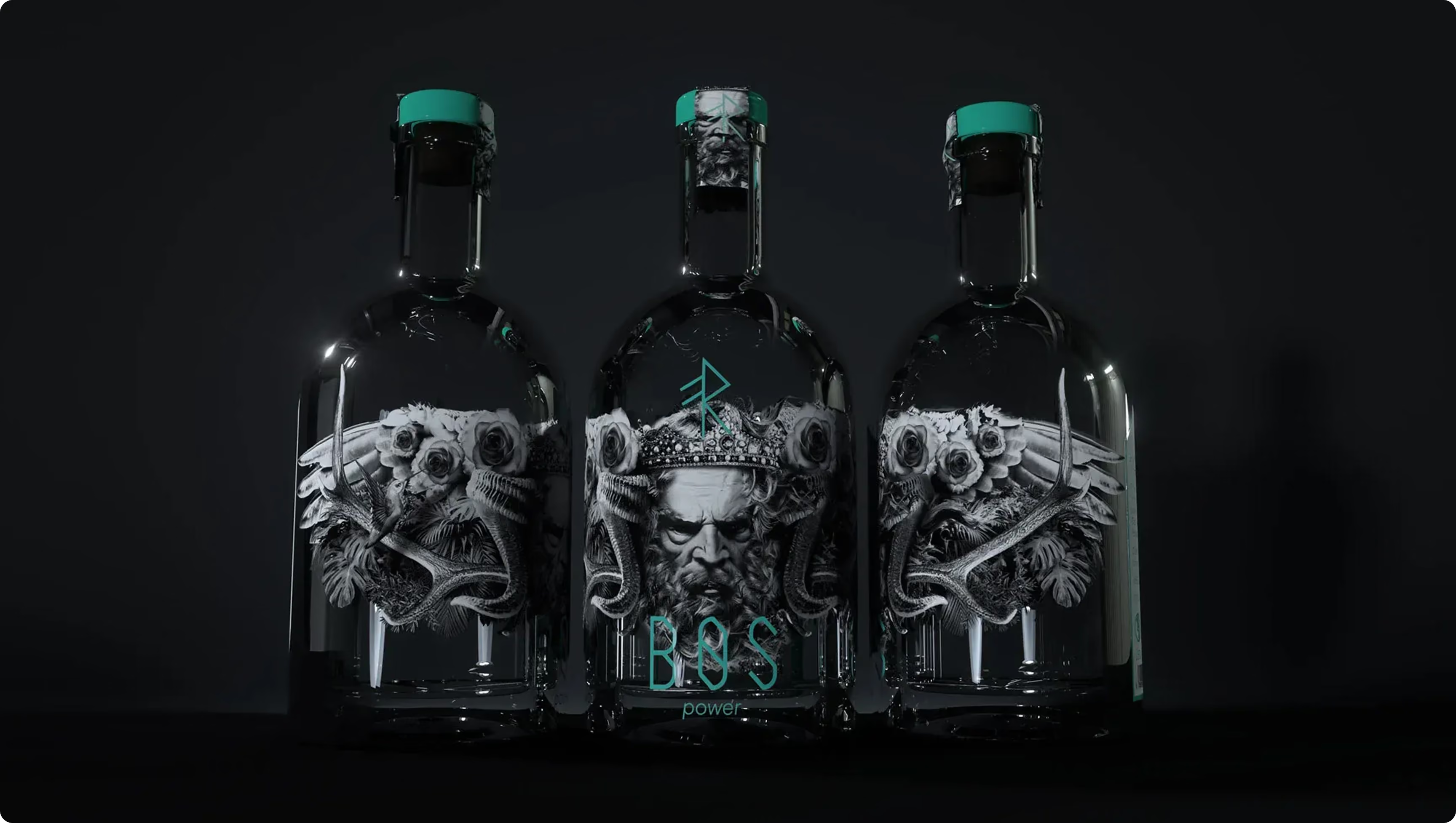

BOS approached our London branding agency to create a premium identity and bottle label design for a new gin range launching across Europe. Rooted in Norse mythology, the concept needed to capture attention on shelf, communicate quality instantly, and reward closer inspection through an immersive story rather than a literal interpretation of Viking culture. A shared fascination with Norse history helped shape the creative direction.
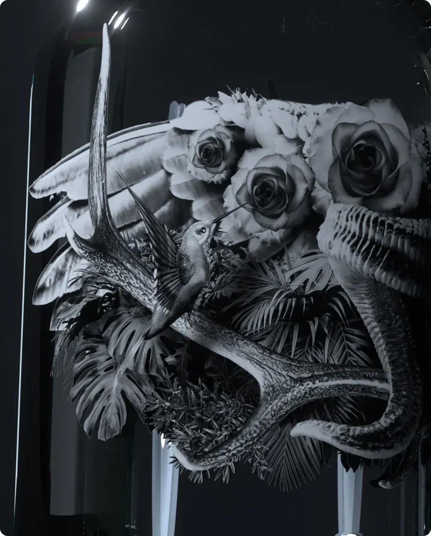
We developed a narrative-led packaging system built around Norse-inspired character illustrations that wrap around each bottle, creating a sense of mystery and discovery. Botanicals and flavour cues are seamlessly woven into the artwork, connecting the mythology to the spirit itself, while unique runes and hidden details distinguish each variant. The result is a scalable, collectible packaging system with clear shelf presence that rewards closer inspection.
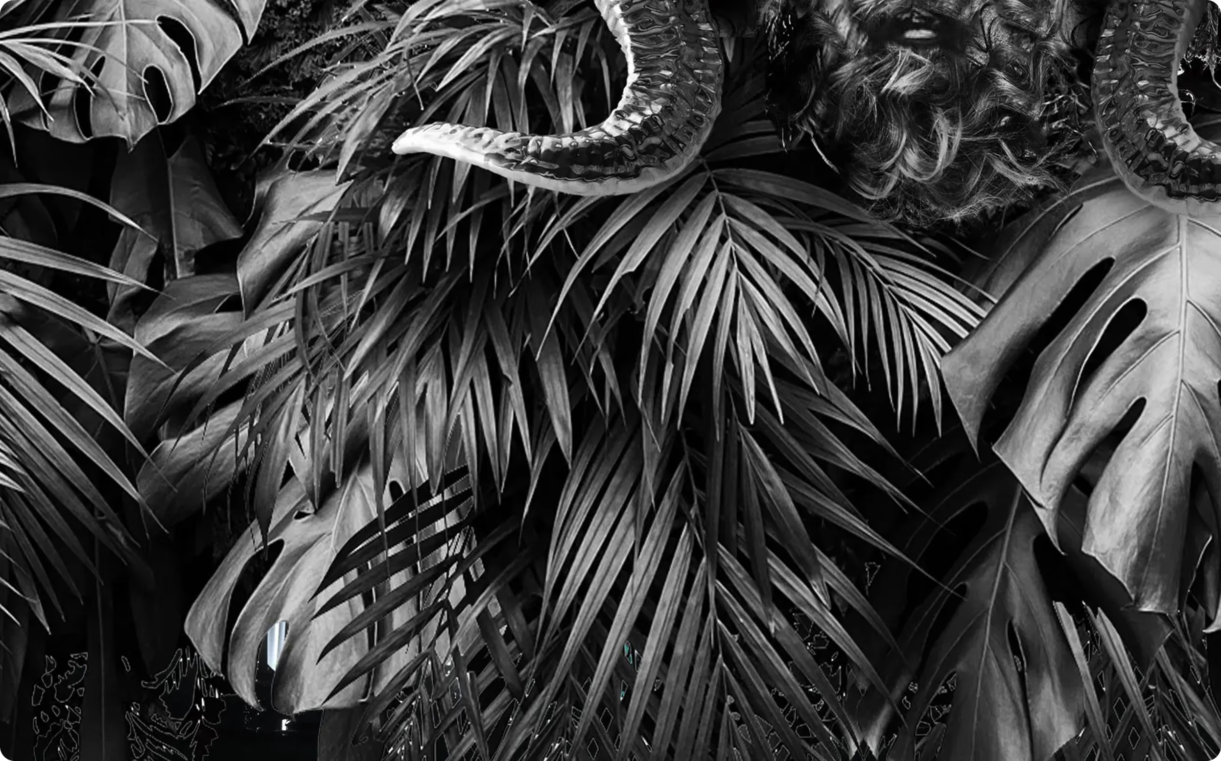
The identity centres on high-contrast black-and-white illustration, designed to feel dramatic and poetic. Runes act as distinctive markers across flavours, supported by hidden details that reward repeat viewing. The bottle becomes the canvas, with artwork wrapping around the glass via a die-cut label shape and silk-screen printing directly onto the surface. The finishing approach keeps the look premium and tactile, and gives the range a recognisable silhouette from multiple angles.
Brand application
A bottle you read with your hands, and a story you spot from across the aisle
The brand comes to life through the packaging first. Illustration wraps the bottle so the narrative unfolds as you turn it, making the product feel immersive rather than front-facing. Silk-screen printing on glass adds immediacy and craft, while the die-cut shape frames the characters and creates a distinctive edge on shelf. Variant differentiation is handled through runes and embedded visual cues, giving BOS a cohesive range that still invites discovery. It is premium, but not precious.
Results
A premium gin identity with real shelf presence, built to be explored, collected, and remembered
BOS left with a brand world that feels culturally rich and specific, without becoming pastiche. The character system gives the range a consistent visual language and a clear way to extend. For our branding company, it was the kind of collaborative, high-concept work that benefits from shared curiosity and close creative alignment.
The design delivers strong standout through bold black-and-white contrast, a distinctive wraparound format, and a recognisable set of runes per flavour. The layered detail encourages longer dwell time at shelf and supports collectability across the range, helping the product present as premium for its Europe launch.
Project summary
Delivered as a brand identity and packaging system for a new BOS gin range launching across Europe. The core asset is a suite of Norse-inspired character illustrations designed to wrap around each bottle, with variant differentiation handled through unique runes and hidden elements. Production was designed around a die-cut label shape and silk-screen printing directly onto the glass, keeping the bottle as the primary brand surface. The result is a clear range architecture with a narrative structure that works from any viewing angle.
 DISCIPLINES