Kool Life
Multi SKU retail brand and packaging for Morocco’s Kool Life range.

Take a beach born smoothie bar and shape it into a retail brand people can pick up in cafes and supermarket aisles across Morocco
Kool began as a smoothie bar serving Morocco’s surf crowd, then grew into a retail offer sold through the Kool Smoothie cafe and supermarket chains. The brief was to create Kool Life, a healthy food brand with enough personality to feel true to its roots, but with the clarity and discipline needed for multi SKU packaging. It also needed a coherent digital and social system that could keep pace with new products.
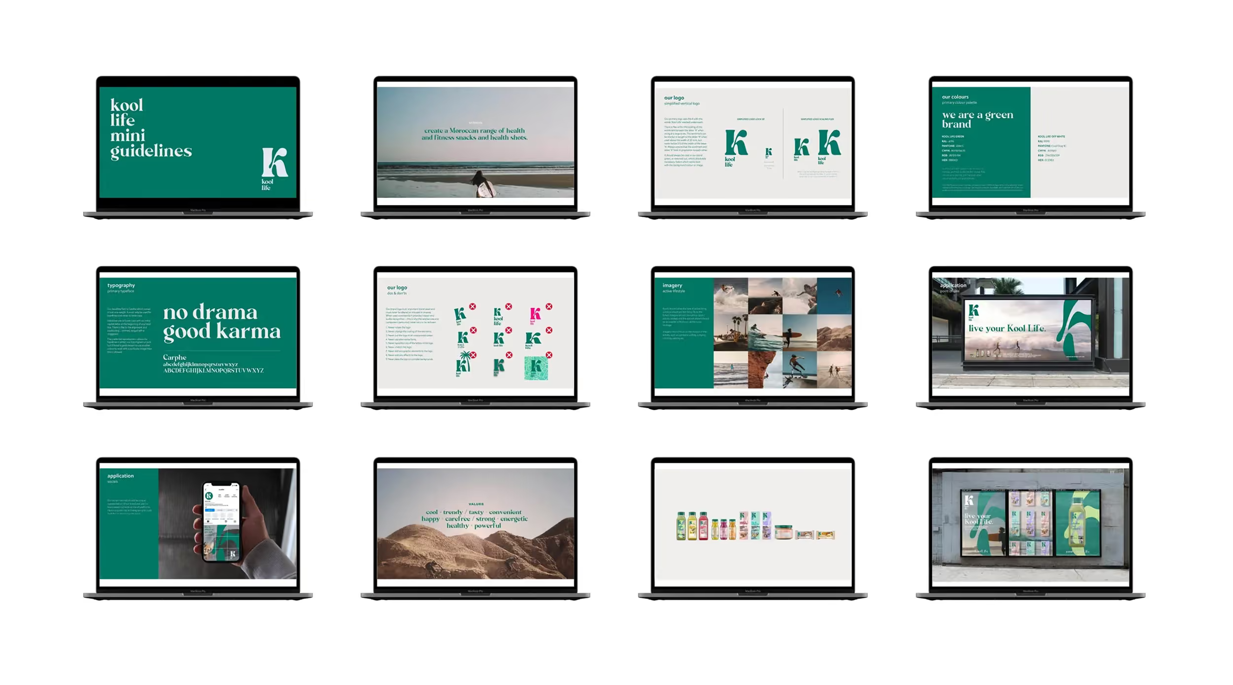
A clear, flexible system built around the Kool ‘K’, lifestyle energy, and packaging architecture that holds together across categories


Research and strategy
We built on earlier work across Kool Smoothie and Kool Coffee, then defined what Kool Life needed to be for a wider Moroccan audience. The aim was simple, keep the surf born attitude, make it accessible, and give the brand a structure that scales.
Packaging architecture
With cereals, energy snacks, juices, and health drinks, the range needed order. We created a repeatable layout logic that can flex for variety within each category, while staying recognisably Kool Life from a distance.
Digital and social system
Alongside packaging, we developed the digital and social design style and templates. This gave the team a consistent way to launch products, tell stories, and keep the brand feeling current across channels.


The identity centres on the Kool “K”, used in negative space and overlaid on lifestyle imagery to anchor the brand in its surf heritage. A consistent grid and clear hierarchy ensure strong legibility across a busy multi-SKU range, supported by lifestyle-led photography rooted in surf culture.
The identity centres on the Kool “K”, used in negative space and overlaid on lifestyle imagery to anchor the brand in its surf heritage. A consistent grid and clear hierarchy ensure strong legibility across a busy multi-SKU range, supported by lifestyle-led photography rooted in surf culture.
From cafe shelf to supermarket fixture, a brand system that keeps the Kool attitude intact Kool Life came to life through a packaging range designed to work hard at shelf, across multiple categories and lots of variants. The negative space ‘K’ became the recognisable anchor, while lifestyle imagery brought the tone and energy. In parallel, we created digital and social templates so the brand could show up consistently beyond the pack, supporting product drops and everyday content with the same visual language. For a branding agency and branding consultancy, this was about building a branding company level system that stays coherent as the range grows.


The Result:
A cool, healthy retail brand that stays true to its surf roots, but works across a full multi SKU range
Kool Life now has a clear brand idea and a recognisable visual signature built around the ‘K’. The system balances lifestyle and structure, so it can stretch from cereals to drinks without losing itself. It also connects naturally back to Kool Smoothie and Kool Coffee, keeping the wider Kool world feeling related.
Kool Life launched as a retail offer sold through the Kool Smoothie cafe and supermarket chains across Morocco. The packaging system supports multiple SKUs and high variety within categories, making it easier to introduce new products without redesigning from scratch. Digital and social templates help maintain consistency as the brand communicates more frequently.
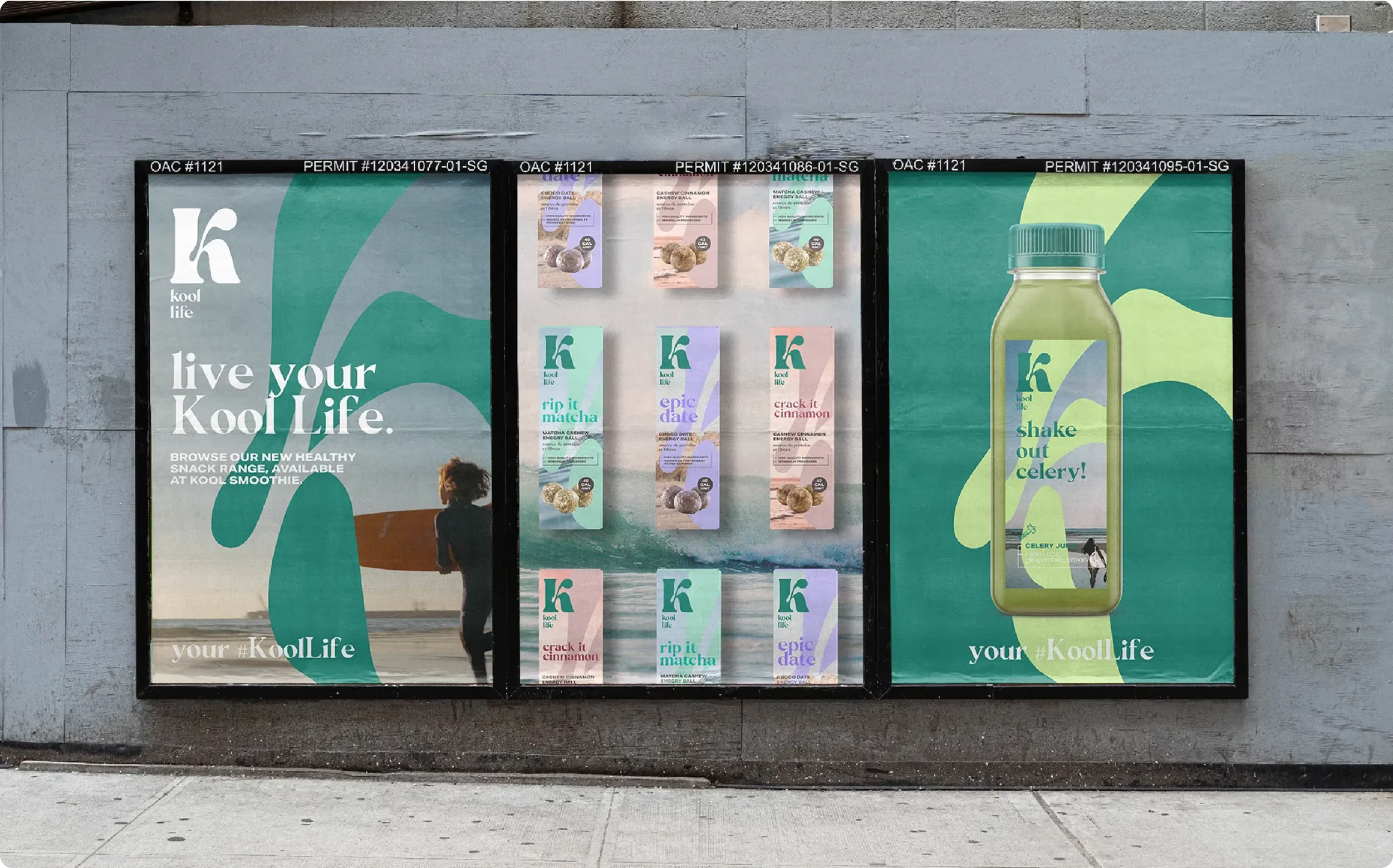

The work covered research, strategy, brand development, multi SKU packaging design, plus digital and social design style and templates. Kool Life was built to live in two contexts, the Kool Smoothie cafe and supermarket retail, with a packaging architecture that holds across categories and variants. The brand system is designed to scale, keeping the ‘K’ device and lifestyle imagery as the constant thread while allowing enough flexibility for future range extensions.
 DISCIPLINES