Oasis Cafe
An Oasis in the Moroccan desert, a place of great food and dining.
Considered a national icon, a place that holds a place in the hearts of the Moroccan people.
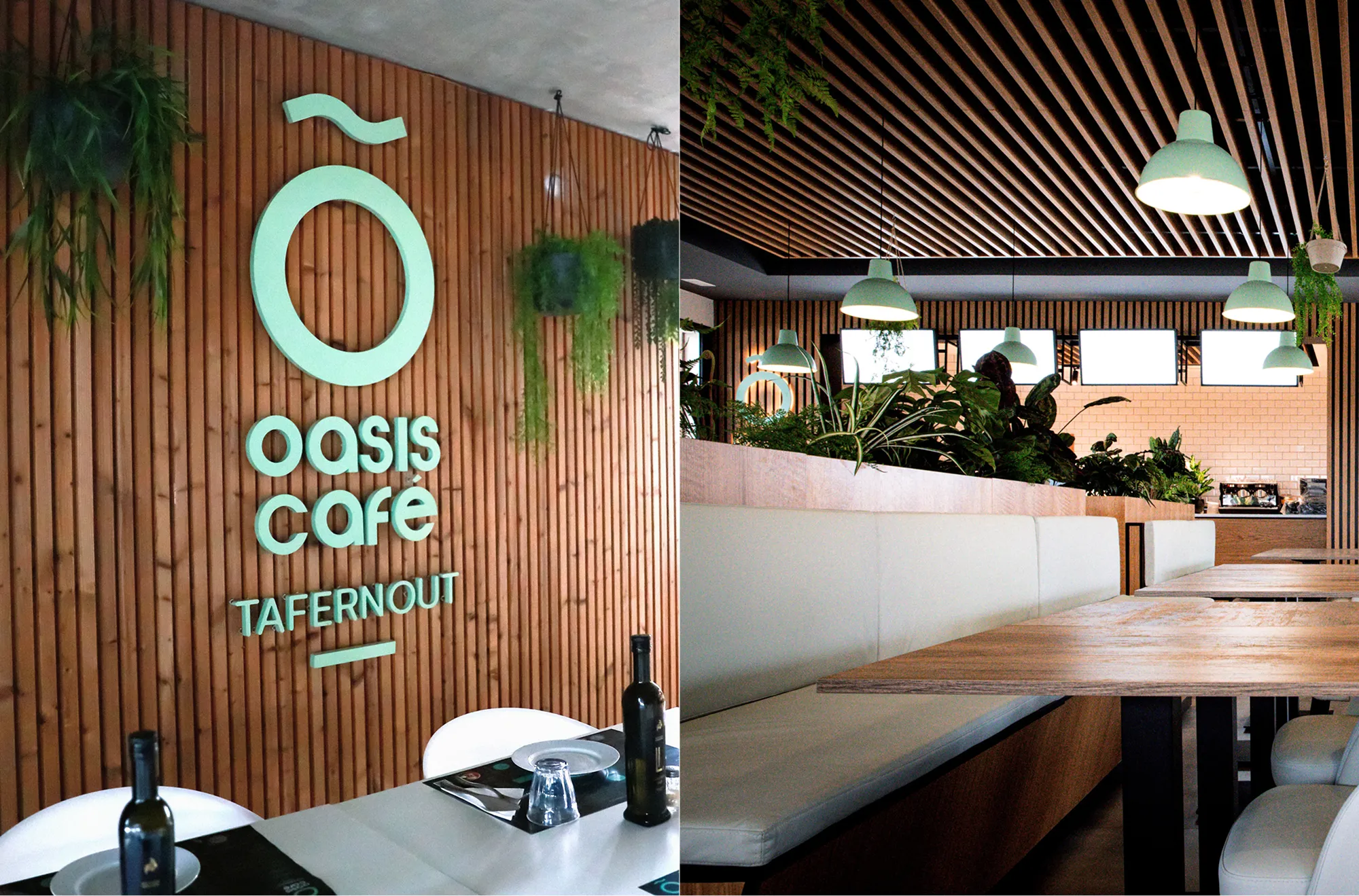
Afriquia needed Oasis to feel like more than a forecourt stop, a place Morocco would choose for food, rest, and family time
Oasis was already known across Morocco, but it felt tiered and dated. Afriquia asked us to refresh the brand without losing the familiarity people trusted. The challenge was to elevate a roadside classic into a calm, credible restaurant experience for everyone, while also creating a clear system for two distinct formats, Tafernout for sit down family dining, and Express for fast food on the go.

A strategy-led identity built around the oasis idea, then engineered to work across formats, sites, and everyday touchpoints at national scale
Benchmarking and insight.
We mapped the competitive set across Morocco, from forecourt offers to casual dining, then identified what Oasis could own. The insight was simple, people wanted a dependable stop that also felt like a treat. The brand needed warmth, calm, and quality, not noise.
Brand architecture.
We defined Oasis as the master brand, then created two clear venue expressions. Tafernout signalled a family restaurant experience. Express delivered speed and clarity for food on the go. Both shared the same core cues, so the system stayed consistent across the network.
Identity and rollout system.
We created a flexible identity with a symbol that could scale from signage to packaging. Then we built practical guidelines for interiors, wayfinding, uniforms, and printed assets. Every element was designed for repeatable rollout across Morocco, without losing craft.
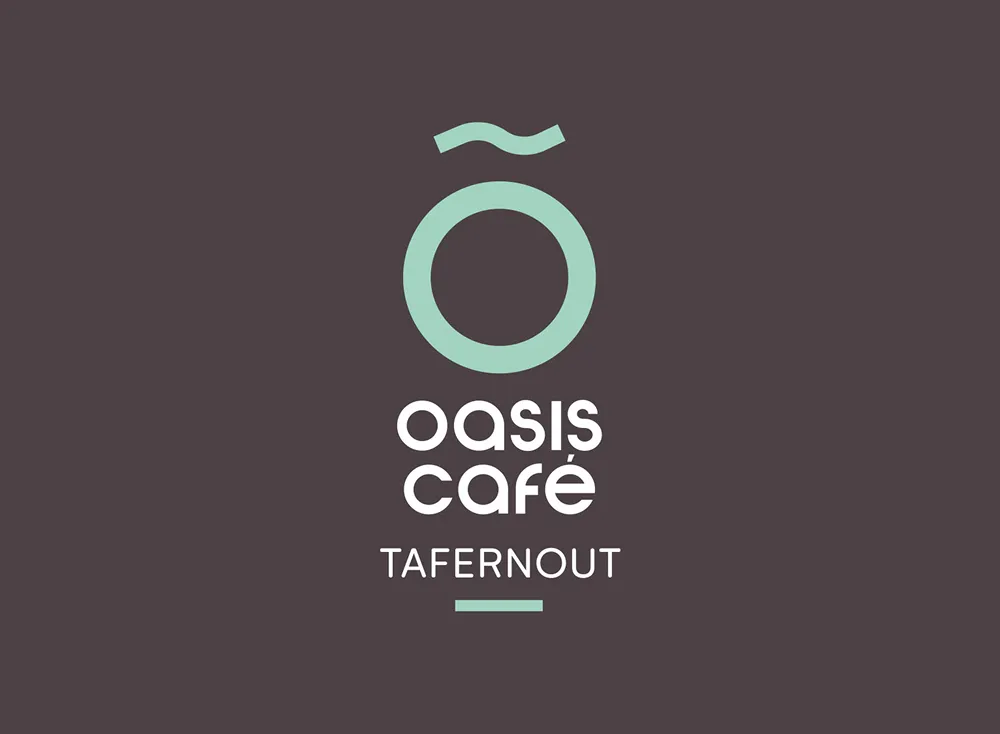
Green anchored the palette, a direct cue to lushness and relief in the desert. The symbol fused an O for Oasis with the circle of life, while the upper form referenced the original Bedouin tent mark to keep continuity. A clean typographic system paired with simple line illustrations for iconography. Photography leaned into real food, generous portions, and shared tables. Grids were clear and modular for menus, packaging, and signage. The tone of voice was welcoming, confident, and plain spoken.
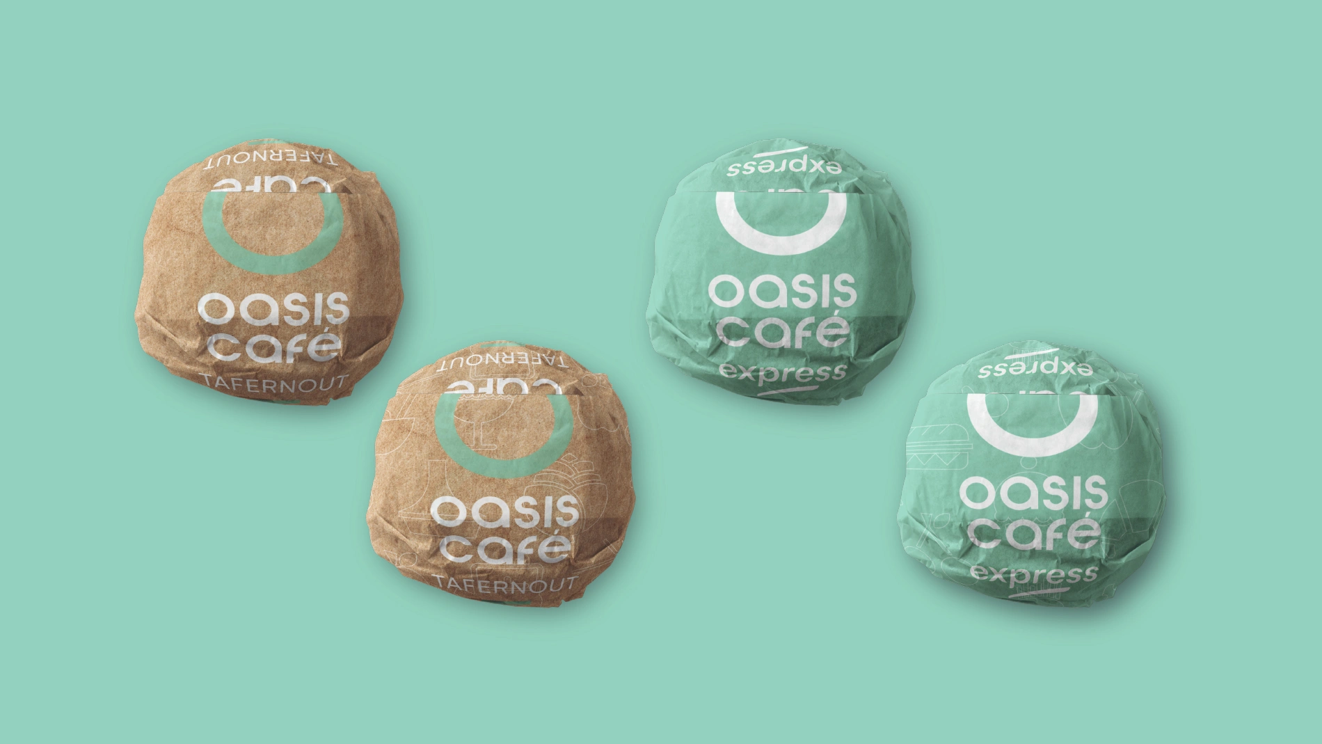
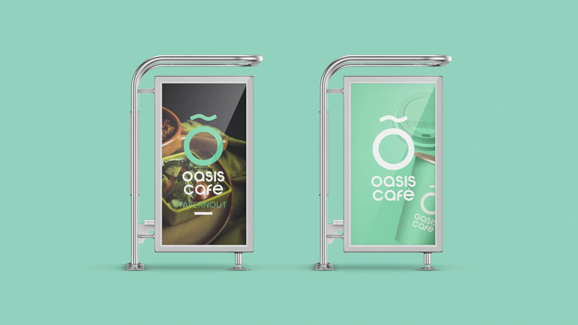
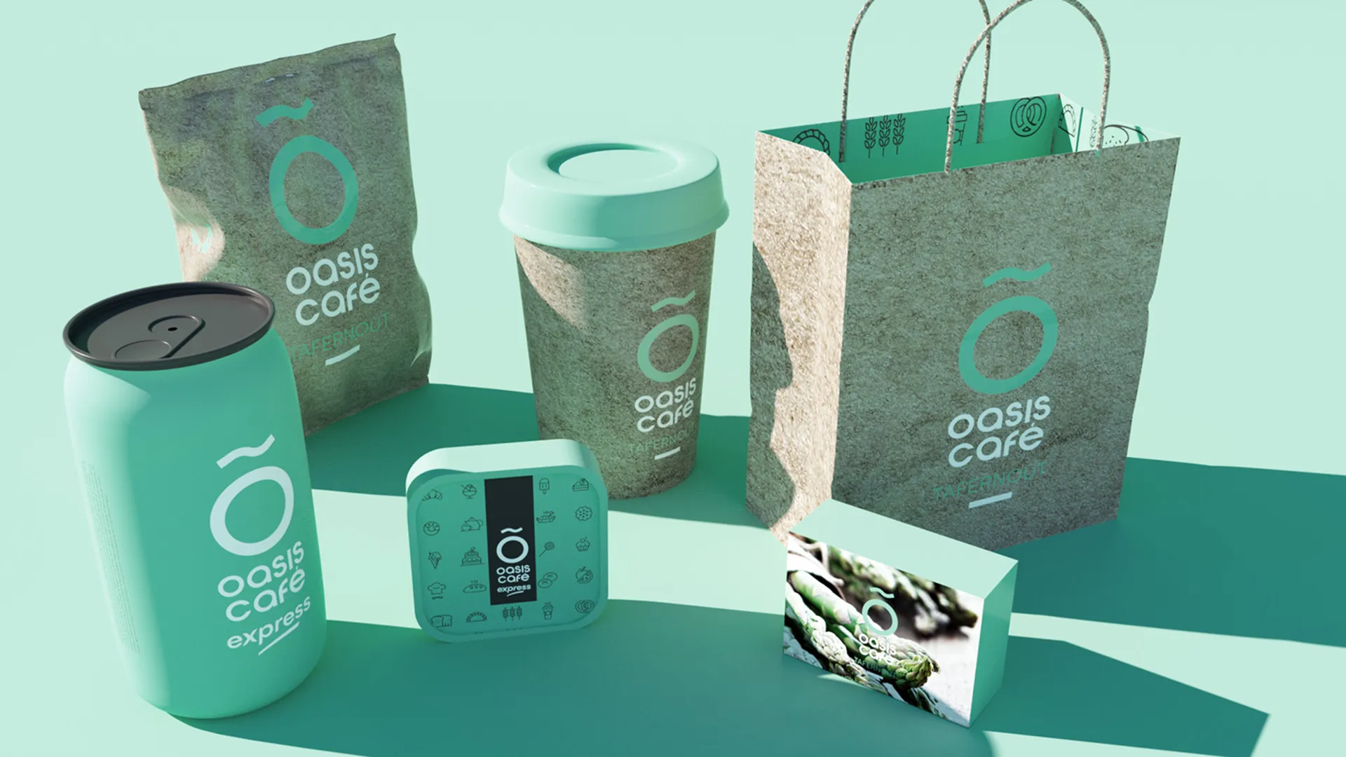
From roadside stop to national brand, expressed through spaces, packaging, and the details people touch every day.
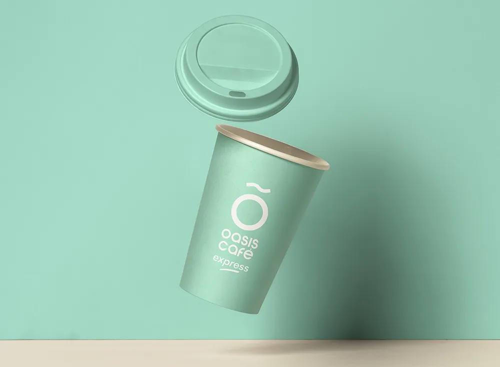
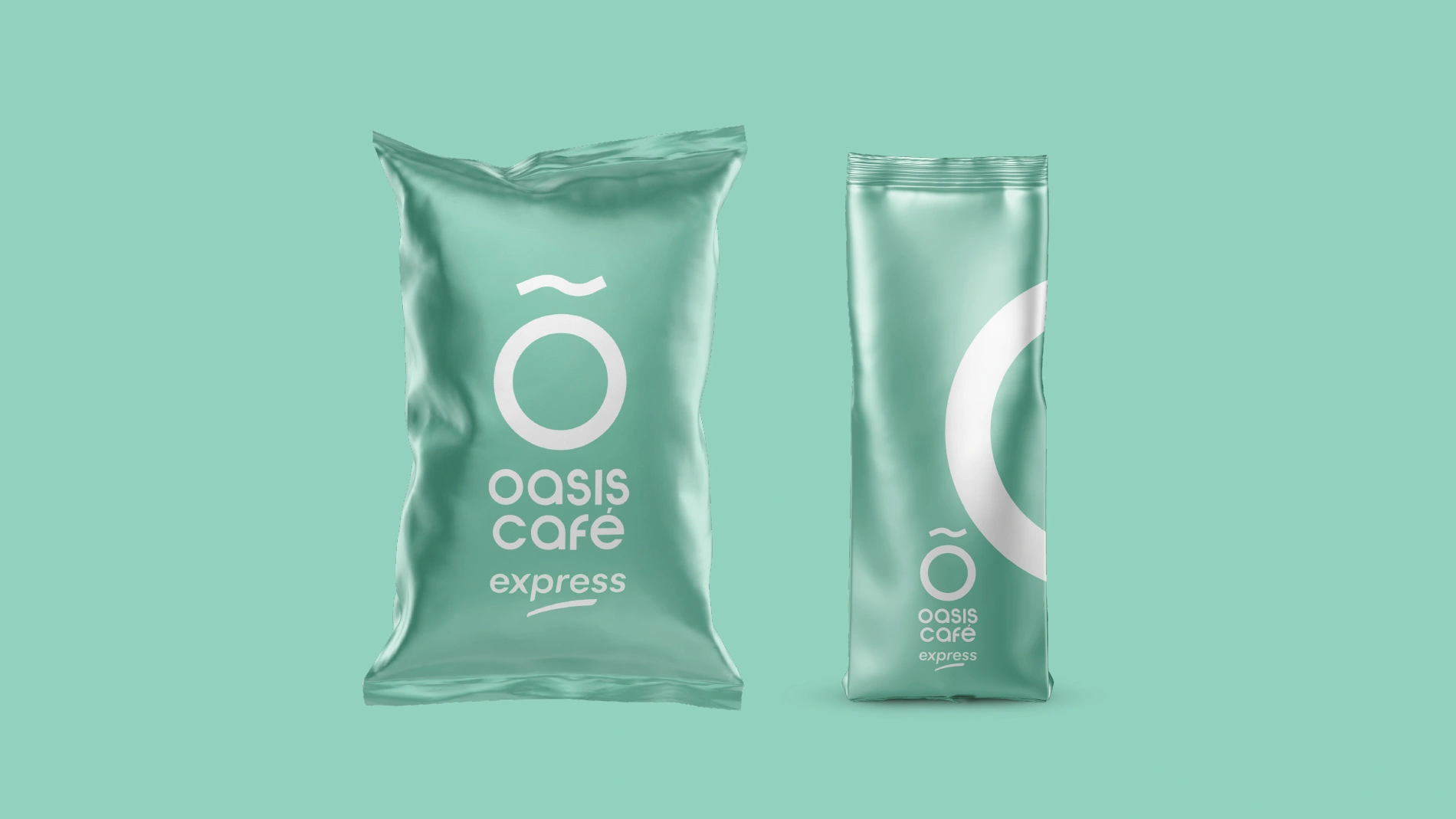
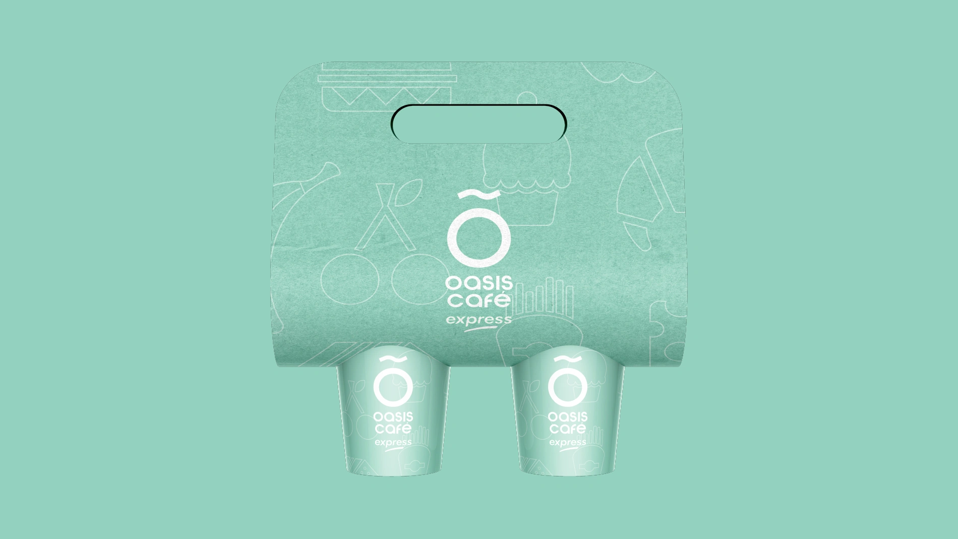
We brought the identity to life across the full customer experience. Packaging and menu systems were designed for speed, appetite appeal, and consistency at scale. Interiors balanced comfort and clarity, creating a calm place to pause, eat, and reset. Wayfinding and signage were built for high visibility and quick decision-making, especially in Express locations. Uniforms carried the brand with restraint, keeping staff presentation smart and familiar. The result was a coherent system that worked across sites, dayparts, and service styles.
 DISCIPLINES