DIMA
A multi-category wellbeing brand built around balance, credibility, and quiet happiness.

Inspired by a post-pandemic shift towards healthier living, Dima You set out to support mind, body and soul through food, wellness, fashion and homeware. The challenge was to create a flexible identity that could unite a diverse lifestyle offering while remaining warm, approachable and true to the meaning of "Always You."
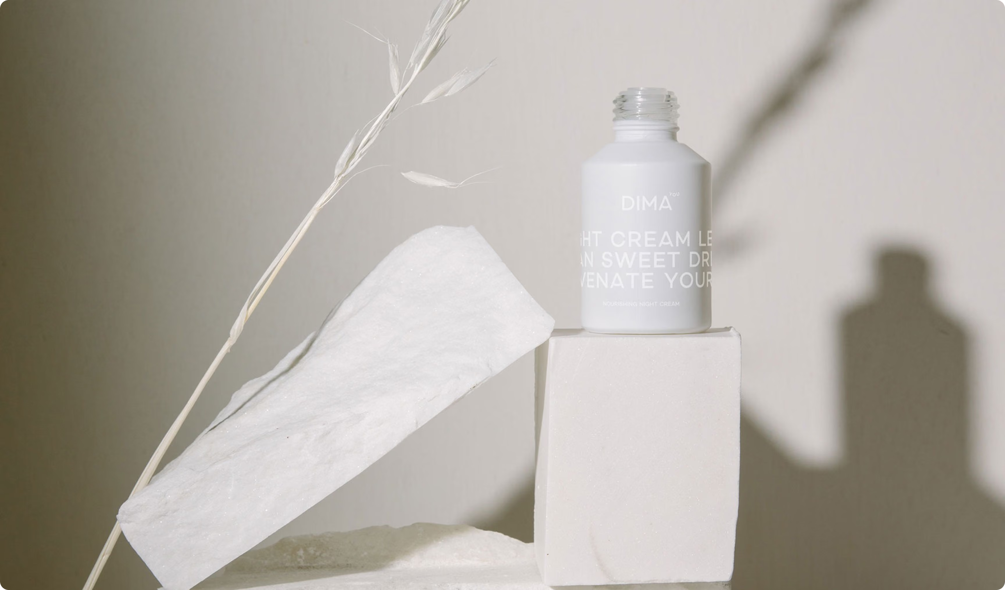
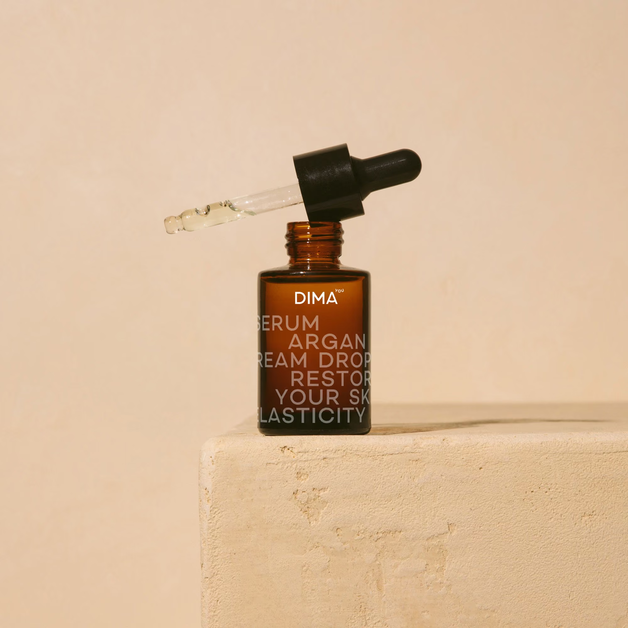
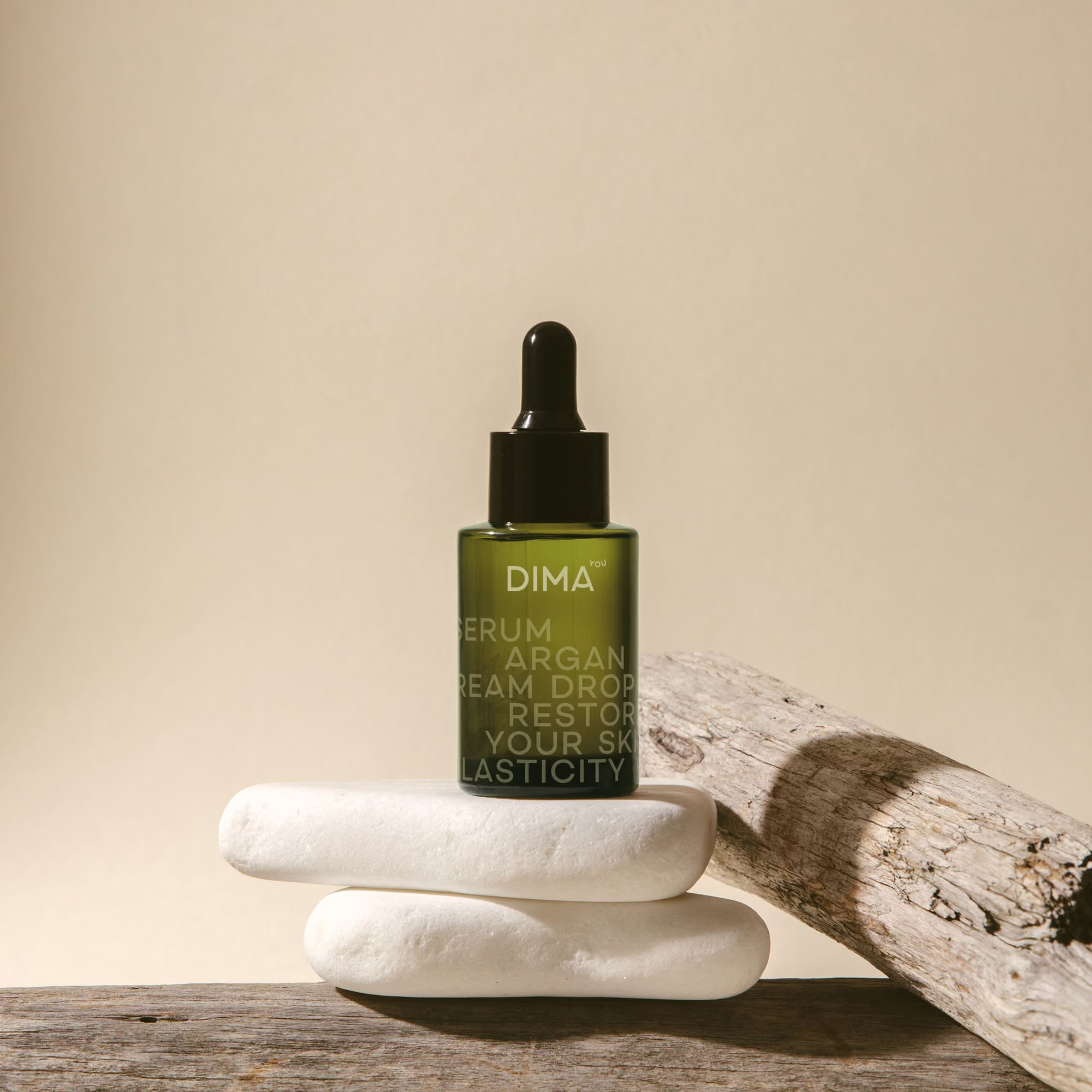
The identity centres on a bespoke typeface with smile cues echoed from the “you” wordmark, used to bring warmth without trying too hard. Colour is handled by category, muted and downplayed for beauty and wellness, brighter and more appetising for food. Typography often wraps around packs in bold, abstract compositions to create presence. Tone of voice stays modern, confident, and friendly, with finishing details that keep the optimism subtle rather than loud.
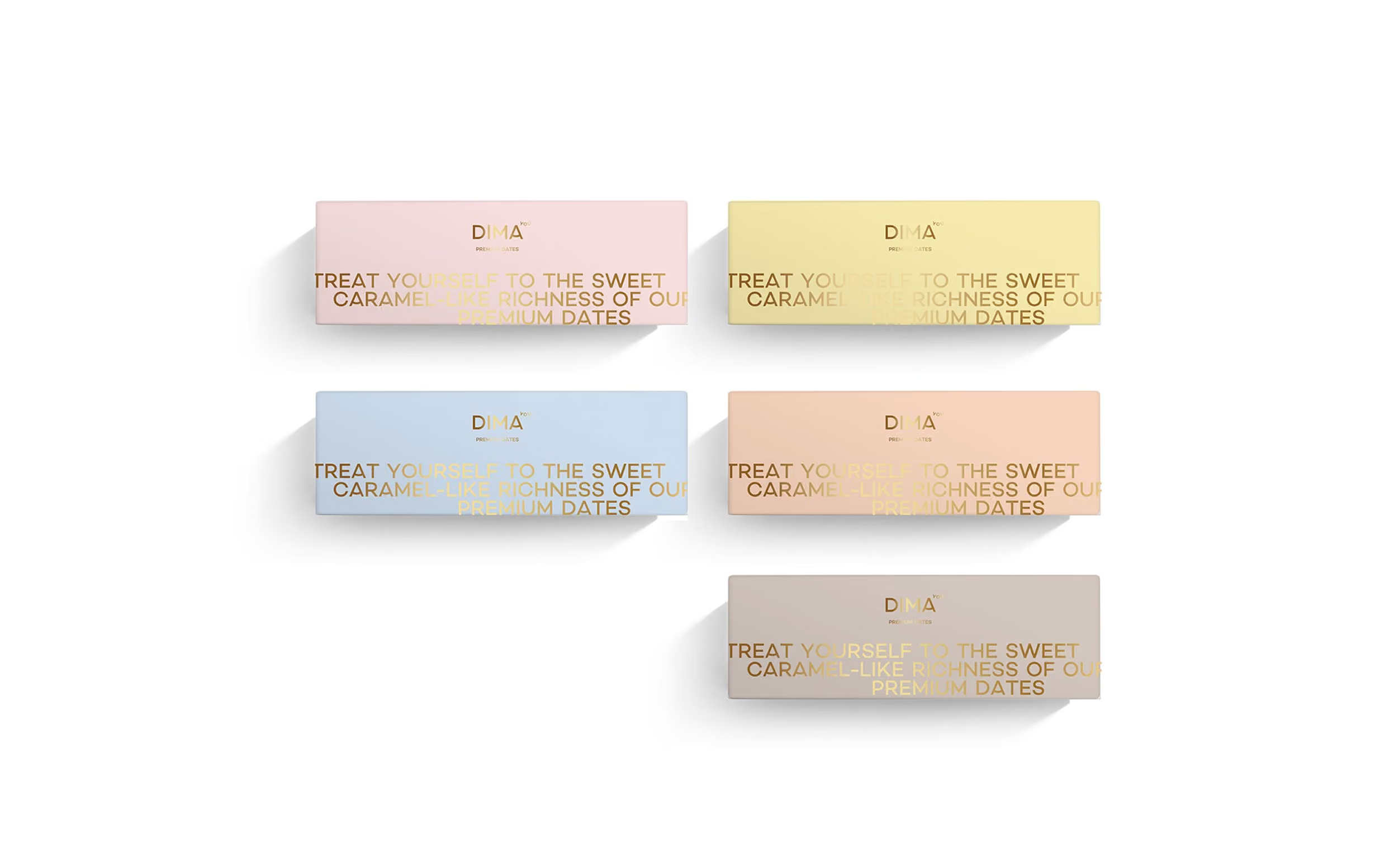
The identity was designed to work seamlessly across packaging, retail and lifestyle touchpoints, from food and wellness to fashion and homeware. Flexible layouts, considered colour palettes and bespoke typography create a cohesive brand system that adapts by category while maintaining a consistent, human feel.


Set the balance
We focused on credibility first, then added warmth. The brand needed to feel professional and considered, with happiness present but never pushed. That meant building a system that could be calm when required, and more energetic when the product and context allowed it.
Design for categories
The identity had to hold its own across different category expectations. Food can carry bolder, more playful cues around taste and benefit. Beauty and wellness asks for more restraint and capability. The system was built to shift tone without changing who the brand is.
Unify through type
A bespoke font became the connector across everything. Smile inspired details, taken from the “you” wordmark, appear in select letterforms. It keeps the brand human and recognisable, while giving us a distinctive tool for packaging and communications.
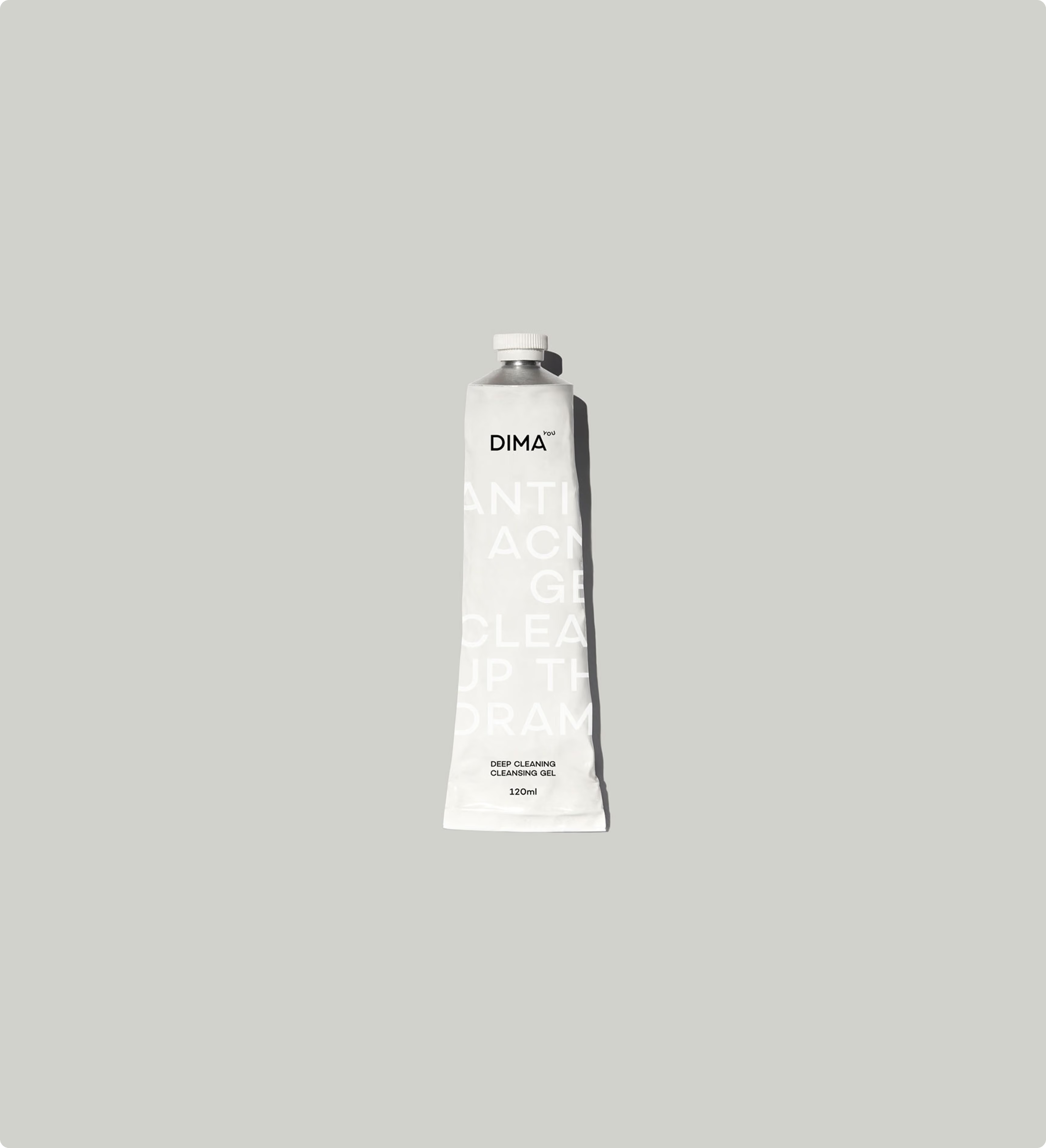
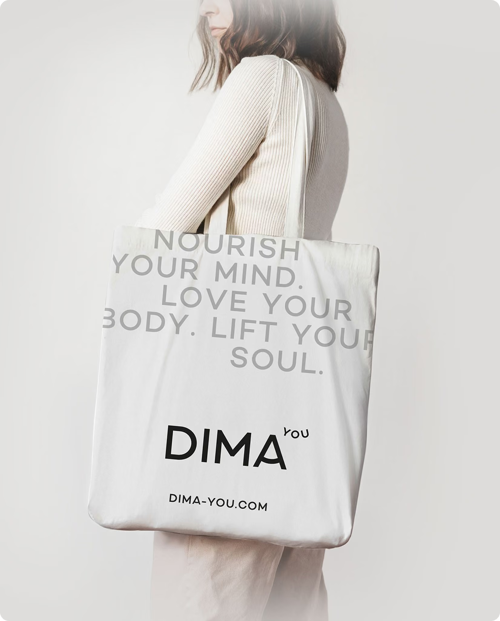
A modern identity that feels credible across categories while allowing moments of subtle positivity to come through in the details. The system balances warmth and restraint, adapting through colour and typography to differentiate ranges while maintaining strong recognition and shelf presence across food, beauty and wellness.
A modern identity that feels credible across categories while allowing moments of subtle positivity to come through in the details. The system balances warmth and restraint, adapting through colour and typography to differentiate ranges while maintaining strong recognition and shelf presence across food, beauty and wellness.
Delivered as a flexible brand identity and packaging system for a multi-category lifestyle concept. The core assets include the Dima You wordmark with the integrated smile, a bespoke font with smile influenced letterform details, and a colour approach that can be dialled up or down depending on category needs. Built to support a broad offer, from healthy diet options to activewear, fashion, and home wear, with packaging designed as the primary expression point. Created by our branding agency team, operating as a branding consultancy and branding company partner for the full identity rollout.
 DISCIPLINES