Orchestrating Identity
Designing Trust: Know Your Customer - building trust in a connected and complex world.
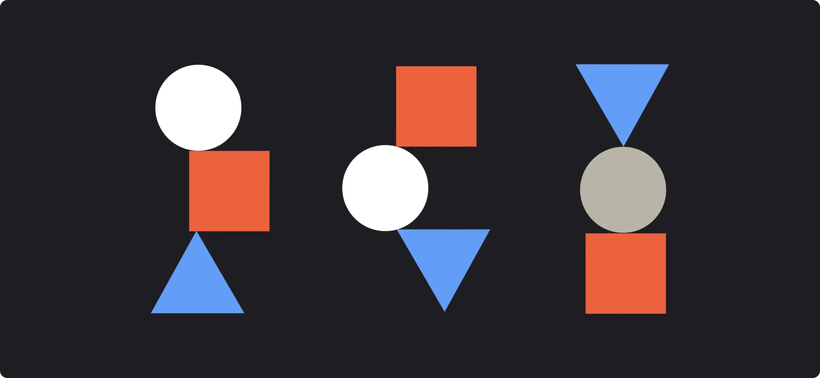
An identity for an identity, know your customer (KYC)
As a branding agency, we understand that identification and verification can be complex—how they work and what benefits they bring. That’s why we set out to create a brand that was the opposite of the typical ‘man in a hoodie’ tech identity. This brand needed to feel approachable, simple, and powerful. Our creative direction was built on disruptive simplicity—so simple even a baby could understand it. The concept was inspired by a universally understood idea: square pegs in square holes, round pegs in round holes. That clarity shaped everything. From the logo and visual identity to the communications strategy and tone of voice, our branding agency ensured simplicity was the thread tying everything together. It’s this kind of clarity and creativity that allows brands to cut through the noise and connect instantly.
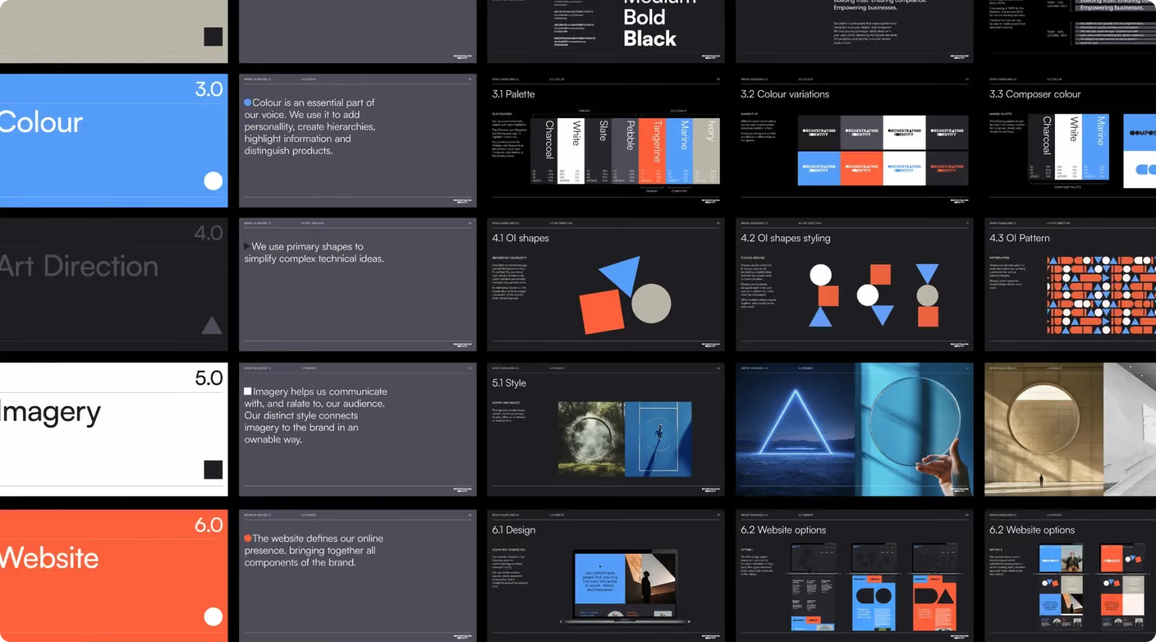
A brand with a split demographic, keeping things simple is where things are most productive.

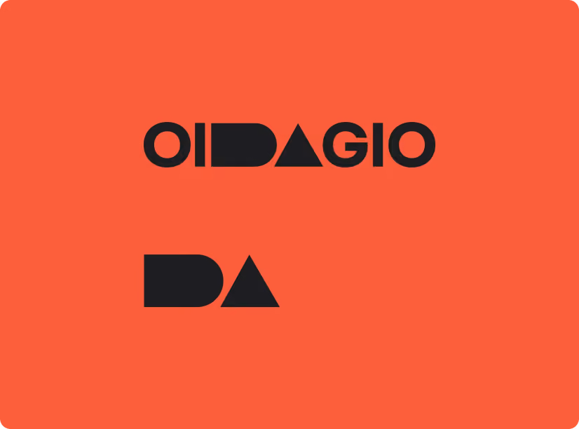
A split audience
COMPOSER
e-KYC solution provides seamless and secure identity verification, enabling you to onboard users quickly and confidently. With customisable workflows, real-time document validation, and tailored, robust identity checks
OIDAGIO
Age Assurance solution is designed to help protect vulnerable users and comply with age-related regulations effortlessly. Whether you need to verify the age of users for age-restricted content, services, or products, our platform provides accurate and reliable age validation. With advanced biometric checks, customisable PII retention periods, and a secure, user-friendly interface, we ensure that your business can confidently meet its legal obligations while protecting your users.
Project details
A strategy-led identity built around connection, clarity and purposeful collaboration.
1. Defining the proposition
Work began by understanding the consultancy's approach, audience and ambition. Workshops and strategic conversations helped uncover the central idea of orchestration—bringing together the right people, skills and perspectives to create something greater than the individual parts.
2. Creating a clear identity
The brand strategy translated this thinking into a simple and accessible proposition. Messaging focused on leadership, coordination and partnership, providing a clear distinction from traditional consultancies that concentrate solely on delivery.
3. Building a practical system
The resulting identity was designed to work consistently across presentations, proposals, digital platforms and communications. Every element was created to support everyday use while maintaining a coherent and recognisable presence.
Identity details
The visual identity balances structure with flexibility, reflecting the consultancy's role in bringing different elements together. A restrained colour palette, confident typography and clean layouts create a sense of clarity and authority, while graphic devices subtly reference rhythm, movement and connection without becoming overly literal. The tone of voice is direct, thoughtful and collaborative throughout.
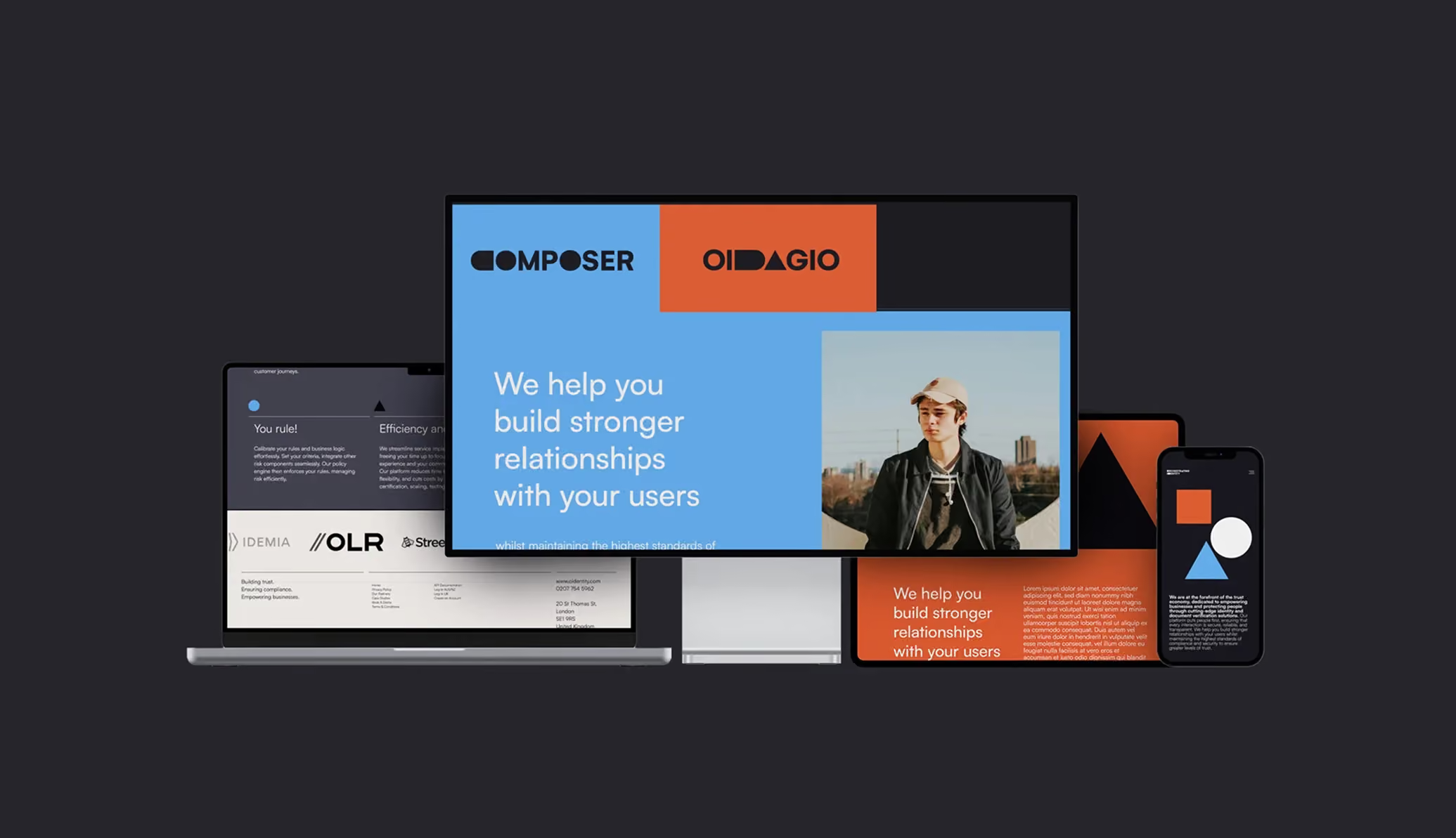
When a brand is based around simplicity, simple and easy to understand metaphors work very well, and using simple shapes of which young children use to understand suiting one thing based on another's form is beautiful, it also allows you to very easily create complex visuals to help demonstrate when things are complex.
The brand needed to feel simple, strong, confident, honest and approachable, especially as on the one hand CTO’s would be the ones purchasing the software, and on the other customers would be going through a system via the sales funnel via online and apps, therefore the brand needs to work with very different people.
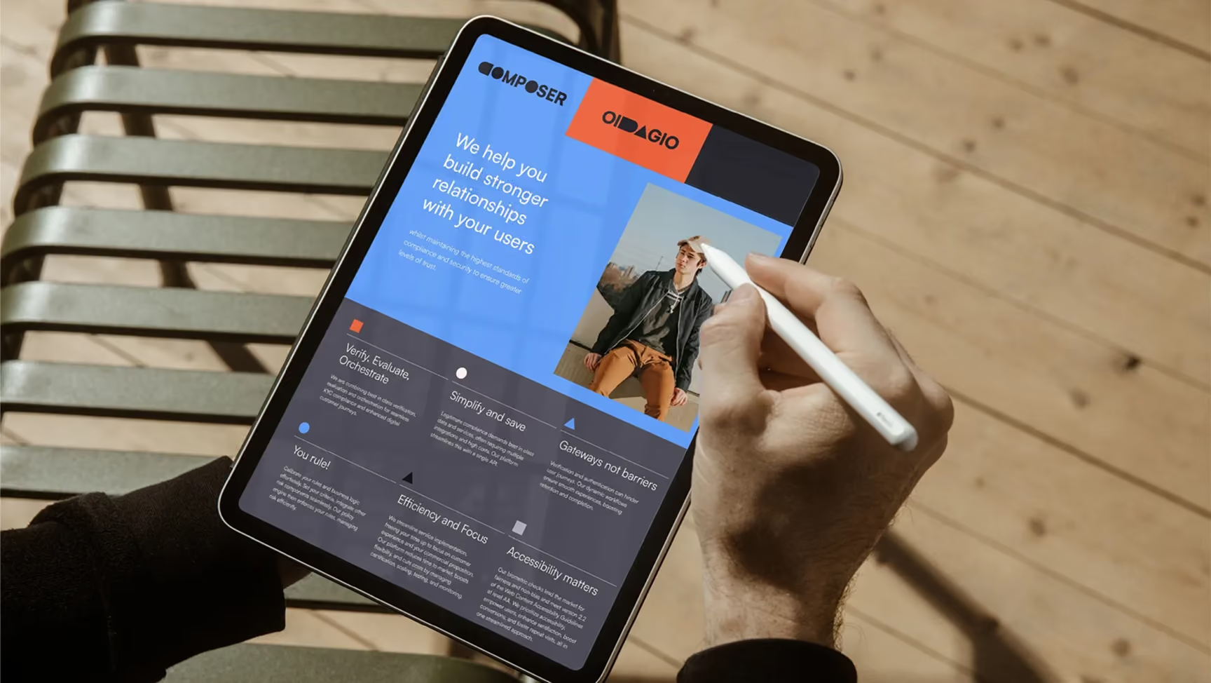

Result:
The final concept relies on a simple and pure idea that is easy to understand and recognised, cutting through the sea of predictable brands cluttering this space.
We love this brand simply because this is all about what is taken out, which applies to the proposition, i.e. extract all the confusion to find the simple honest answer. The braing and plyful colours and simplistic shapes have formed a pleasing and fun way to create new ideas and explore interesting expressions.


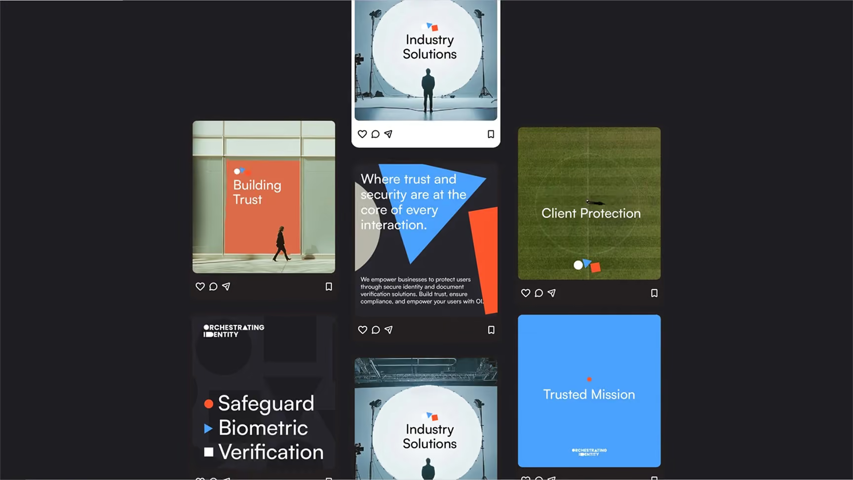
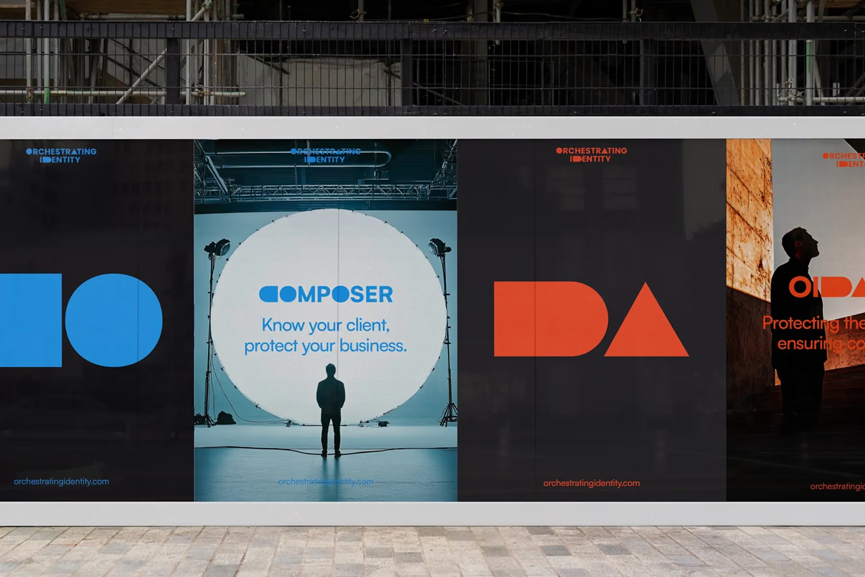
blah.blah
 DISCIPLINES

