Stassen Tea
A full Ceylon Tea rebrand and packaging system across 48 SKUs.
A Sri Lankan tea giant needed a brand and packaging refresh that could scale across a complex range, without losing the craft and calm that tea promises
Stassen Tea came to us with an open mind and a clear sense they needed support shaping their tomorrow. The brief covered brand strategy through to brand creation, packaging design across 48 SKUs, copywriting and final artwork, all delivered in 12 weeks. The main challenge was volume and complexity, multiple flavours, sub categories, and pack copy across every format. The expectation was simple, make it feel exciting, premium, and easy to shop.

Honouring a heritage built over generations, the new Stassen identity brings together the richness of Sri Lankan tea culture with a fresh, contemporary spirit. Through thoughtful design, vibrant storytelling and a renewed sense of quality, the brand transforms an extensive tea range into a unified experience that feels both premium and approachable. A celebration of craftsmanship, nature and tradition — reimagined for tea lovers around the world.
The project
A structured branding consultancy process, then a packaging system built for flavour clarity, shelf impact, and range discipline
1. Research and benchmarking
We started with sector research and benchmarking, then looked at demographic expectation and market gap. We reviewed typical consumer behaviour, pack environments, and the community and ritual around tea drinking. That groundwork gave the team and client a shared view of the opportunity and the competition.
2. Purpose and positioning
From purpose and positioning to brand story, we built the strategic logic behind every decision. That clarity mattered when the range got complex. It helped Stassen move quickly with confidence, and it gave the project a consistent thread from brand idea to pack architecture.
3. Three stage design
We followed our three stage design process to develop a modern, nature-led graphic language. Hand drawn logo marks and a pattern system created a distinctive ownable look, while flavour cues and illustration did the hard working communication job on shelf.
Identity details
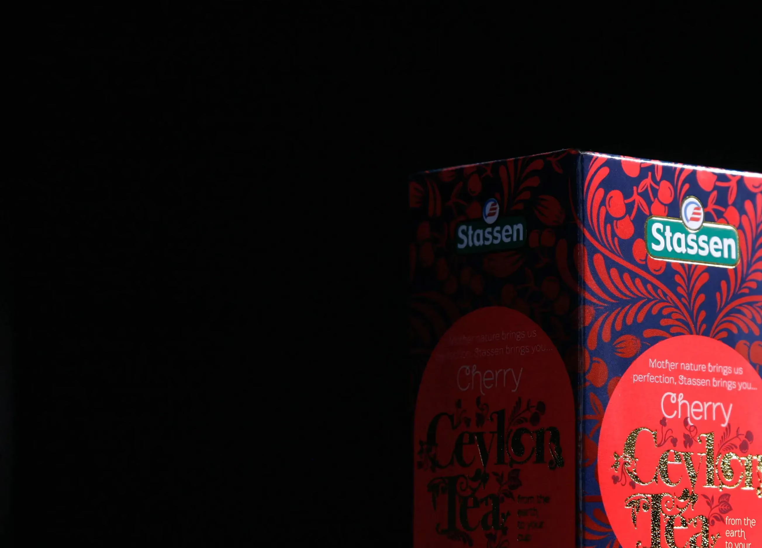
The identity centred on a modern interpretation of nature, built through a graphically pleasing pattern and multiple hand drawn logo marks. Each SKU used its own illustration, wrapping around the carton to create colour, warmth, and clear flavour cues. Tone of voice was calm and confident, with the copy line, “Mother nature brings us perfection, Stassen brings you…”, used as a consistent lead in across products. Finishing details included foils and die stamps to support a luxury feel.
Brand application
A packaging system that works hard on shelf, then rewards you when you open it
The brand came to life through the full packaging build, outer pack, inner, tea bag envelope, and tab. Illustration and pattern were designed to wrap accurately around the carton, with colour gradients and pattern alignment handled precisely in artwork. Inside the pack, brand messages were printed in a nod to the “last leaves left” style from older papers, adding a small moment of personality. It is the kind of detail a branding agency can obsess over, because it is where the brand gets remembered.
The result:
A bright, warm pack range that brings order to complexity, and raises the bar for how a modern Ceylon Tea range can look
The range feels friendly, premium, and contemporary, without losing the calm, nature-led cues people expect from tea. The system clearly defines between complex ranges and sub categories, which makes the brand easier to shop and easier to extend. It was intense work, but it proved the value of disciplined brand and pack architecture, and strong project management.
The project delivered a complete rebrand including strategy, brand creation, copywriting, and final artwork across 48 SKUs in a 12 week process. The output covered multiple pack components, outer, inner, envelope, and tab, with foils and die stamps specified to support a luxury finish. For a branding company, the scale was the test, and the system held.
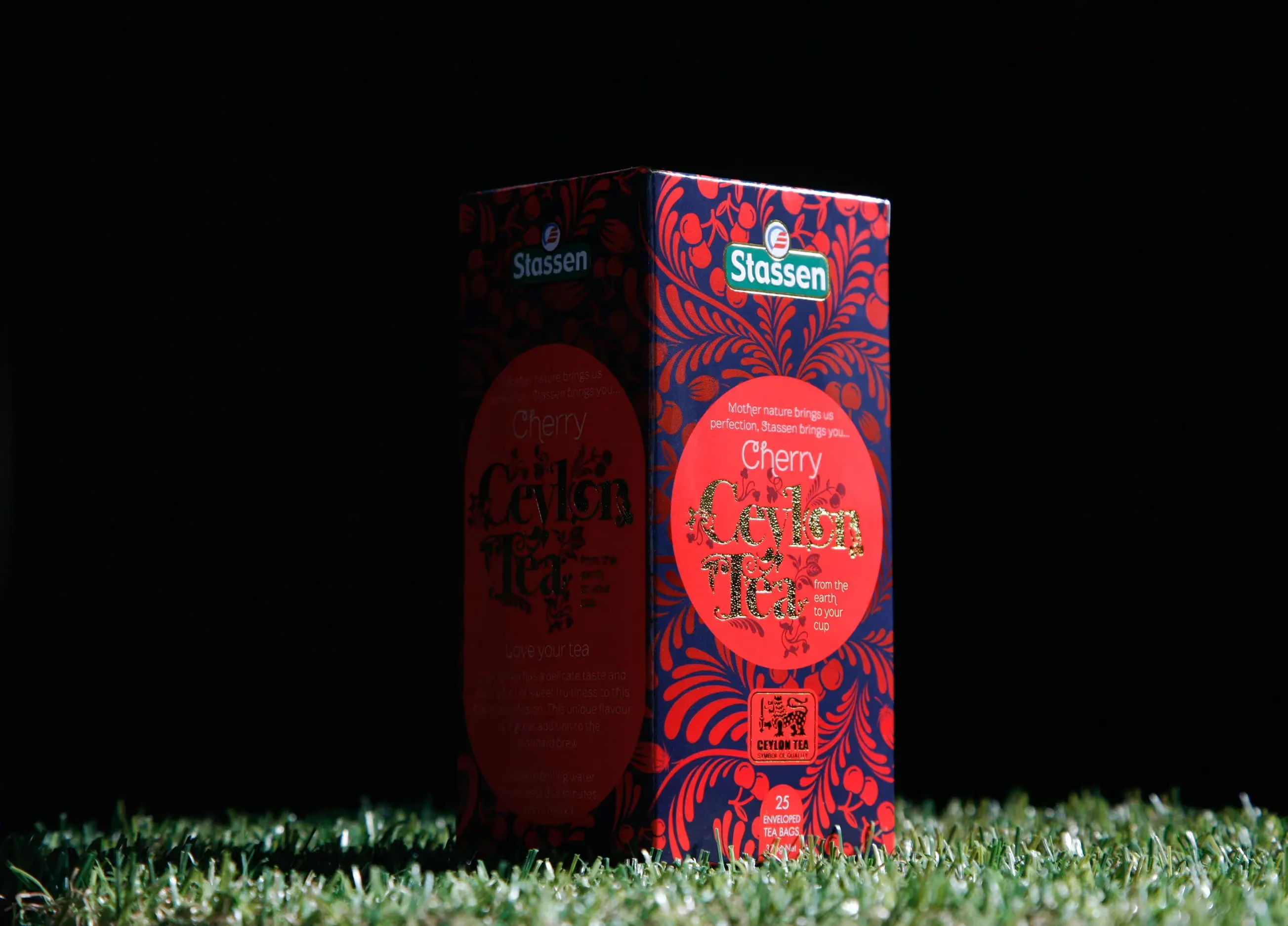
Delivered end to end, brand strategy through to brand creation, packaging design, copywriting and final artwork, completed in 12 weeks. The scope covered a full packaging suite including outer cartons, inner print, tea bag envelope and tab, with foil and die stamp finishes. Print artwork was built to ensure wrap accuracy, matching gradients and patterns across panels. The result is a structured pack architecture designed to support a versatile range, the kind of work you expect from a branding consultancy working at scale.
 DISCIPLINES
You might also like
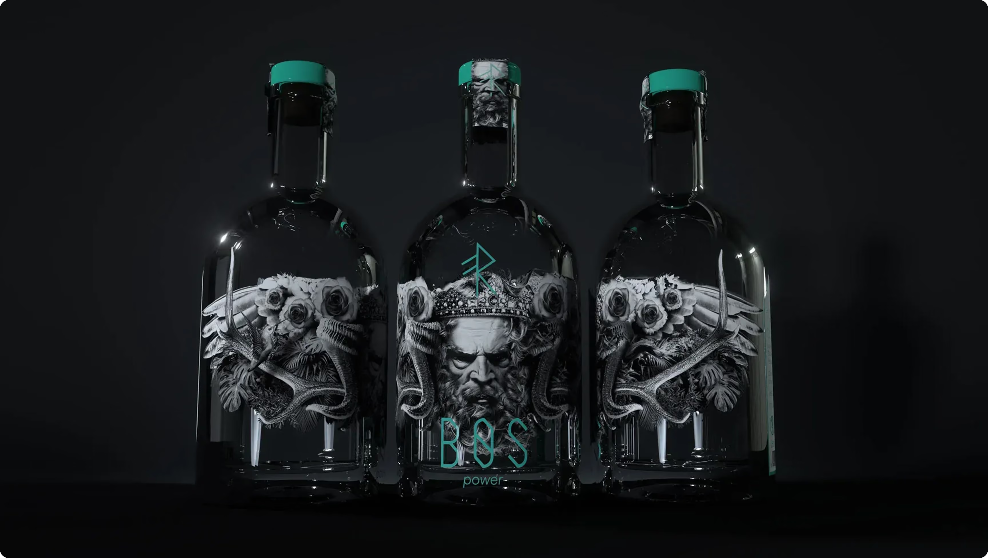

A brand concept for a dual-purpose wellness drinks range, designed to clearly distinguish products that energise by day and help unwind by night while maintaining a connected brand experience.
A brand concept for a dual-purpose wellness drinks range, designed to clearly distinguish products that energise by day and help unwind by night while maintaining a connected brand experience.