Kool Smoothie
A vibrant, ownable identity for a smoothie brand designed to stand out in a crowded FMCG market.
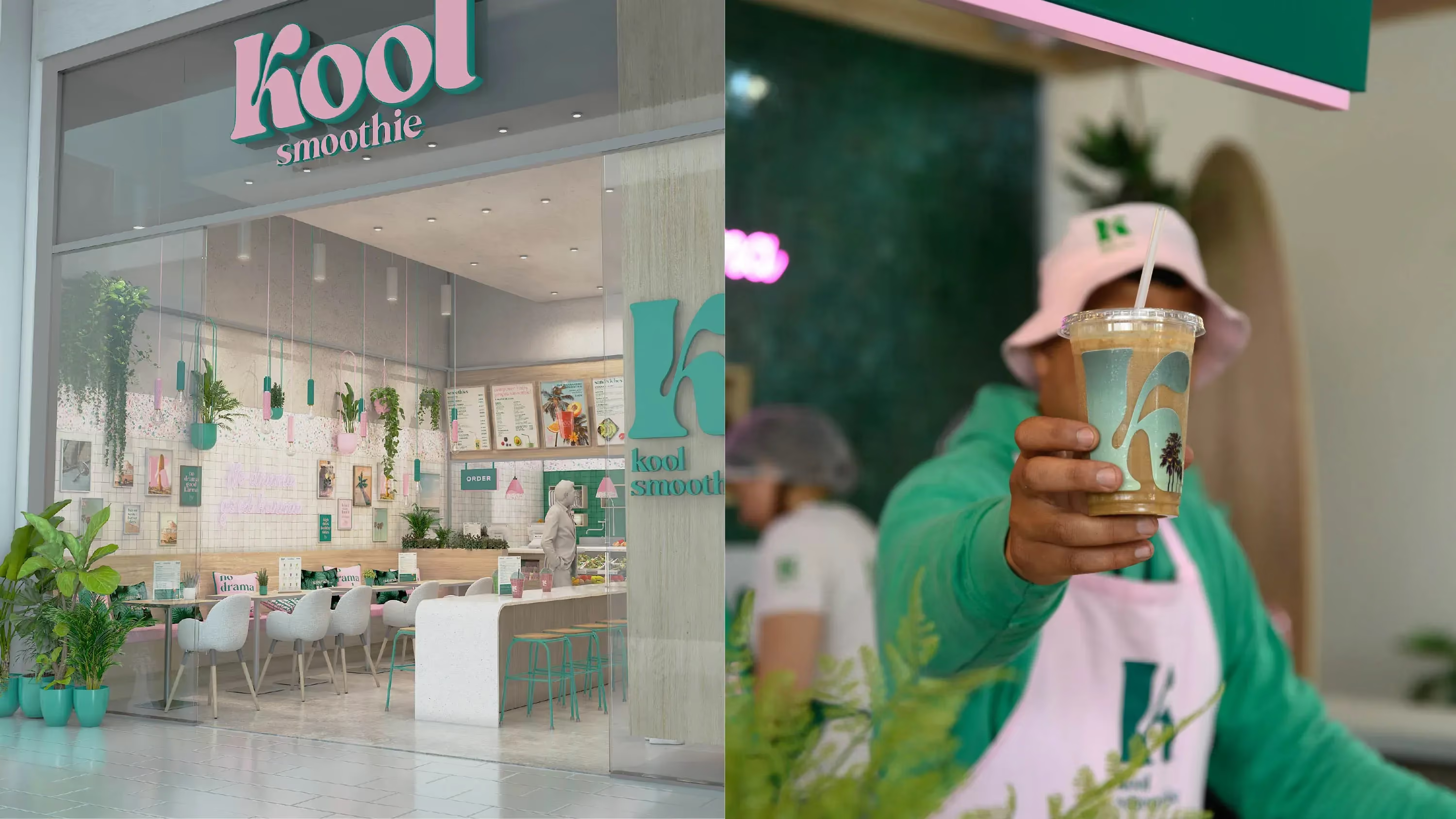
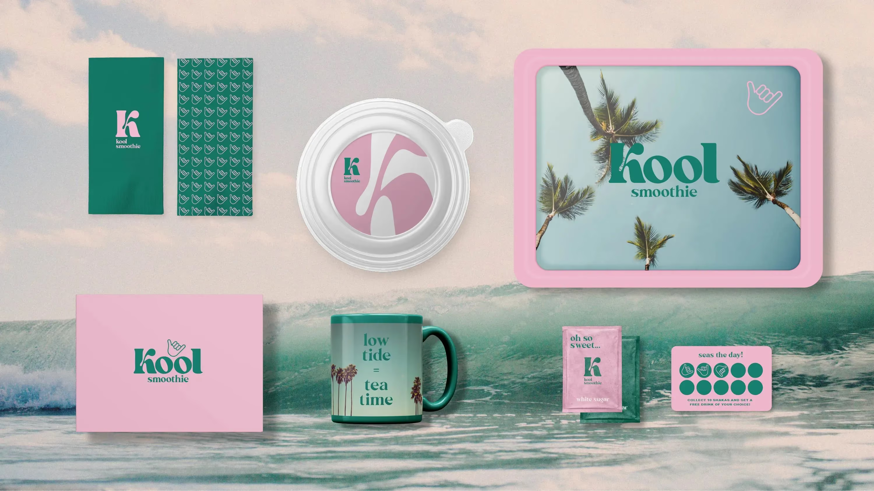
A playful identity system built around flavour, personality and bold simplicity.
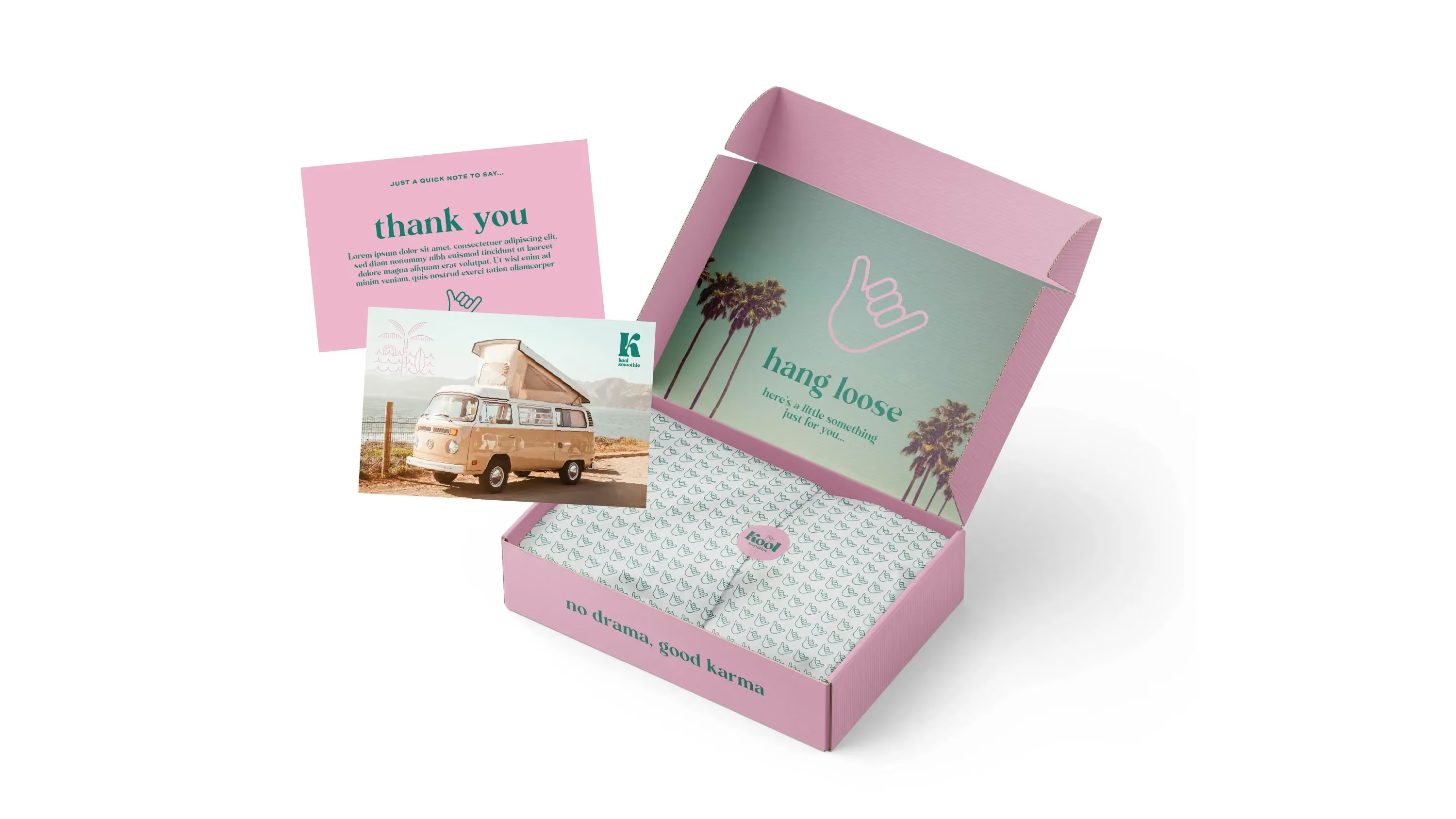
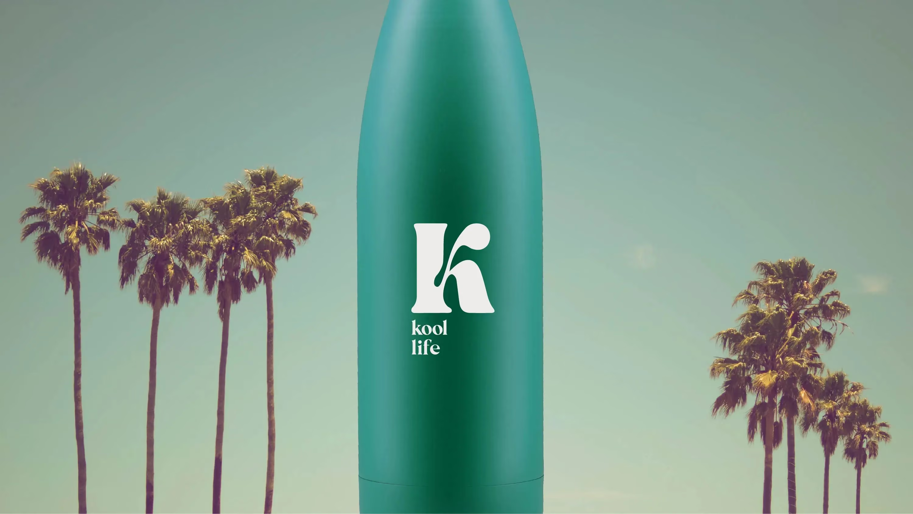
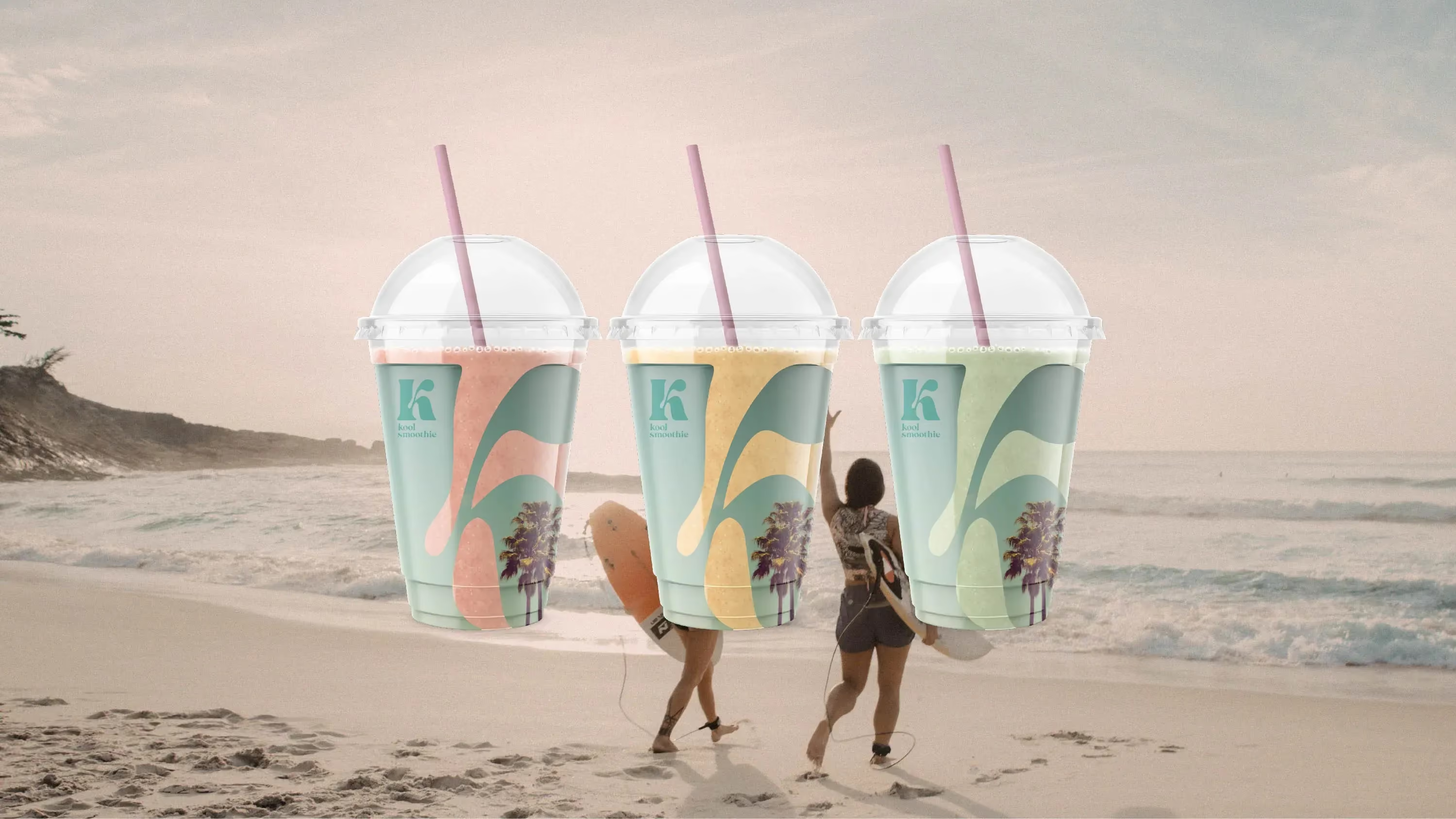
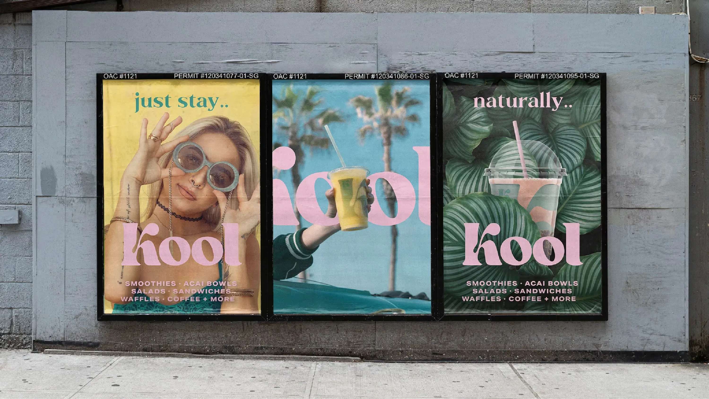
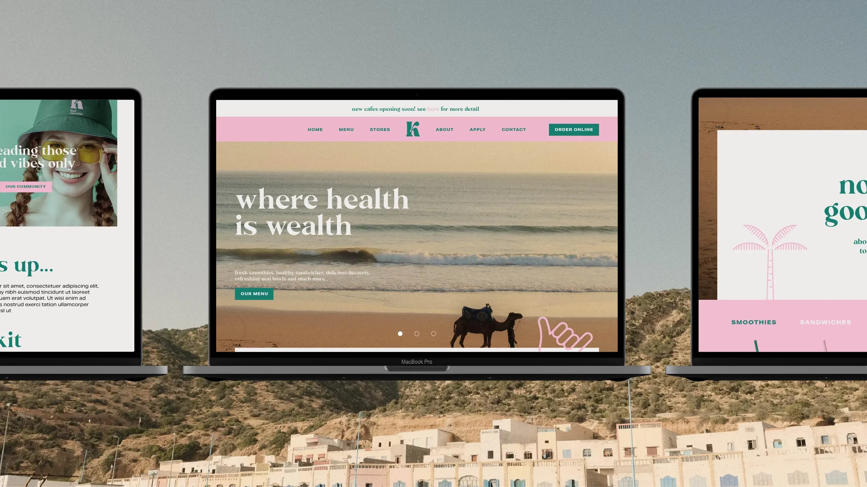
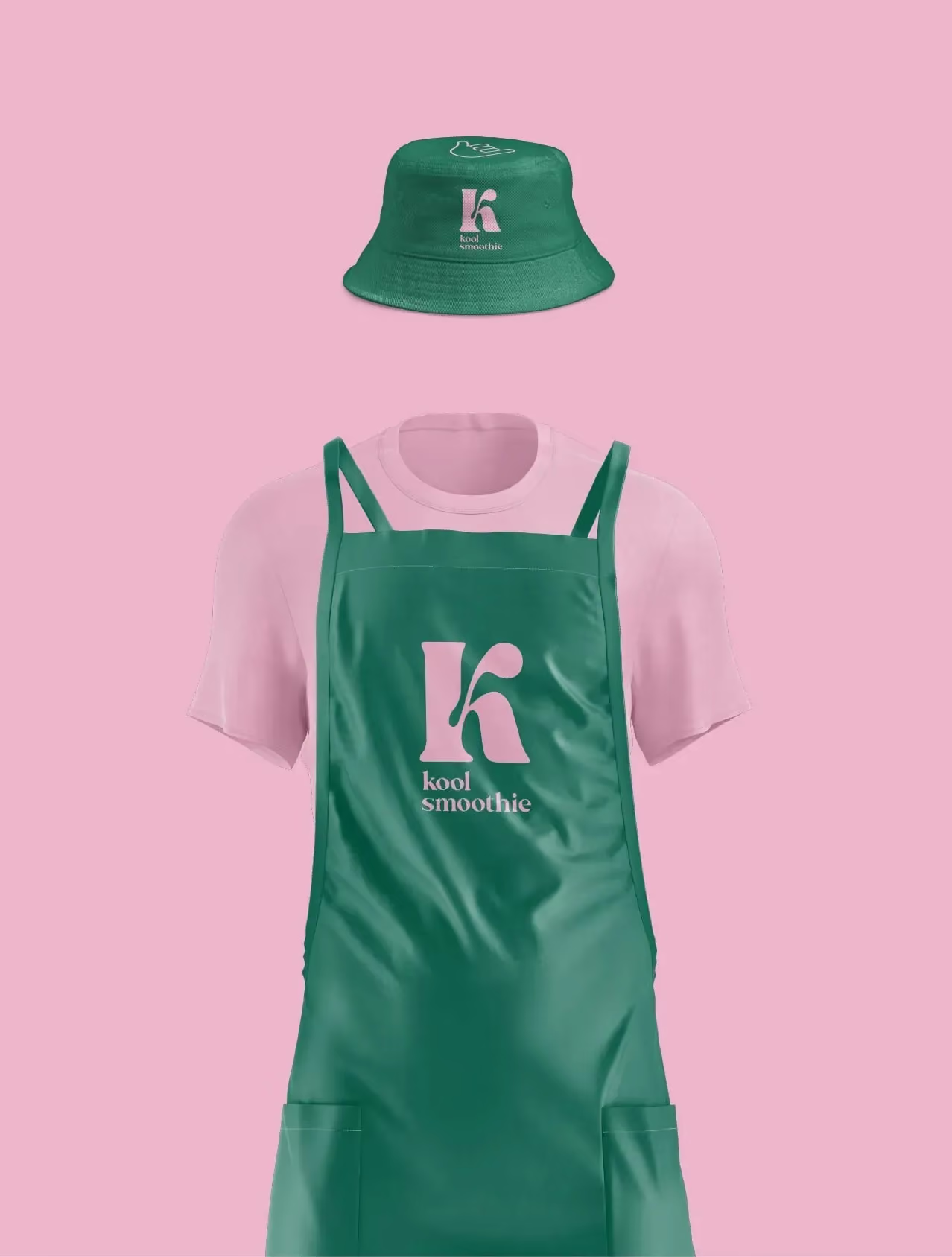
The system was applied across packaging, retail environments, communications and promotional materials, ensuring every touchpoint delivered the same confident brand experience. From individual bottles to point-of-sale displays and wider campaign assets, the identity maintains strong shelf impact while remaining easy to navigate across multiple flavours and product ranges.
Create a distinctive smoothie brand that could cut through a category dominated by health clichés and visual sameness.
The challenge
Kool Smoothie needed a brand that felt energetic, optimistic and memorable without relying on the familiar language of wellness or nutrition. The challenge was to create a visual identity that celebrated flavour and personality while working across a growing range of products, retail environments and consumer touchpoints. The brand needed to feel fresh, contemporary and instantly recognisable on shelf.
Project details
1. Finding the opportunity
Research highlighted a category saturated with predictable cues—green palettes, fruit photography and functional messaging. Rather than competing on health claims, the strategy shifted the focus towards enjoyment, colour and positivity, giving Kool Smoothie a more emotional point of difference.
2. Building a recognisable brand
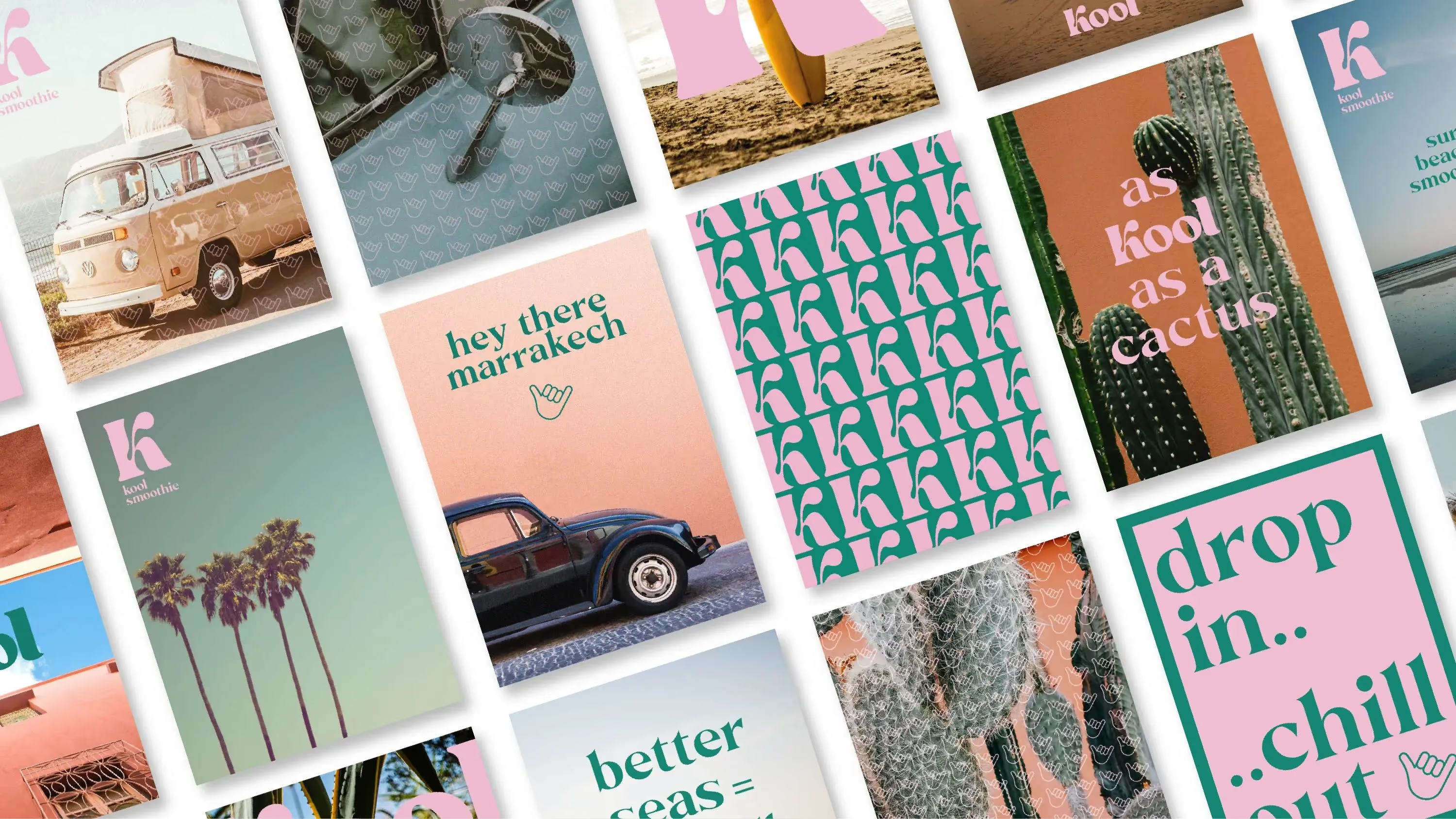
The identity was designed around a simple, flexible visual language that could adapt across different flavours and formats while remaining unmistakably Kool. Bright colour combinations, expressive typography and confident graphic elements created a system that felt energetic without becoming chaotic.
3. Designed for growth
Every element of the brand was developed with scalability in mind, allowing new products and future extensions to slot naturally into the identity without diluting recognition or consistency.
Identity details
The visual identity uses bold typography, vibrant colour and playful graphic compositions to communicate freshness and flavour rather than relying on literal fruit imagery. The system balances simplicity with energy, allowing each flavour to have its own personality while remaining clearly part of the same family. Messaging is optimistic, approachable and designed to be understood at a glance.
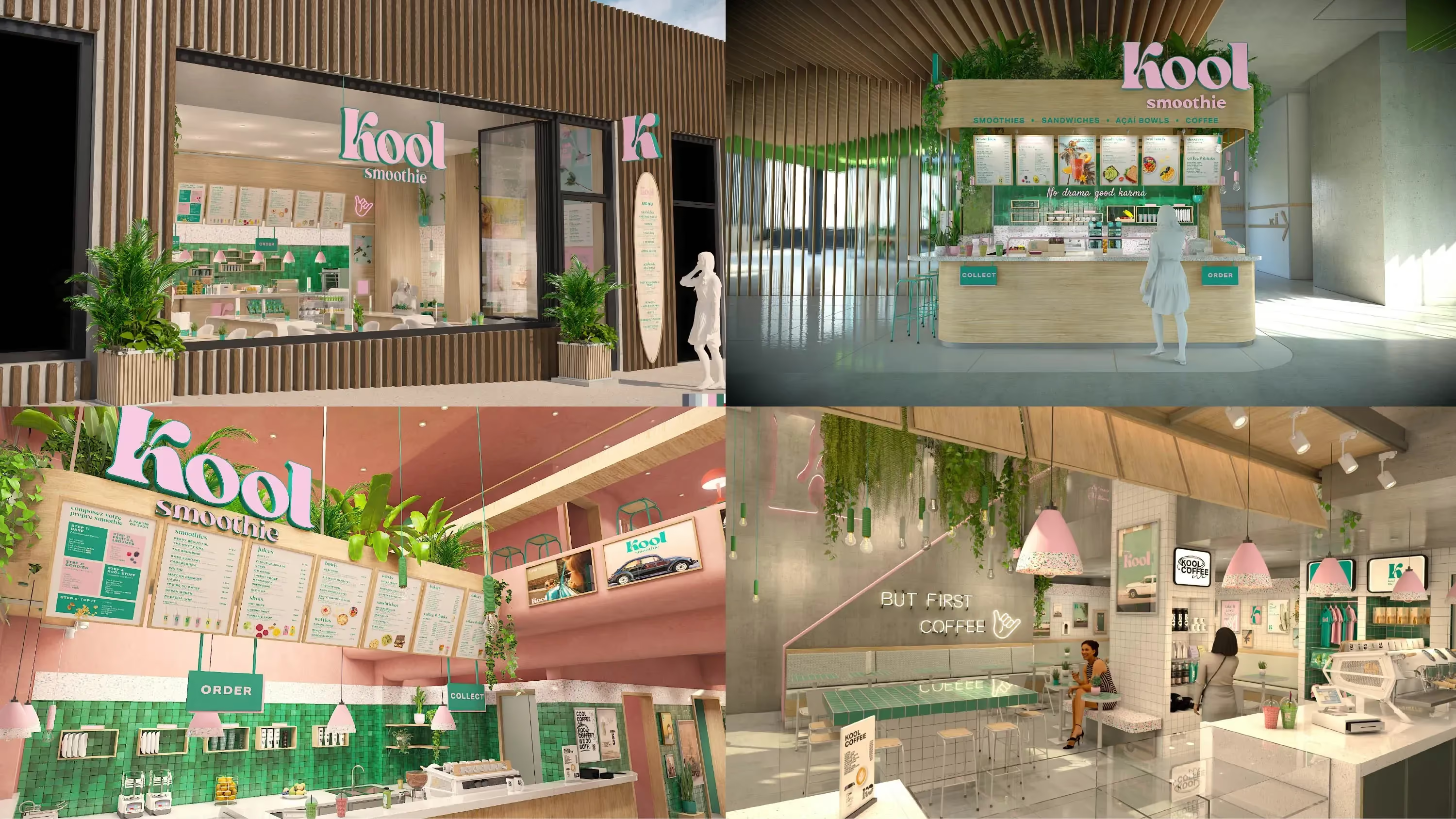
The project focused on creating a brand that could compete through clarity, personality and consistency rather than category conventions. By developing a scalable identity system and applying it across packaging, retail and communications, Kool Smoothie gained a flexible platform capable of supporting future growth while remaining instantly recognisable on shelf.
The Result:
A distinctive smoothie brand built to stand out through personality rather than convention.
Kool Smoothie moved away from the visual clichés of the health drinks category to establish a brighter, more engaging identity centred on flavour and optimism. The brand feels more contemporary, approachable and memorable, creating stronger recognition across both packaging and retail environments.
The flexible identity system supports future product launches and brand expansion without sacrificing consistency. Its simple visual rules allow the range to grow naturally while maintaining a strong and recognisable presence wherever it appears.


More than a visual refresh, the project established a flexible brand system designed to evolve over time. Every element works together to create a distinctive presence that feels confident, approachable and unmistakably Kool, whatever the format or occasion.
 DISCIPLINES