Diddy bites
Branding and packaging for a playful baby snack brand parents trust.
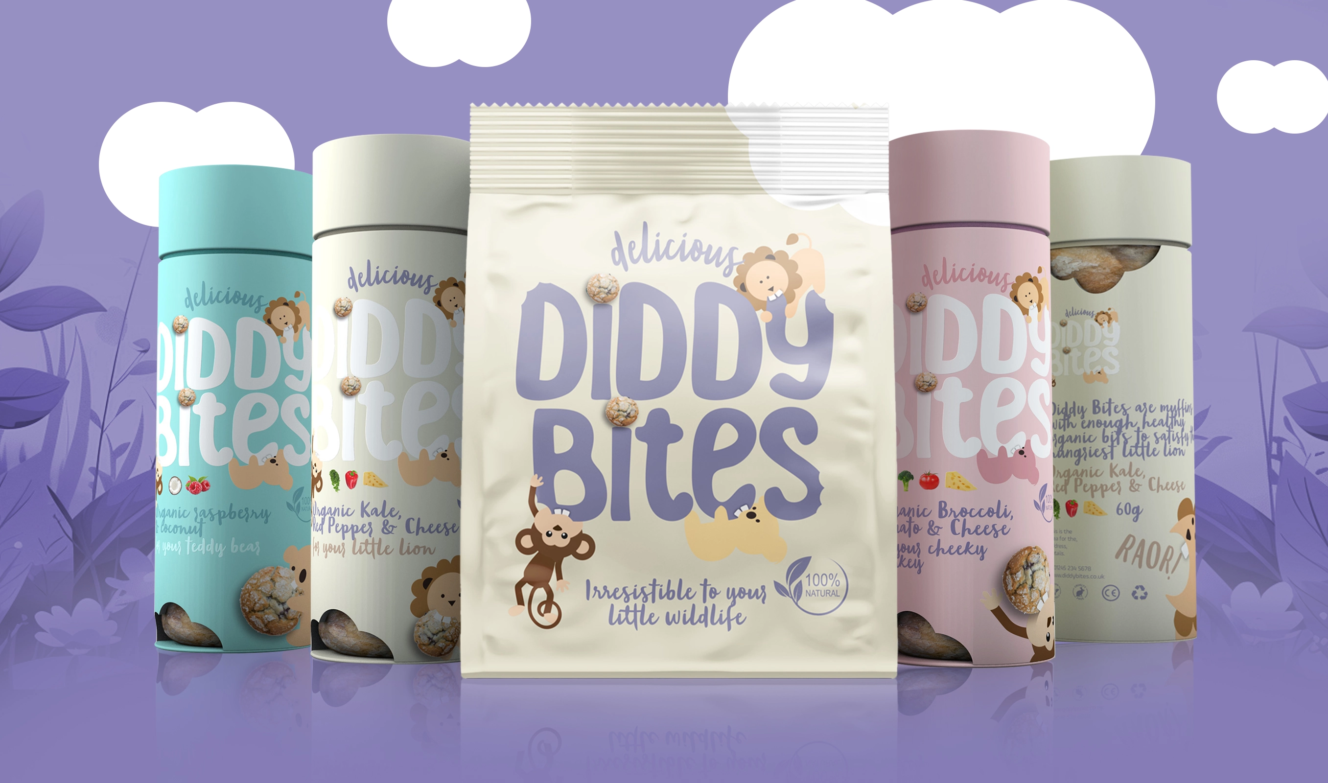
Diddy Bites needed a brand and packaging system that could hold two truths at once, childhood fun and parental confidence. The challenge was to build a wholesome, playful world that still read as credible in a category shaped by health, transparency, and sustainability expectations. The brand had to stand out, feel easy for busy parents, and make snack time feel like a small moment of joy.
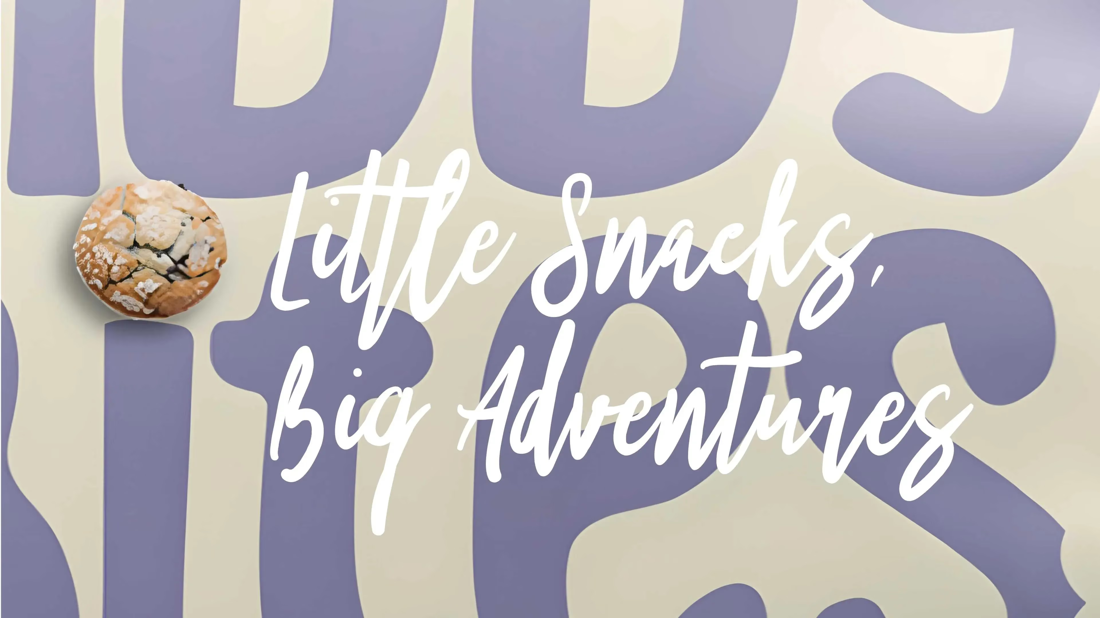
A brand world built around ‘little wildlife’, balancing imagination with clarity and trust at every touchpoint


Project details
1. Brand idea and voice
We anchored the brand around a simple promise, wholesome snacks that feel irresistible to your little wildlife. The tone stays light and warm, with a parent-friendly clarity that keeps the product message straightforward.
2. Packaging as reassurance
The packaging needed to work hard in a quick decision moment. Playful cues bring the joy, while clear information design supports trust, helping parents feel confident about what they are picking up.
3. Designed for real life
We built a system that feels convenient and easy to live with, because the audience is busy. The result is a brand that reads fast, feels friendly, and still carries a sense of care.
Identity details
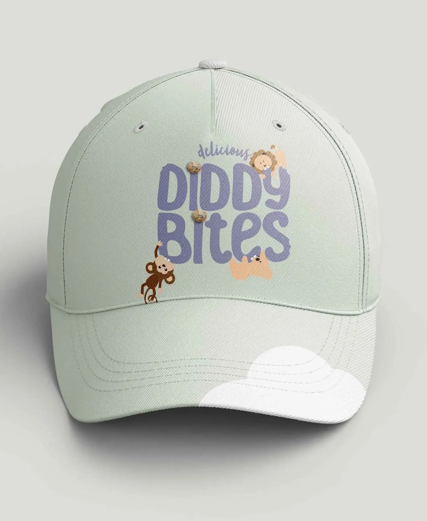
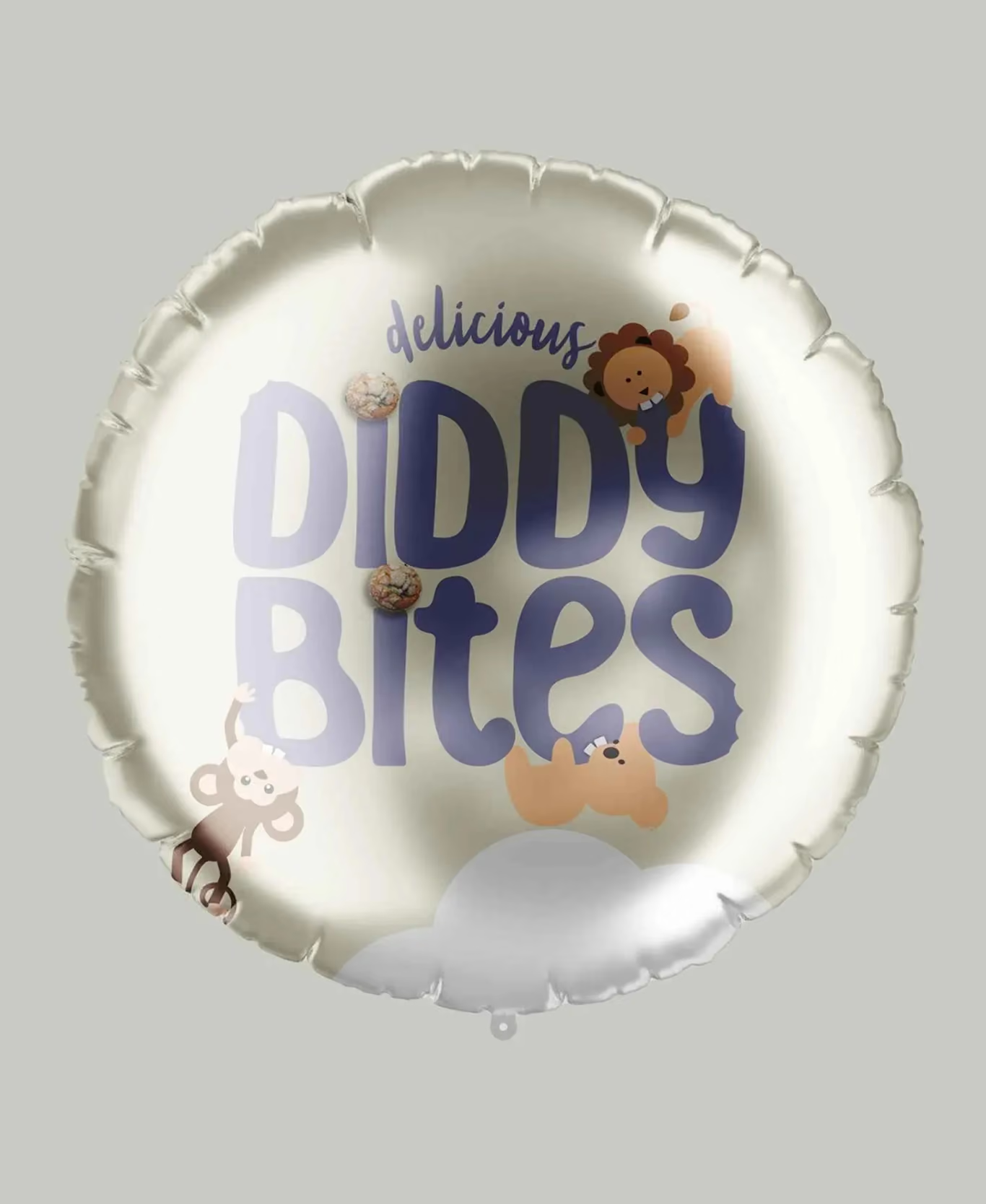
The identity pairs a friendly, playful typographic voice with a clear hierarchy for product information. Colour is bright and optimistic, used to signal flavour and add shelf energy without tipping into chaos. Photography and illustration lean into joyful, childlike imagination, with finishing details that feel considered rather than noisy. The tone of voice stays warm, simple, and parent-aware, with ‘little wildlife’ as the consistent thread.
Brand application
Packaging that earns attention, then earns trust, built for snack time realities
The brand came to life through packaging design that balances delight with reassurance. Bold, playful cues create standout and bring the ‘little wildlife’ idea into a world kids respond to. Clear messaging supports the parent decision, keeping the nutritional story easy to understand and the product range easy to shop. The system was designed to scale across flavours while staying consistent, giving Diddy Bites a recognisable presence and a confident, wholesome feel.

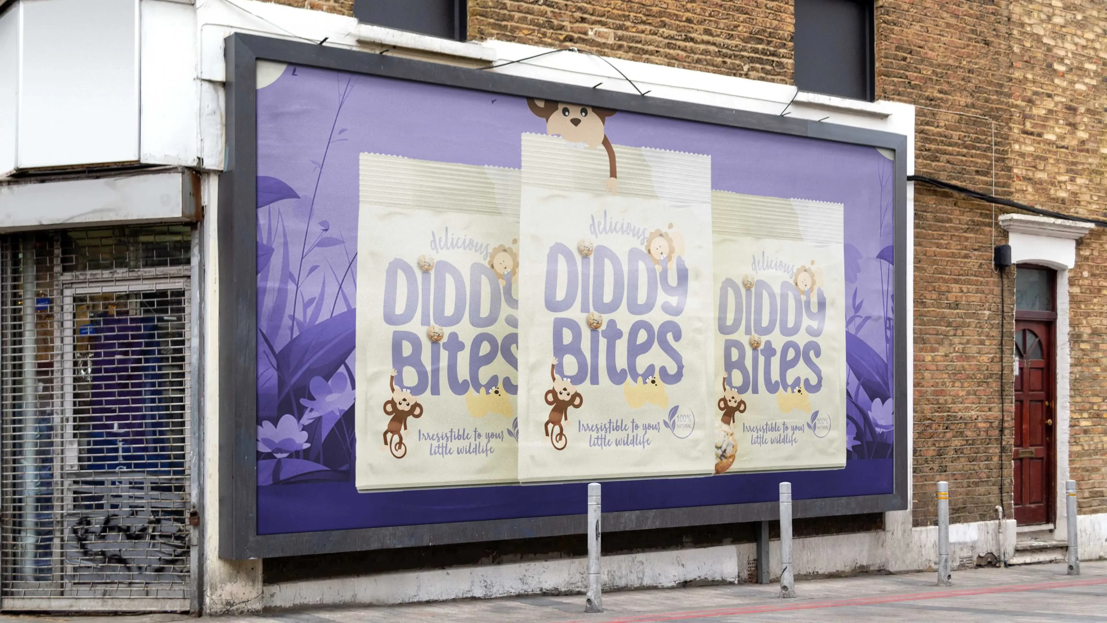
The result:
A wholesome, playful baby food brand with a clear point of view, and packaging designed to feel irresistible without losing credibility
Diddy Bites now has a defined brand idea, a consistent voice, and a packaging system that holds both sides of the category brief, fun for kids and reassurance for parents. The work positions the brand as a thoughtful choice, not just a cute one, which is where many new entrants struggle.
The brand is set up to compete in a market shaped by demand for healthier, transparent, and sustainable food choices. With 100% natural ingredients and an easy-to-shop range structure, the packaging supports faster recognition across flavours and clearer decision-making for busy parents.

Delivered as a full brand creation and packaging design project, built to support a growing product range. We developed the core brand idea, tone of voice, and packaging system so Diddy Bites could show up consistently wherever parents discover and buy. As a branding agency and branding consultancy, our focus was on clarity, character, and credibility, the three things that turn a new brand into a trusted choice. The result is a brand platform and packaging toolkit designed for everyday use and repeat purchase.
 DISCIPLINES
You might also like

A brand concept for a dual-purpose wellness drinks range, designed to clearly distinguish products that energise by day and help unwind by night while maintaining a connected brand experience.
A brand concept for a dual-purpose wellness drinks range, designed to clearly distinguish products that energise by day and help unwind by night while maintaining a connected brand experience.