Labgrown diamonds
Brand, packaging, retail and e-commerce for a lab grown diamond offer.
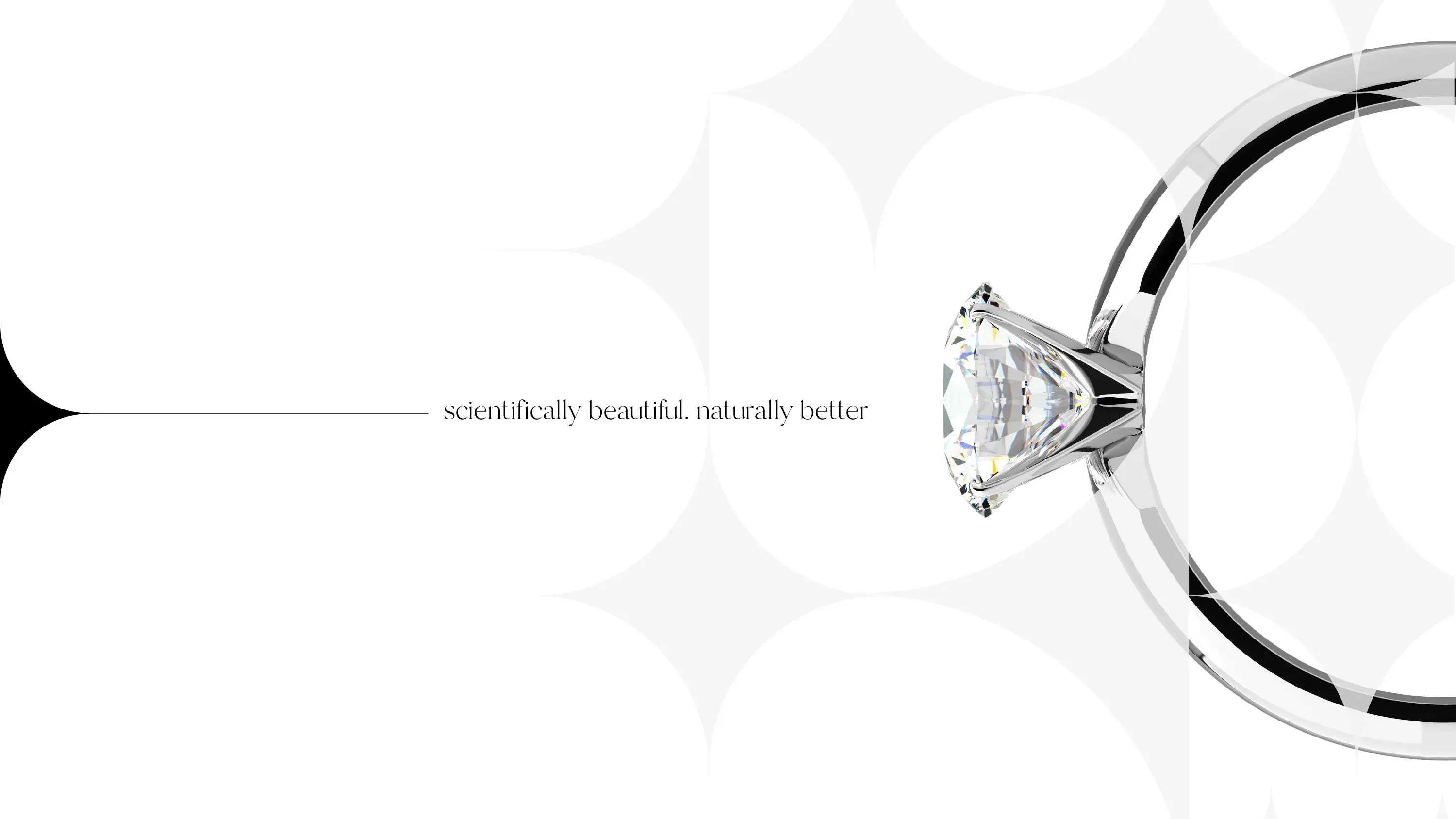
A brand idea rooted in attraction and connection, expressed through a clean, controlled design system
Build a premium diamond brand that feels emotionally true, not synthetic, across packaging, retail, and digital. Labgrown Diamonds needed a complete brand system for a fast-growing category, without borrowing cues from traditional jewellers.
Our mission: to build a premium diamond brand that feels emotionally true, not synthetic, across packaging, retail, and digital.


The Challenge
The challenge was to communicate high quality and modern technology while keeping the emotional weight people expect when buying a diamond.
The work had to live everywhere, from packaging and point of sale through to a full e-commerce experience, social presence, and email communications, all with a clear, consistent point of view.
Project details
1. Positioning and story
We positioned the brand around the natural laws of attraction, echoing how carbon bonds to form diamonds. It gave Labgrown Diamonds a human way to speak about technology, without over-explaining it. The result felt timeless, romantic, and credible, which is what people want when they are buying a symbol of commitment.
2. Symbol and device
The symbol represents two parts coming together, made for each other, and the radiance those moments bring into people’s lives. It works as a mark and as a graphic device, giving the brand a recognisable structure across packaging, retail, and digital. Simple shapes, used with restraint, did the heavy lifting.
3. System across channels
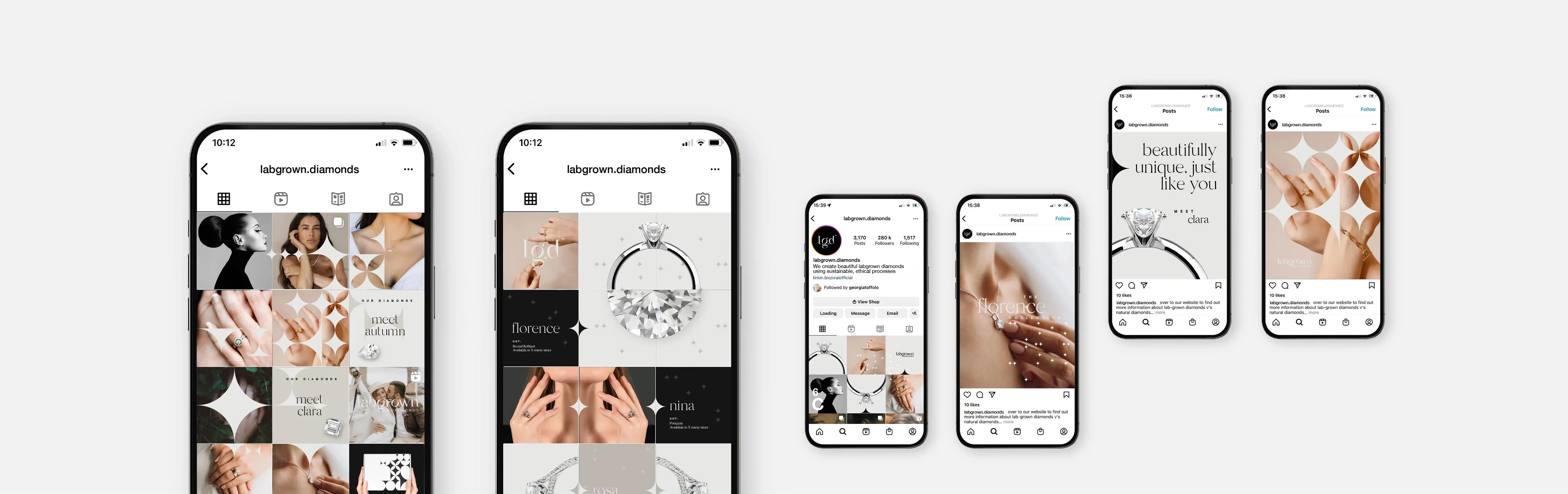
As a branding agency and branding consultancy, we built a system designed to perform in the real world, not just in guidelines. Clean layouts, consistent photography direction, and modular templates meant the brand could scale across point of sale, posters, e-commerce, and email comms, while staying unmistakably Labgrown Diamonds.
Identity details
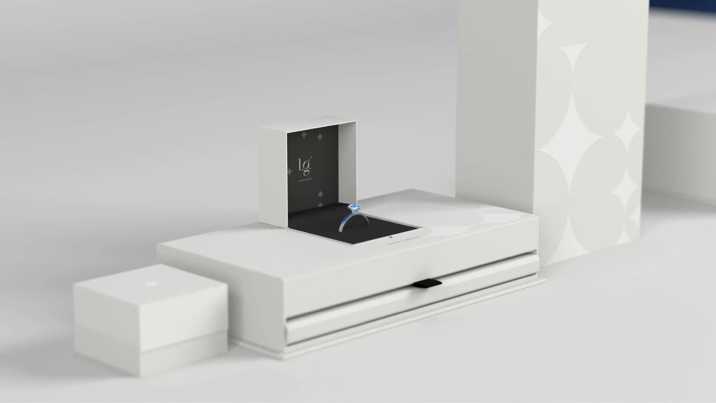
The identity lives in black and white, kept intentionally minimal so the product can shine. The packaging uses white foils on a matte substrate, paired with a black inner to frame the stones and heighten the reveal. Photography is monochrome and controlled. Layouts are clean and modular, built around the radiance shape as a repeatable grid device. Product naming draws from famous and successful women from history, celebrating feminine influence with quiet confidence.
From an understated outer box to a high-impact reveal, then carried through retail and online
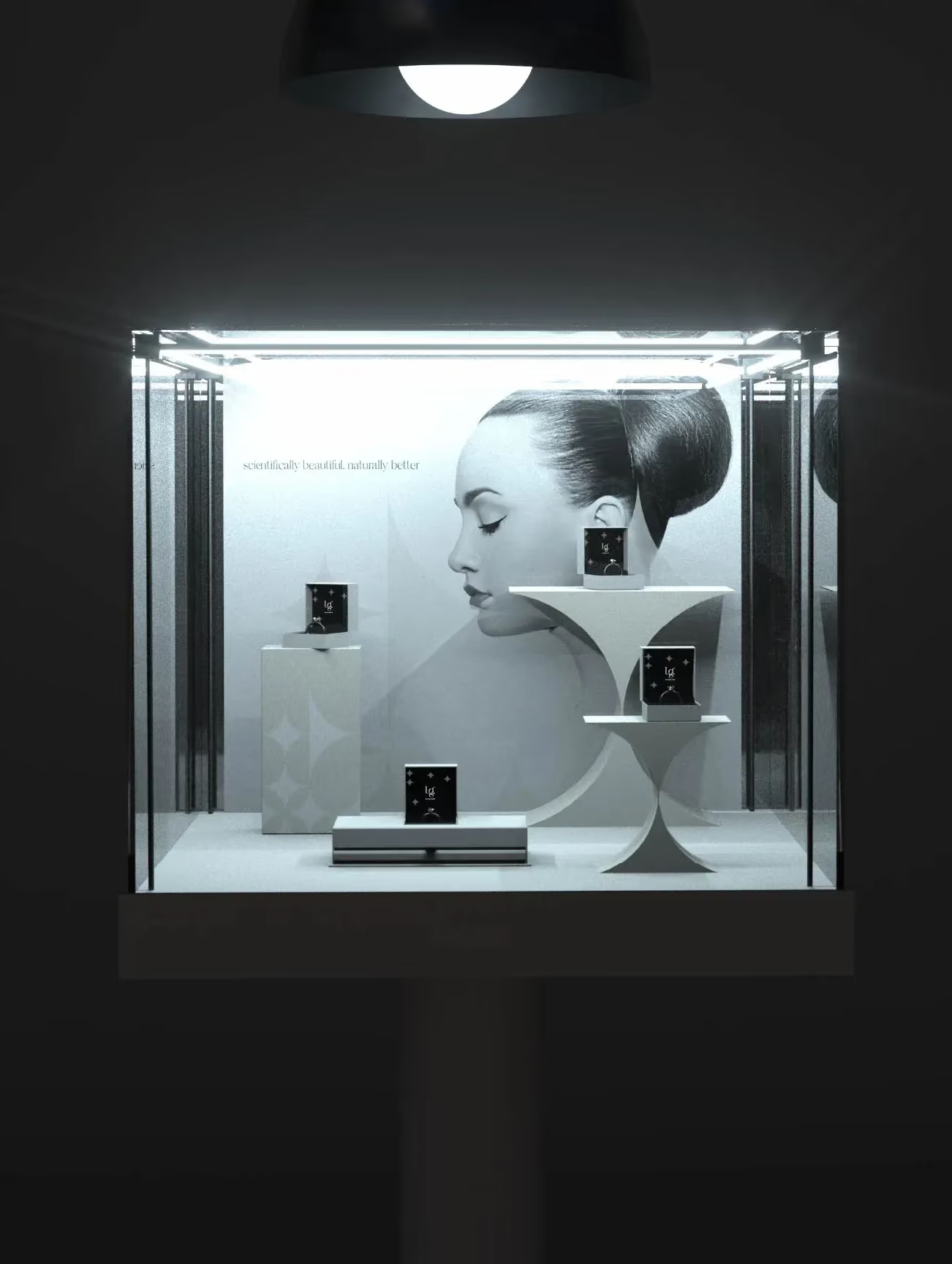
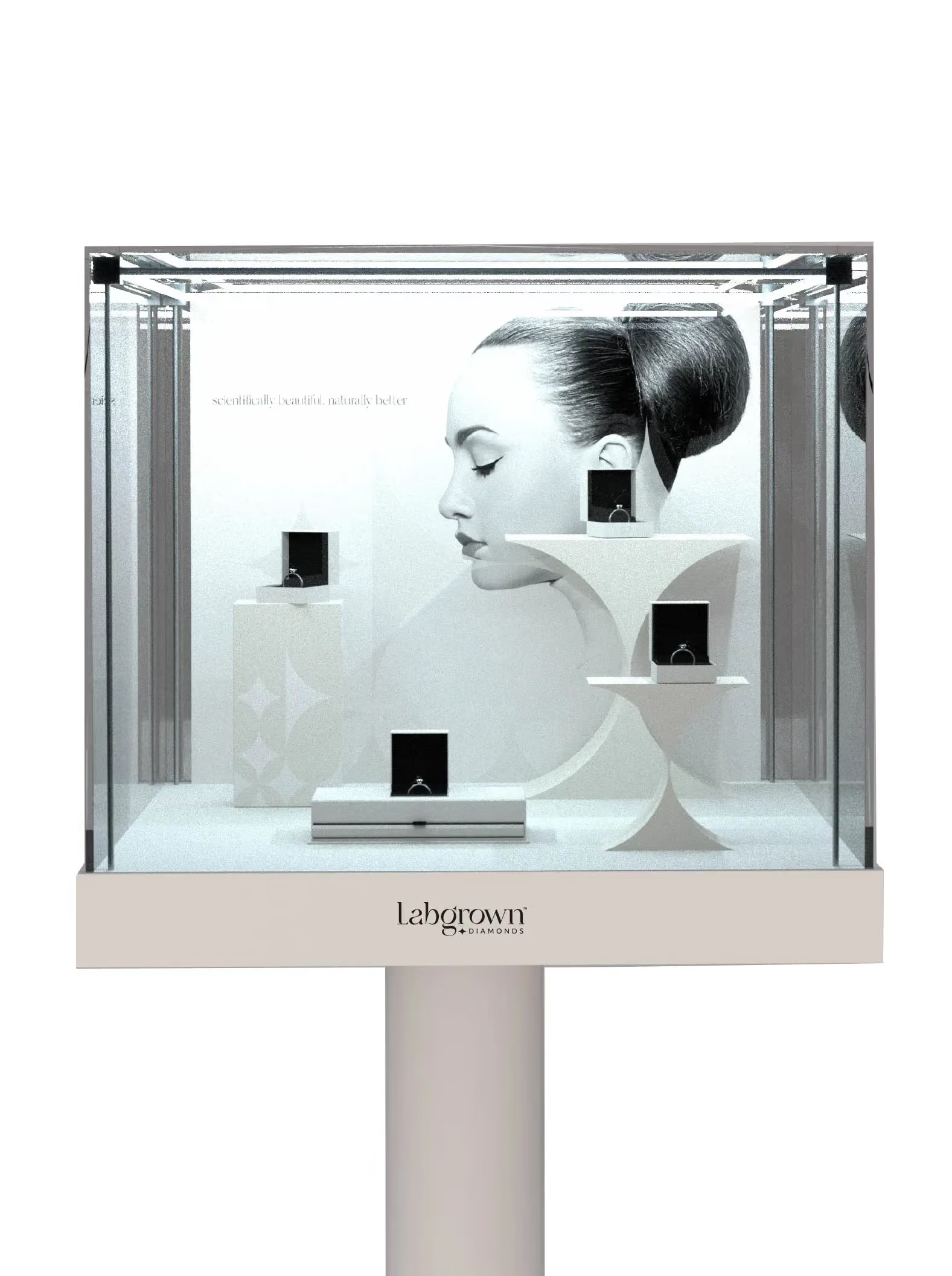
Packaging led the experience, with a clean exterior and a darker interior that sets off the sparkle. In-store point of sale followed the same logic, white-led layouts, black and white photography, and a modular display system that could be reconfigured for promotions without losing brand consistency. Digitally, we designed the full e-commerce website across desktop, tablet, and mobile, mapping the front end through the sales funnel and into re-engagement email comms. We also supported setup for social media reach, keeping the look and tone aligned.


The result
A premium, modern brand world that makes lab grown feel desirable, considered, and gift-worthy
Labgrown Diamonds launched with a coherent brand system that holds up across packaging, retail, and digital. The attraction-based positioning gave the brand an emotional centre, while the monochrome design language kept it sharp and confident. As a branding company, we focused on creating a repeatable system, so the brand can evolve its offers and promotions without reinventing itself each time.
The project delivered a complete set of working touchpoints, including branded packaging, point of sale assets, an e-commerce website design across devices, and email communications for re-engagement. Social media setup was aligned to the same system, supporting consistent content and recognition across channels.

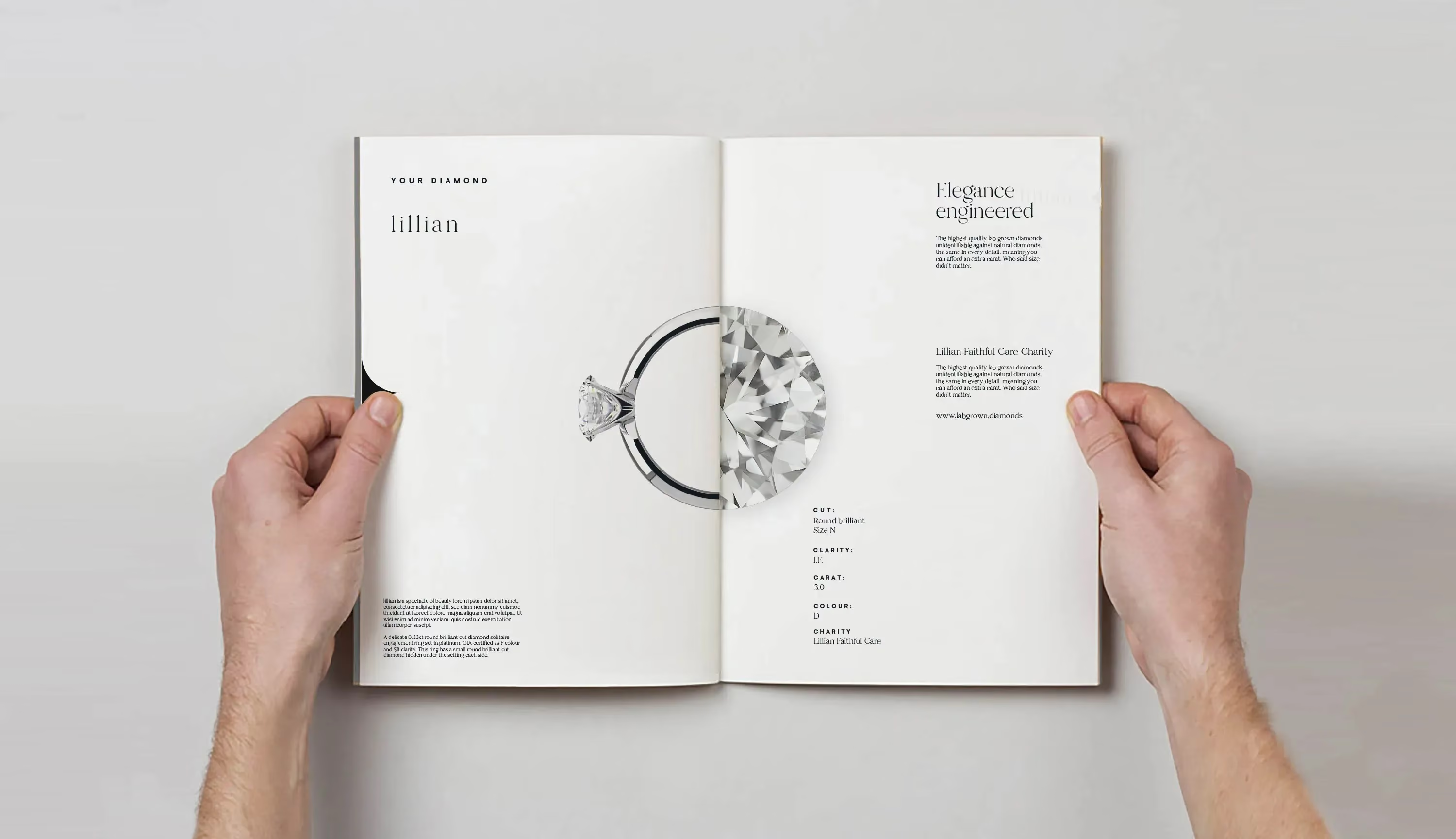

The work covered brand research and brand strategy through to branding design, packaging design, digital design, point of sale design, and communications. The e-commerce site was designed end-to-end, from front end pages through the sales funnel and into re-engagement email comms, with responsive layouts for desktop, tablet, and mobile. In retail, the modular point of sale system allowed display cabinets and posters to be refreshed regularly using the radiance device, keeping the brand consistent while supporting changing promotions.
 DISCIPLINES
