Sharjah 24
A brand for a news channel based on time and light.


Build a simple, instantly recognisable identity for a government backed contact centre, designed for everyone in Sharjah
Sharjah Contact Centre needed a brand that felt official, approachable, and easy to understand at a glance. Operating under the Sharjah Government Media Bureau, it supports the public with information on events and activities across the emirate, from Sharjah city to Al Hamriyah, Dibba Al Hisn, Khorfakkan, Kalba, and Al Dhaid. The brief was clarity first. No clever naming. No ambiguity. A branding consultancy approach, delivered at pace in four weeks.

A simple visual language built around conversation cues, then tightened into a system teams could use every day.
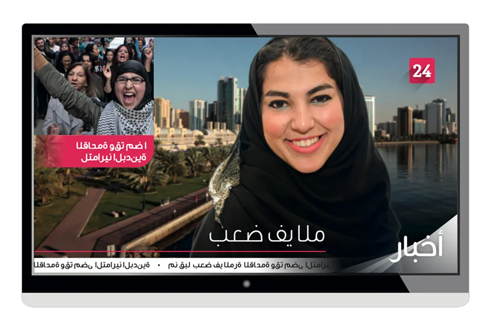

Clarity led naming
Clarity led naming
The name was kept purely functional to avoid confusion and to work across a broad demographic. We supported this with a direct line, Happy to help, giving the brand a human tone without losing the authority expected from a government service.
Recognisable core shapes
Recognisable core shapes
The identity leans into universal symbols of communication, speech bubbles and quotation marks. These shapes act as a consistent container for messaging, making the brand easy to spot and easy to apply across formats.
Arabic first expression
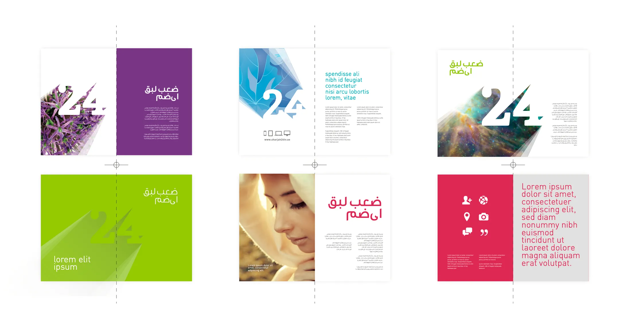
Arabic type was overlaid onto the shapes to create a confident, local expression that still reads quickly. The result is a mark and layout approach that stays legible, even when scaled down or used in busy information contexts.
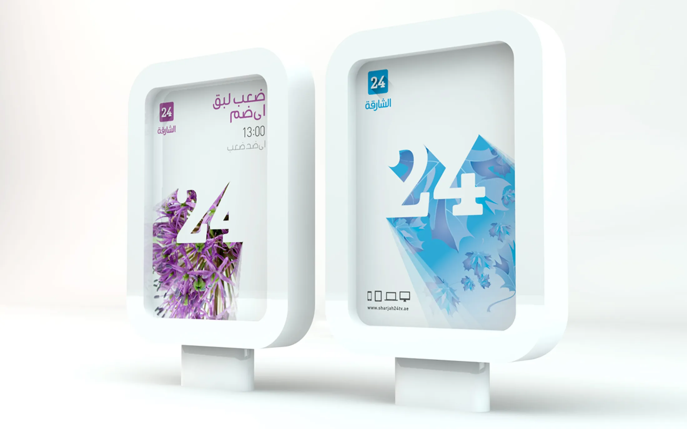
The system centres on bold speech bubble and quotation mark shapes, used as repeatable brand devices. Arabic typography sits over the forms, creating a clear hierarchy and a distinctive signature. Layouts follow a simple grid to keep information tidy and fast to scan. The tone of voice stays direct and service led, anchored by Happy to help. Finishing details focus on clarity, consistent spacing, and predictable placement rules so the brand holds together across everyday use.
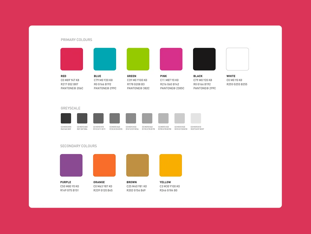
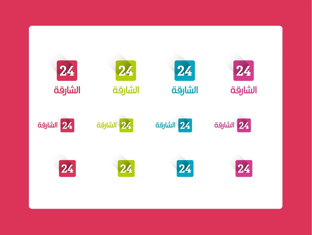
The result:
A clear, recognisable identity that matches the role, public service communication that feels official, calm, and human
The Sharjah Contact Centre brand now reads as a single, dependable service, rather than a collection of messages. The visual language is easy to recognise and simple to repeat, which matters when the audience is everyone. It supports an emirate that cares, with a tone that feels helpful without trying too hard. As a branding company, we focused on usability, so the identity works day to day, not just in a presentation.
The project was delivered end to end in four weeks, covering branding, brand application, and brand guidelines. The output gives the team a consistent system for ongoing communication about events and activities across Sharjah, Al Hamriyah, Dibba Al Hisn, Khorfakkan, Kalba, and Al Dhaid. Built for a 24 7 operation, the assets and rules are designed to support frequent updates without visual drift.
 DISCIPLINES