Chapel's
Experimental ale brand inspired by East End gilt mirrors and Victorian nightlife.
This work was conceptual, an exploration into an idea based around a change in east London inns and the craft of the gilt mirror.
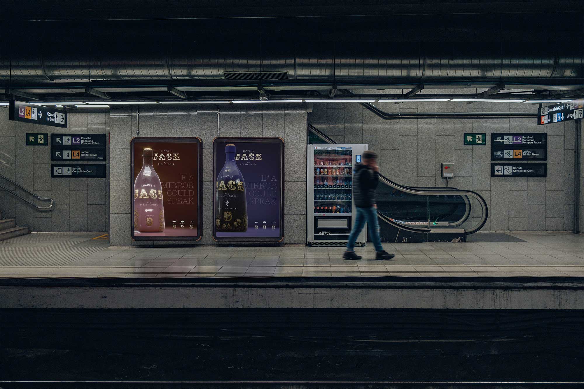
Time, secrets, hope, dreams, 1888 - secrets inside 150 year old mirrors, a theme rich in thought, and ideas.
We wanted to explore an experimental concept rooted in the East End’s gilt pub mirrors, objects loaded with craft, theatre, and gossip. The challenge was to build a world that nods to Victorian 1880's drinking culture while staying contemporary and collectible. Naming needed to carry humour and history. We wanted the packaging to feel like it was created from as much craft as the gilt mirrors from that period that still adorn East London pubs and inns today.
We imagine the product to have hints of yesteryear, a subtle scent of lavender and new mown hay, delicate taste of "Fleurs de Bulgarie," a rich blend of rose and bergamot with an undertone of citrus lemon, popular in Victorian times. In fact from the view from afar, the touch in the hand, to the scent and to the taste, the epxperinec, when in a bar that potentially started out as a Victorrian inn, all while teasing the imagination through imaginative copylines, would be entoxicating.
We treated the mirror as a time machine, then built a brand system around its secrets, shine, and storytelling.
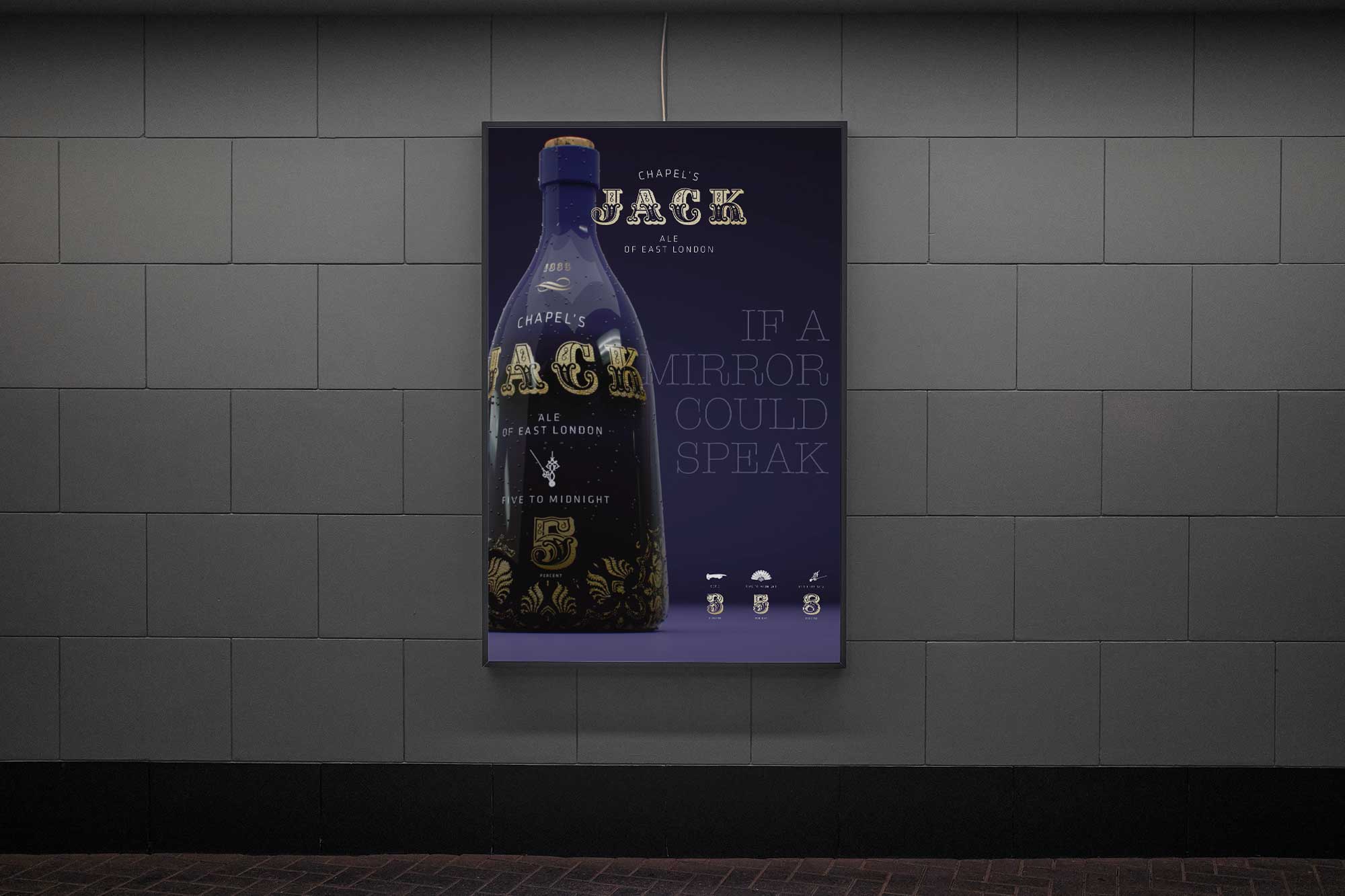
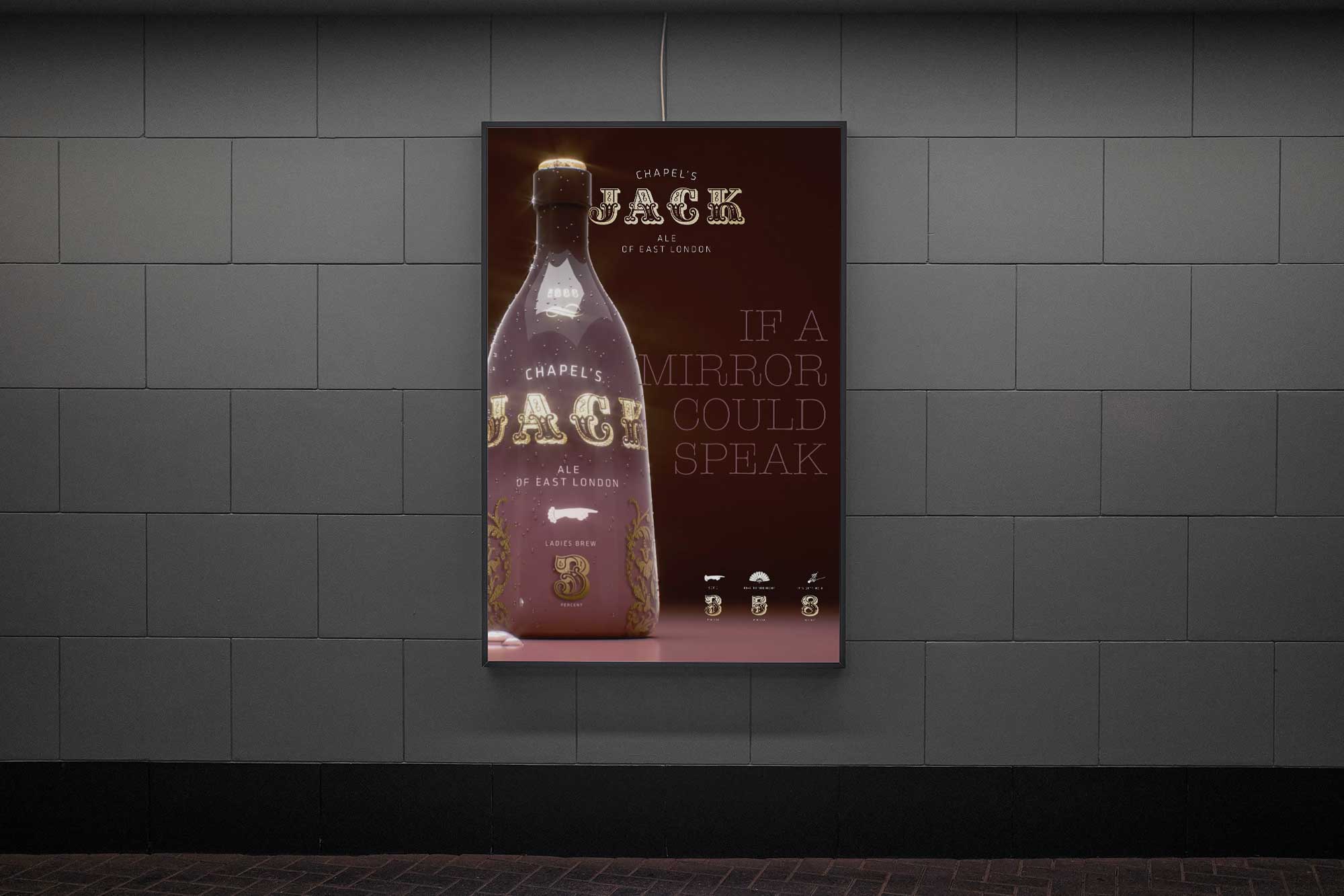
Story first.
We anchored the concept in the idea that mirrors have witnessed everything. Not a literal character drama, more a chorus of whispers. This gave us a narrative spine for copy, naming, and promotion, and a clear mood: decadent, curious, slightly dark, and always mysteriously inviting.
Naming with a wink.
Chapel became the connective tissue, a nod to Whitechapel and the pub geography that inspired the project. Individual variants used time and strength (%) as playful cues, with titles like Set 3, 5 to Midnight, and It’s Getting 8.
Packaging as illusion.
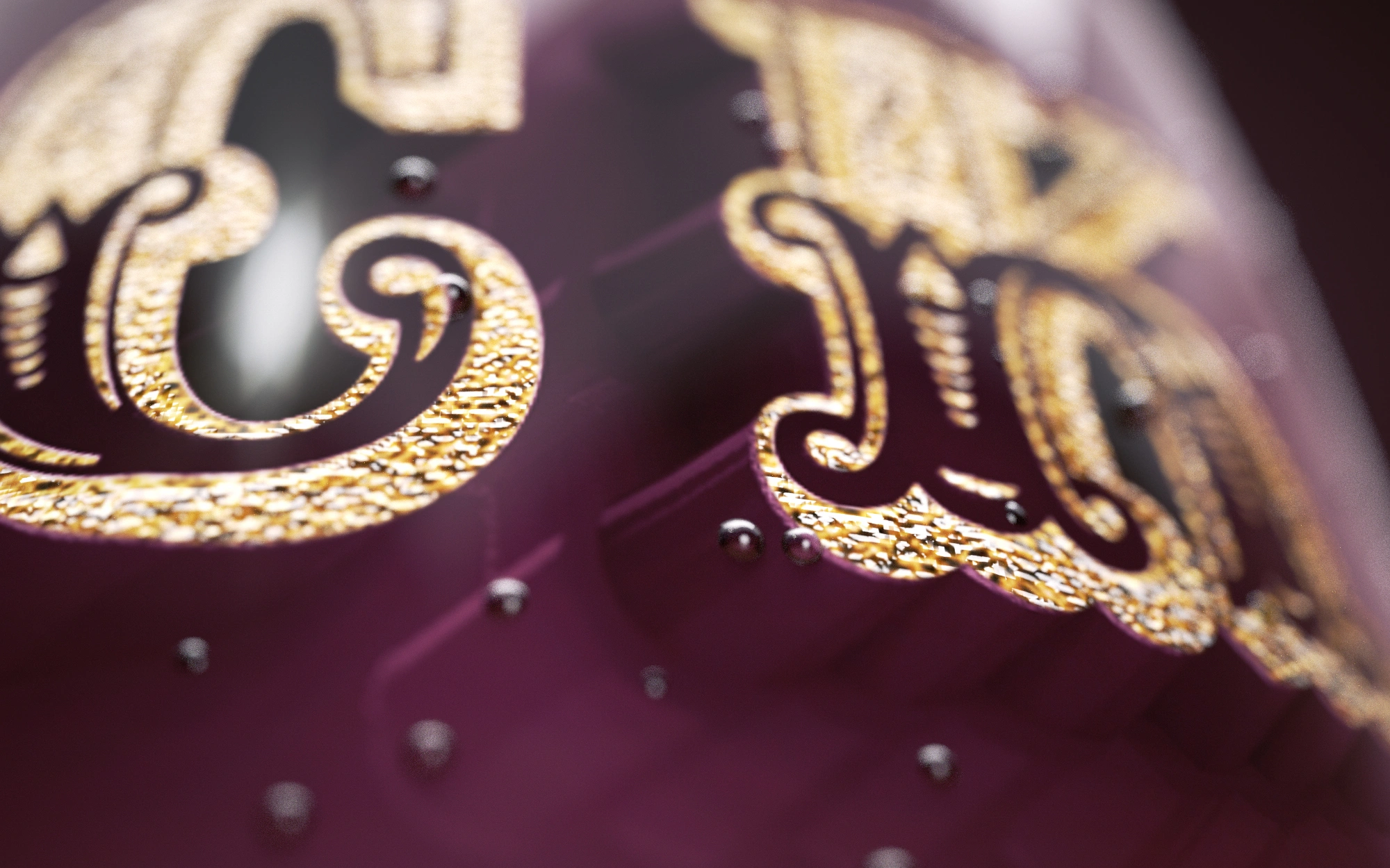
We designed labels to behave like gilt mirrors, with high-gloss depth, tonal shading, and a foil layer that catches light like ornament. Bright gradients brought modern energy. Greyscale tints created dimensionality. The result feels like an object you might find behind a bar, polished nightly.
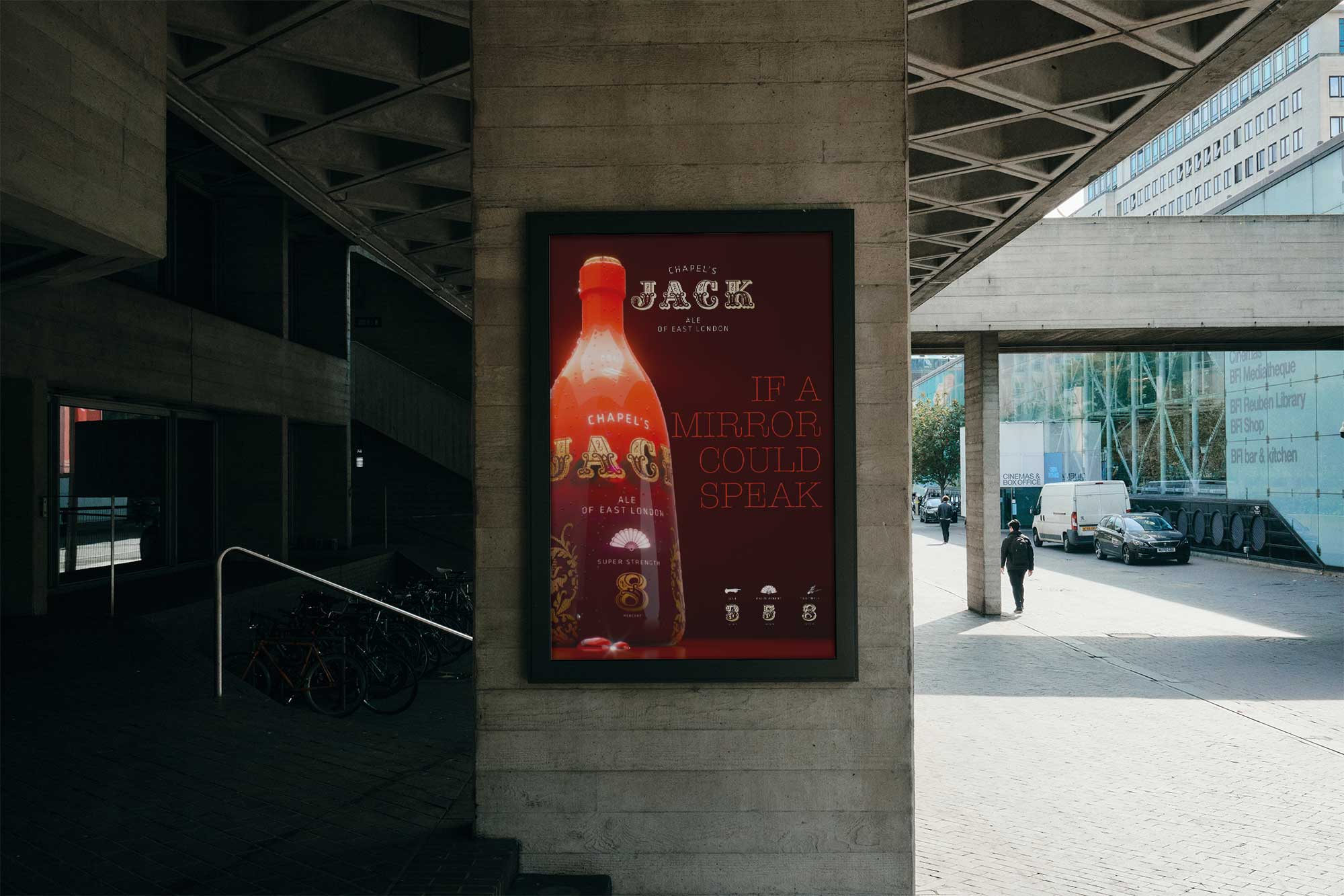
The identity pairs ornate, Victorian-influenced typography with a clean, contemporary supporting typeface to keep it sharp. Colour is bright and rich, built in gradients with greyscale shadowing to suggest depth. Foil finishes deliver the gilt effect. Photography direction is moody pub interior light, reflective highlights, tight crops on detail, and bottle-as-object still life. Layout uses a simple grid so decoration stays intentional. Tone of voice is knowing, poetic, and slightly mischievous. Key line: Secrets of the mirror.

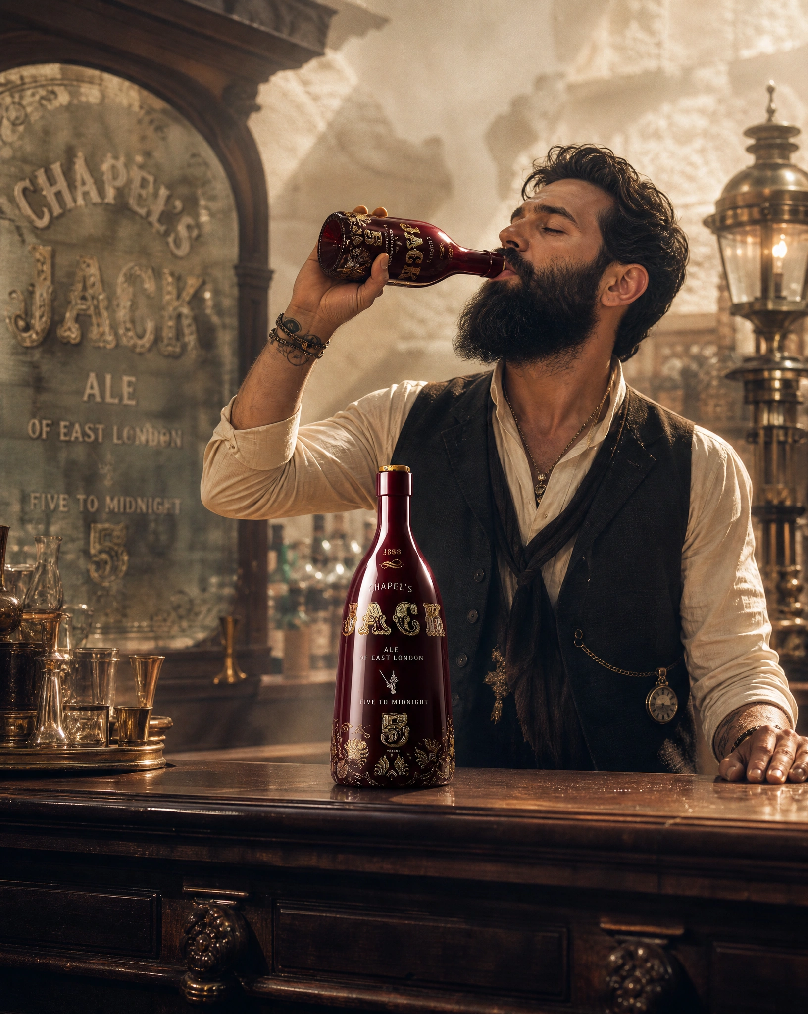
From bottle to back bar, a brand designed to belong in the glow of tiles, brass, and glass.
The system was built for maximum impact at arm’s length and in-hand. On pack, the mirror illusion becomes the hero, with variant names and strength cues working as quick reads. For promotion, we developed the idea of gifting gilt mirrors to partner pubs and bars, paired with printed advertising styled after 1880s pub notices. The result is a brand that lives across packaging, point-of-sale, and interiors, and feels native to the spaces that inspired it.
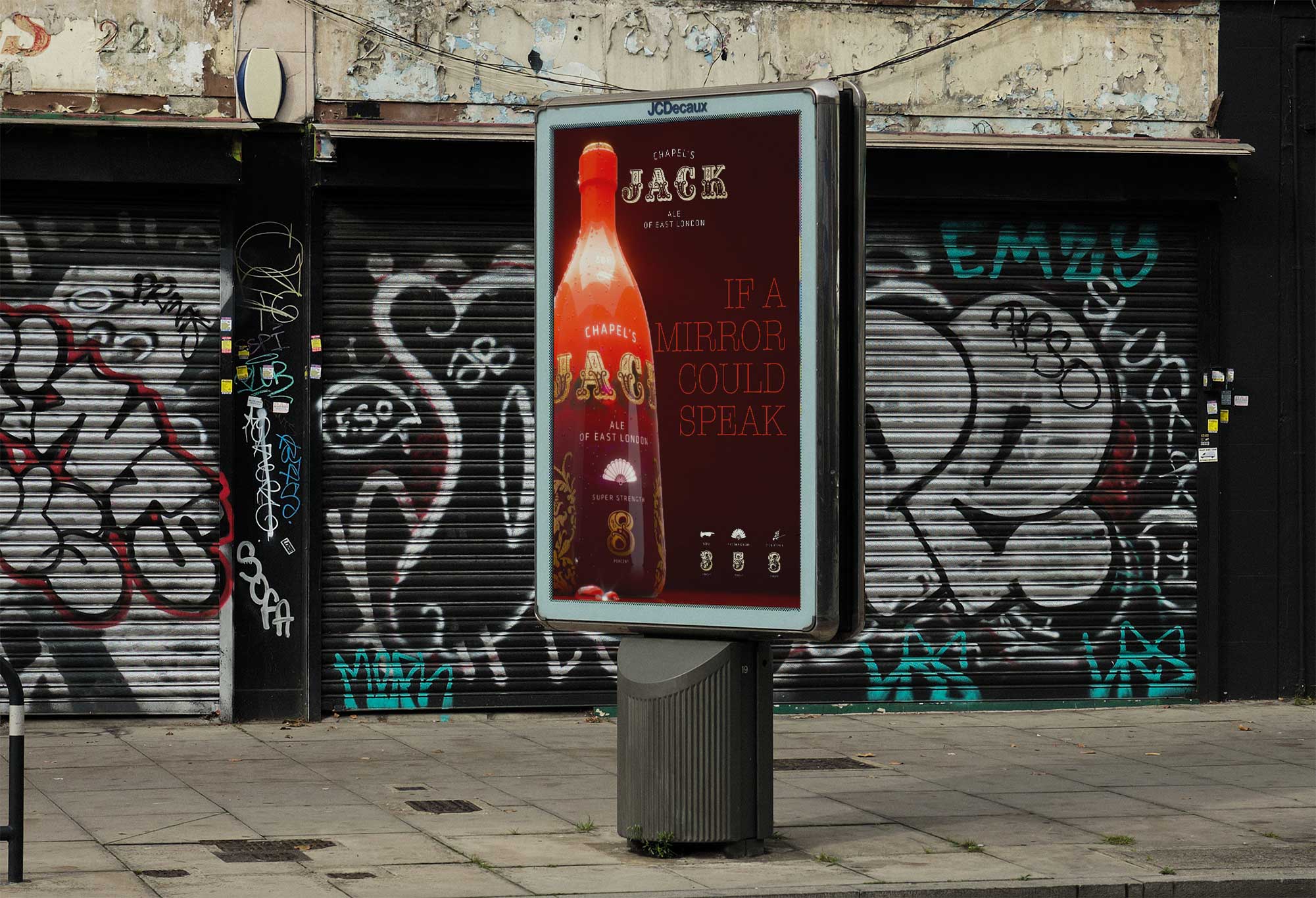

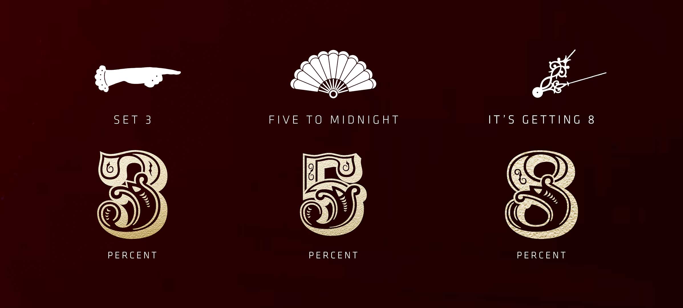
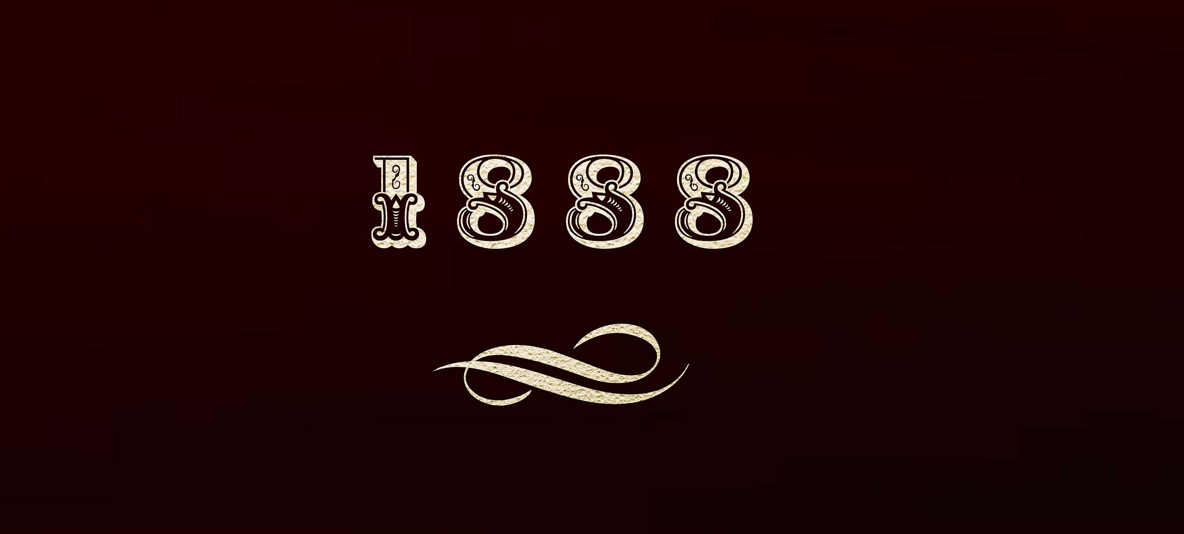
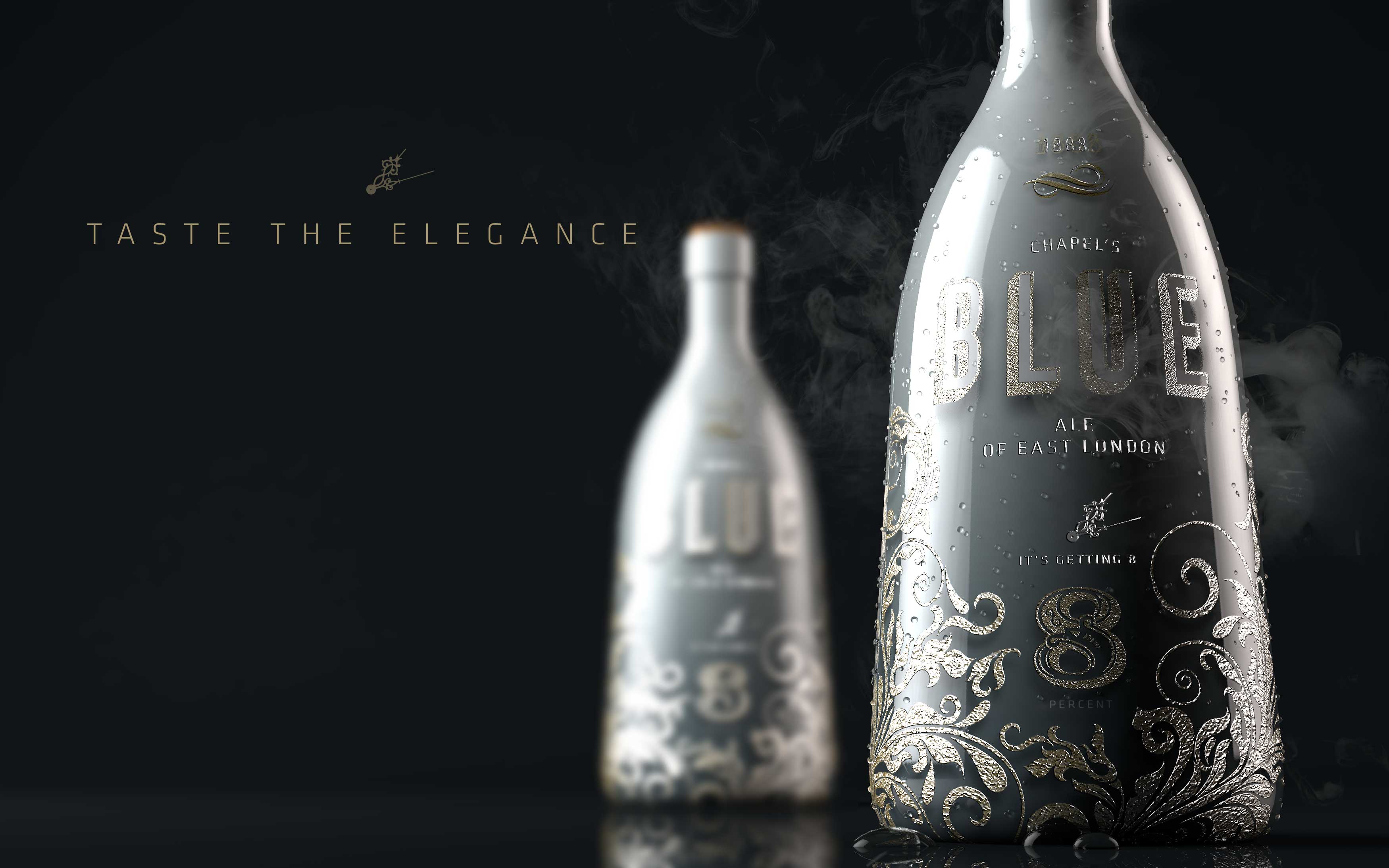
A contemporary cult concept with Victorian polish, designed to stop people mid-conversation at the bar.
The contrast between the high gloss of the rich gradients to the gilt foil, with the depth of the type created through the 3 dimensional effect, is based on the original design appaorach by the original masters of the gilt mirrors, although the work for us was much easier than the skill required by these master craftsman.
The concept gained a clear narrative platform that can stretch across new variants, seasonal drops, and collaborations. The mirror concept gives the brand a distinctive asset, part object, part story engine. Naming strikes the balance between heritage cues and modern humour, making the range feel premium without feeling precious.
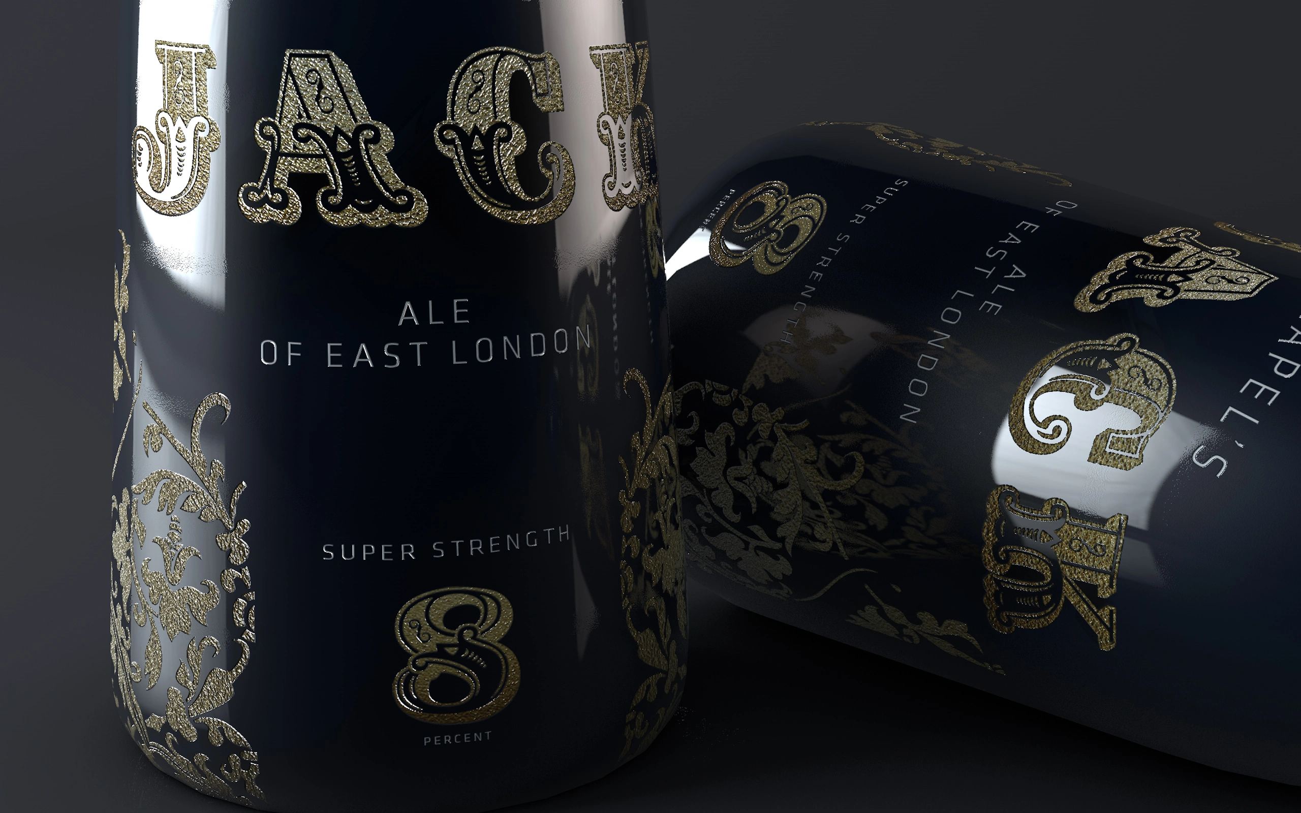
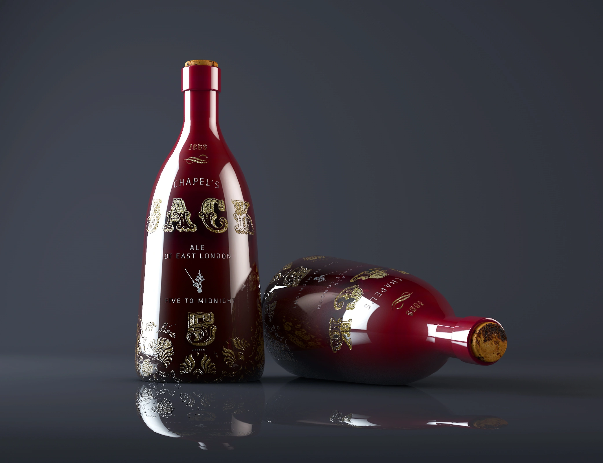
Completed in a 4-week sprint, from positioning through to production-ready packaging direction. We defined the brand architecture around Chapels as the masterbrand, with Chapel-led variant naming and strength cues as the organising principle. Visual assets were designed for real-world print finishes, including high-gloss varnish and foil specification to achieve the gilt effect. The rollout plan prioritised on-trade touchpoints, bottle presence behind the bar, and promotional mirror placements supported by 1880s-style advertising artwork.
 DISCIPLINES