Summerhill
A modern-elegant brand system and website for a London luxury furniture name.

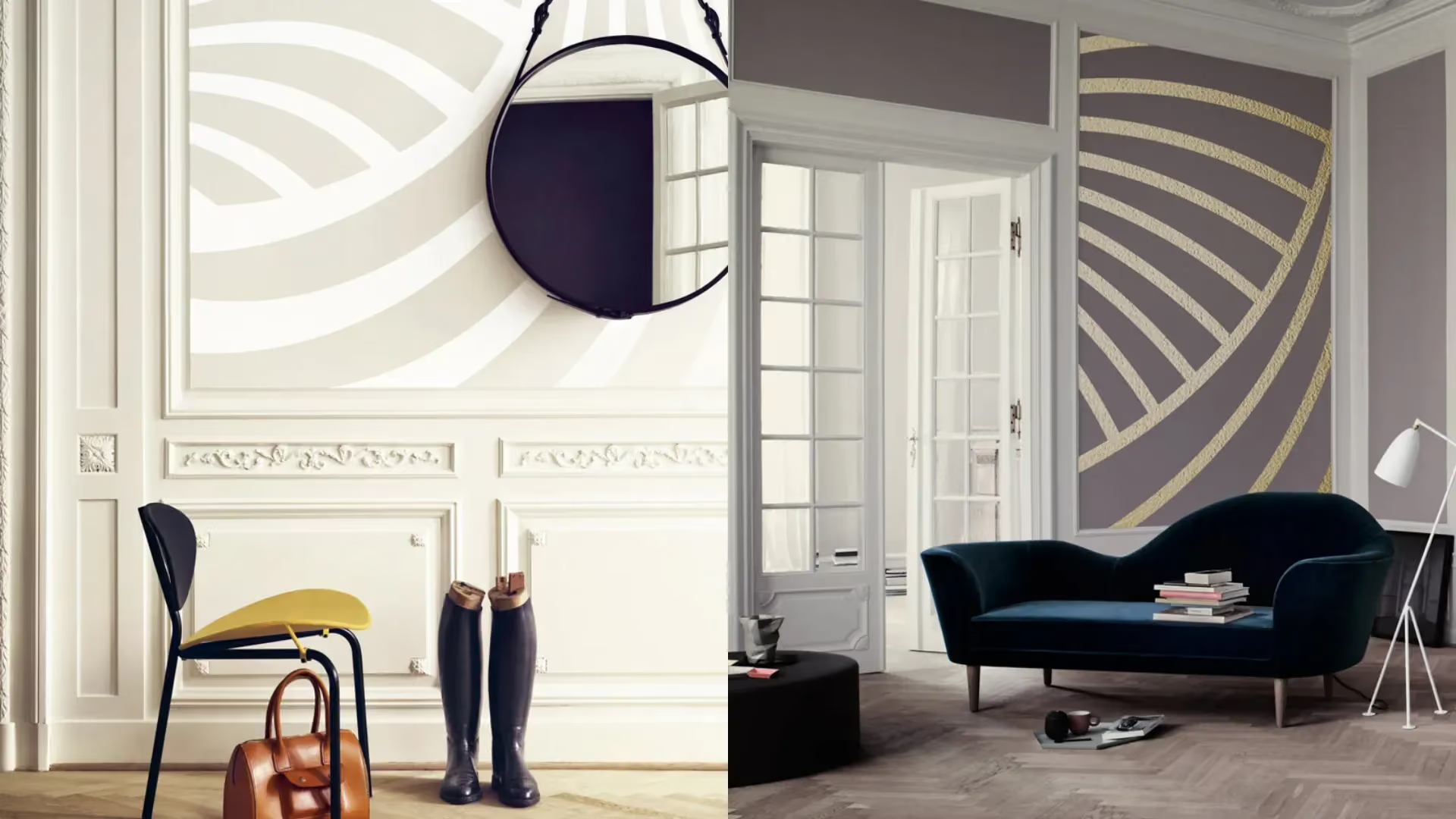
A family-run luxury furniture brand needed a sharper point of view, and a system to carry it consistently across every touchpoint
Summerhill, based in London’s West End, wanted a brand that reflected the quality of its furniture and the breadth of its global clientele. The brief covered the full picture, an audit and benchmarking, a clear brand strategy with mission, vision, values and purpose, plus a complete identity and website design. The challenge was balance, staying timeless without feeling traditional, and feeling contemporary without losing luxury.


The project
A modern elegance idea, built into strategy and expressed through type, monochrome discipline, and a pattern language that can flex by taste
1. Audit and benchmarking
We started with a comprehensive audit and global benchmarking to understand where Summerhill sat, and where it could credibly go next. That work set the bar for what “luxury” needed to mean here, then gave us a practical set of decisions to guide the brand across identity, website, and communications.
2. Strategy to steer
From there we shaped the full brand strategy, mission, vision, values and purpose. The aim was clarity, so every piece of communication could feel like it came from the same place. It is the kind of work a branding consultancy does best, giving teams a shared language before any design decisions land.
3. Identity with range
The concept of modern elegance became the anchor. A serif type choice did the heavy lifting, bridging classic sophistication with a clean, contemporary feel. Then we built a pattern system as a visual signature, flexible enough to shift from refined and restrained to bold, cubist-inspired expressions.
Identity details
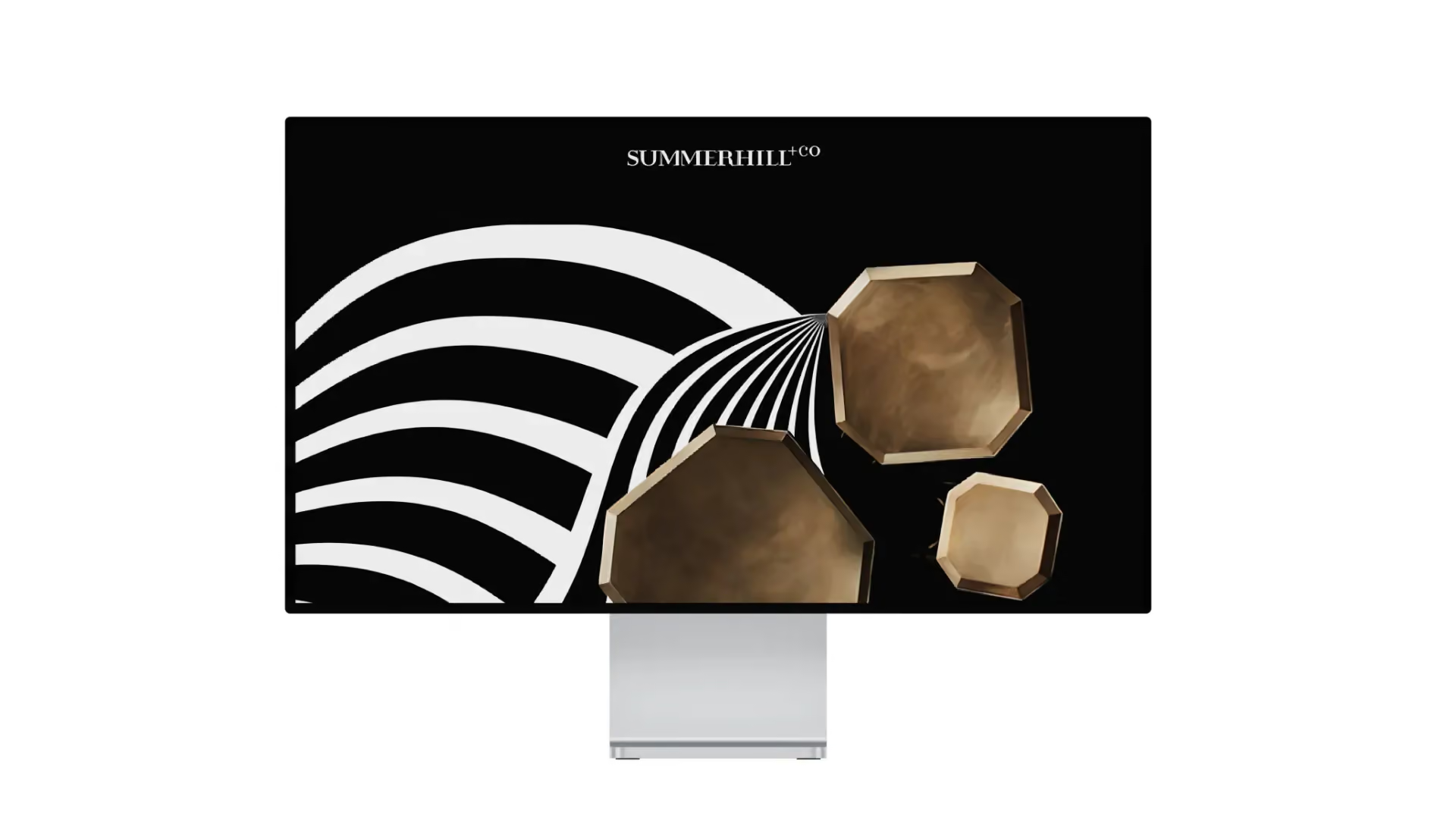
A carefully chosen serif font set the tone, timeless, but not formal. The palette stayed monochrome, black and white, to keep everything crisp and confident across different applications. The pattern system became the finishing detail, sometimes elegant and minimal, sometimes more geometric and cubist in spirit. The overall feel is modern elegance, designed to suit varied interior tastes while staying recognisably Summerhill.
Brand application
A system designed to show up well everywhere, from brand communications to the website
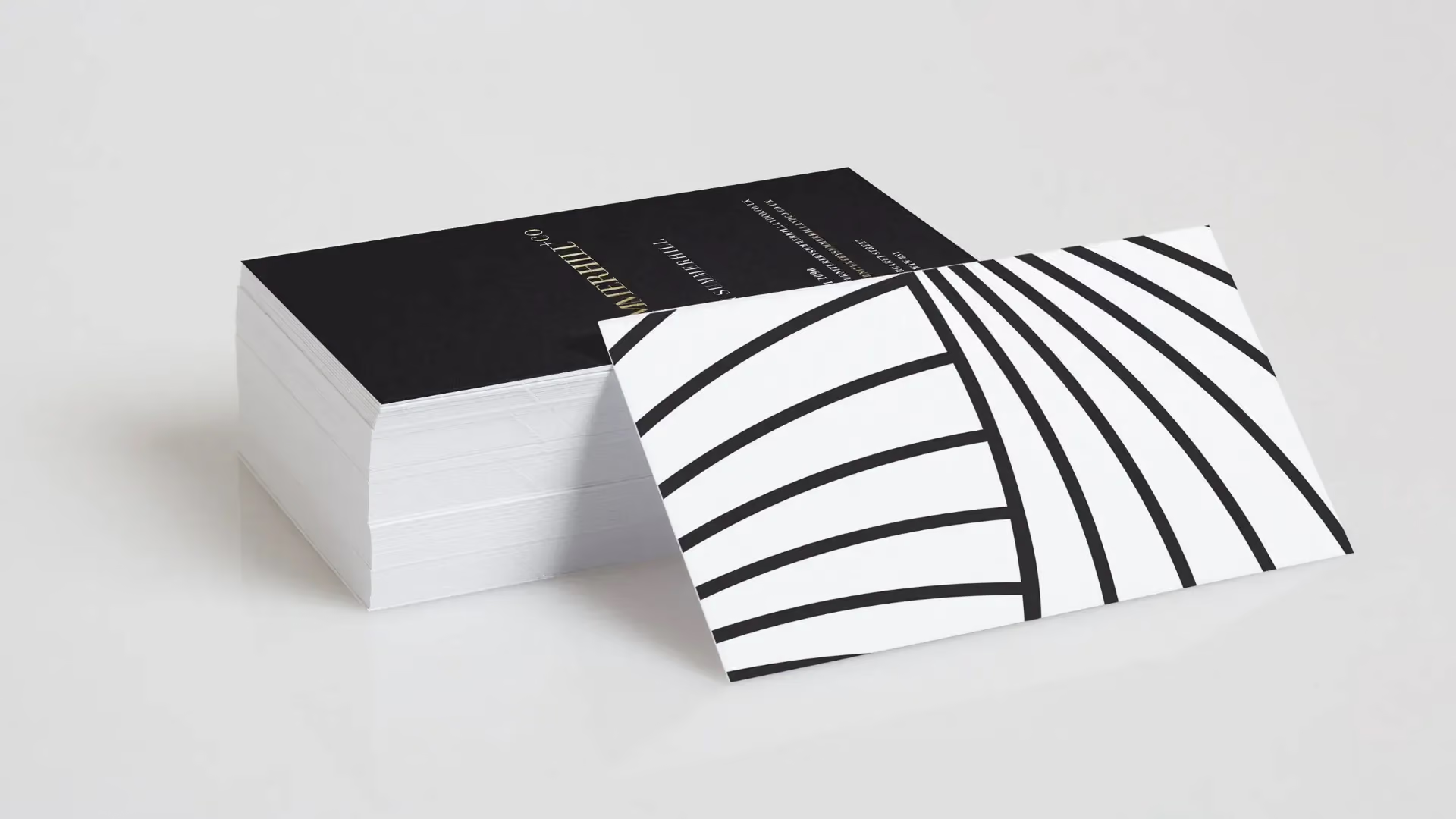
The identity was built to perform across mediums without losing its edge. The signature patterns were applied with precision across communications, using the same core language but adjusting the expression depending on context. The black and white palette made it easy to keep consistency while shifting emphasis between light and dark. As a branding agency and branding company, we also carried the system through to website design, so the digital experience matched the same standard of restraint and detail.
The result:
A clearer luxury position, a tighter visual signature, and a brand that can speak to classic and contemporary interiors without changing who it is
Summerhill now has a defined point of view anchored in modern elegance, supported by a full strategy and a cohesive identity system. The serif typography and monochrome discipline create a confident baseline, while the pattern language gives the brand room to express different moods without fragmenting. It is a brand built for consistency, not repetition.
The system’s flexibility supports a broader spectrum of customer tastes, from refined classic preferences to more modern, design-led sensibilities, while keeping a single recognisable signature. The black and white palette also improves consistency across communications, letting the brand shift between white-led and black-led executions without losing impact.
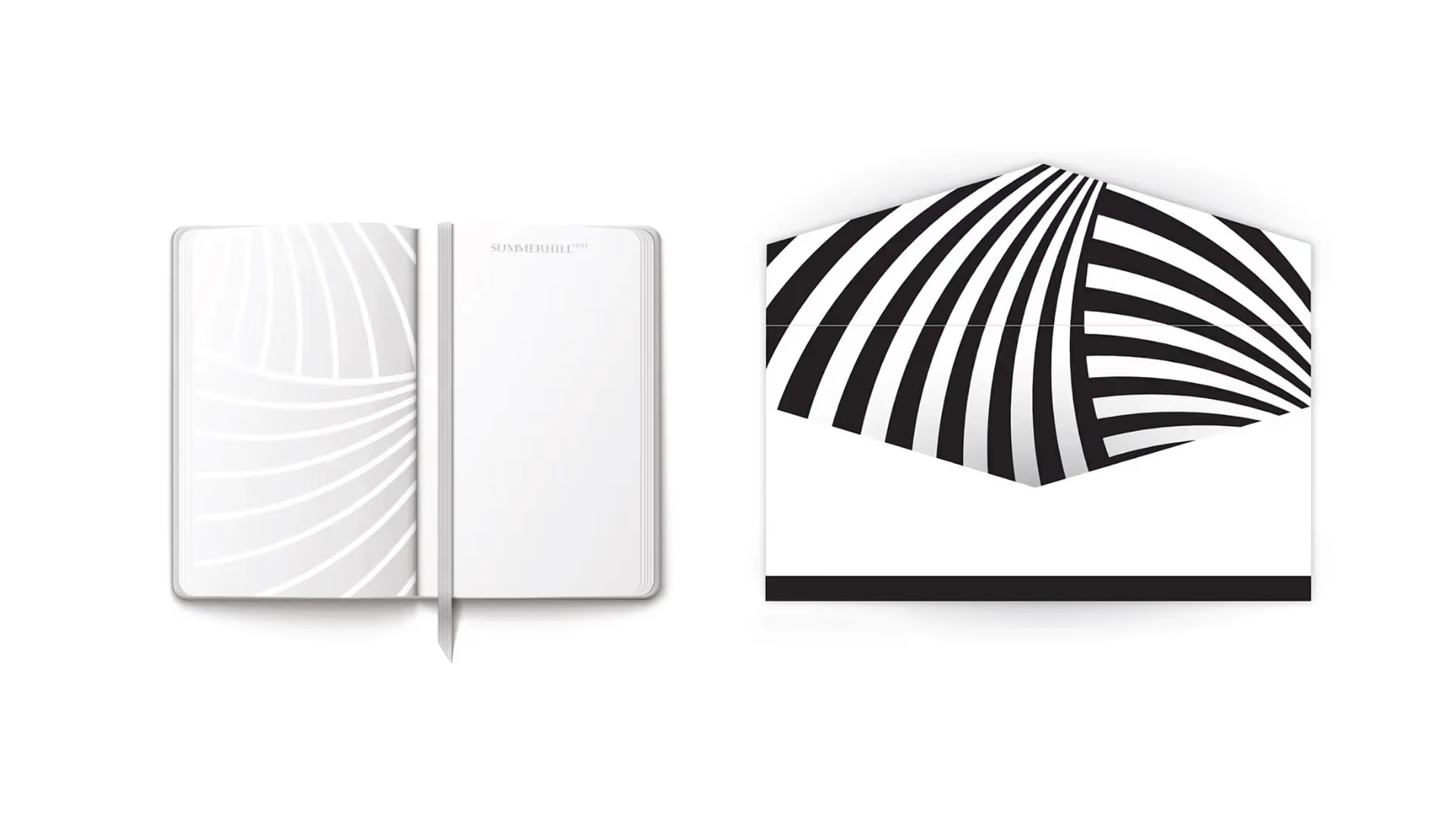

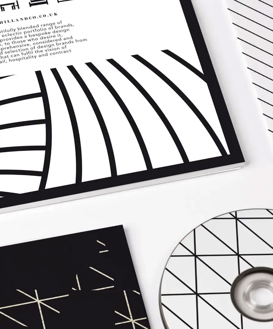
Delivered end-to-end, from audit and global benchmarking through to brand strategy, identity, and website design. The work included mission, vision, values and purpose, plus a complete visual system centred on typography, monochrome colour, and a distinctive pattern language. The result is a coherent brand architecture for communications, with a design system that can flex in expression while staying consistent in tone and recognition.
 DISCIPLINES

