The Churches Conservation Trust
A unified print and digital system for historic churches across Great Britain.
CCT needed to raise visibility and relevance in a fast, digital-first world while still honouring the buildings and their stories. The brief covered engagement for mixed audiences, from heritage experts to casual visitors, plus consistency across leaflets, website, posters and wayfinding. Information also had to be easier to find on site and online. And everything needed to support fundraising, turning interest into practical support for conservation.
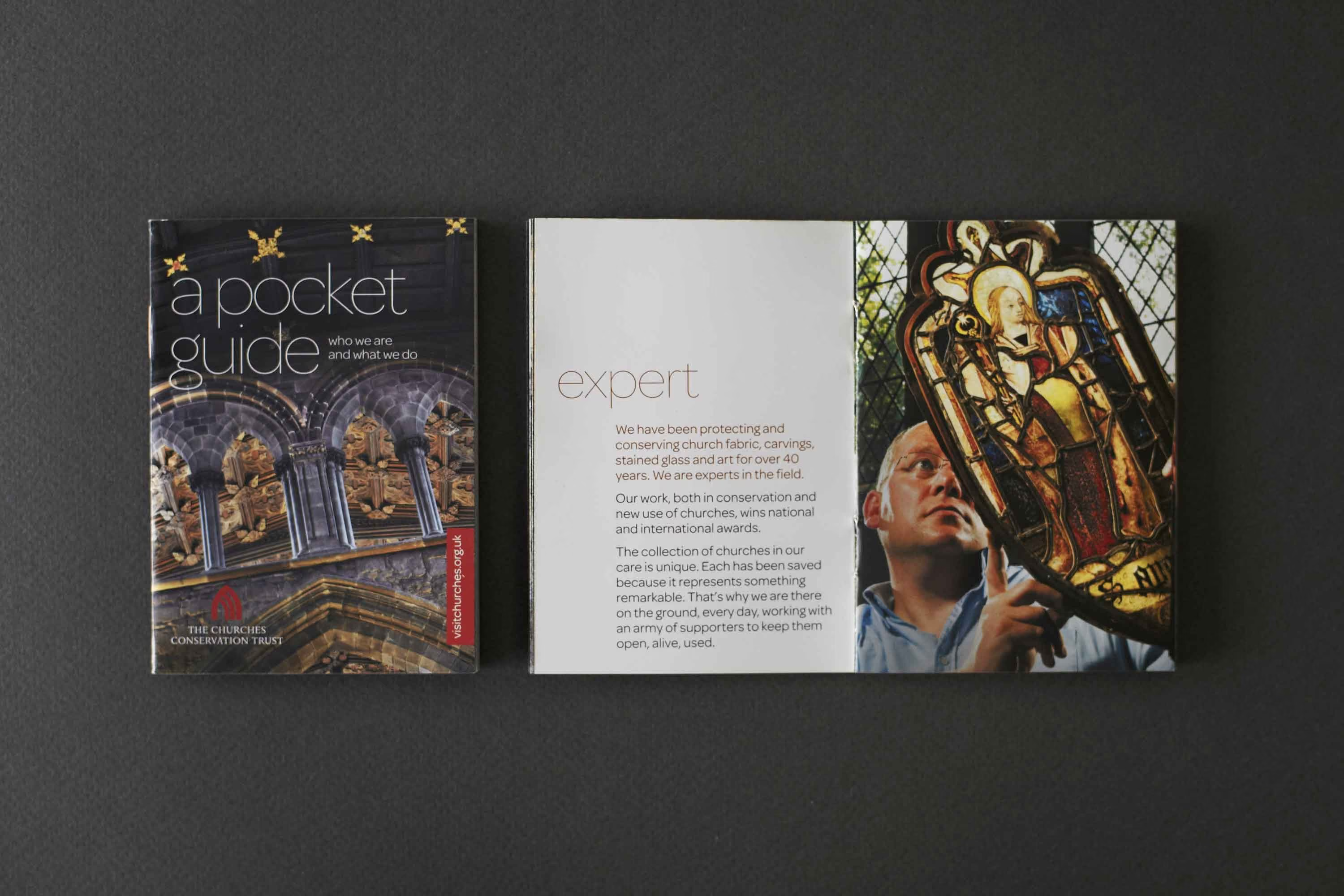
Delivered as an integrated print and digital rollout, the work covered leaflets, posters, a responsive website and an on-site wayfinding system. The brand architecture was built as a flexible system so CCT could apply it consistently across different churches and different communication needs, without redesigning from scratch each time. As a branding consultancy and branding agency partner, Garden focused on clarity, accessibility and a recognisable visual language that can keep evolving as CCT’s communications grow.

A clear, flexible brand system built to work hard across print, screen and on-site experiences
Project details
1. Understand the mission
We spent time getting close to the churches and to CCT’s purpose, the people behind it, and the reasons these places matter. As a branding consultancy, we needed the work to feel respectful, not reverent. Human, not museum-like.
2. Audit and simplify
We reviewed the existing brand and communications to spot what was already working and what was slowing people down. The focus was clarity, consistency and usability. The aim was a system that could scale across many churches and many formats.
3. Design for real users
Tourists, local communities, historians and donors all arrive with different questions. We designed as a branding company that cares about flow and comprehension, not just looks. The output had to guide, invite and explain, quickly.
Identity details
A restrained, contemporary design language that lets the churches lead. Clear typographic hierarchy for fast scanning, supported by a consistent grid across print and digital layouts. Colour and graphic elements were kept simple to avoid competing with architectural detail. Photography was treated as storytelling, focusing on texture, light and material presence. Tone of voice stayed direct and welcoming, with information structured for ease of use.
Branding application
From first glance to on-site visit, a system that helps people find, understand and support
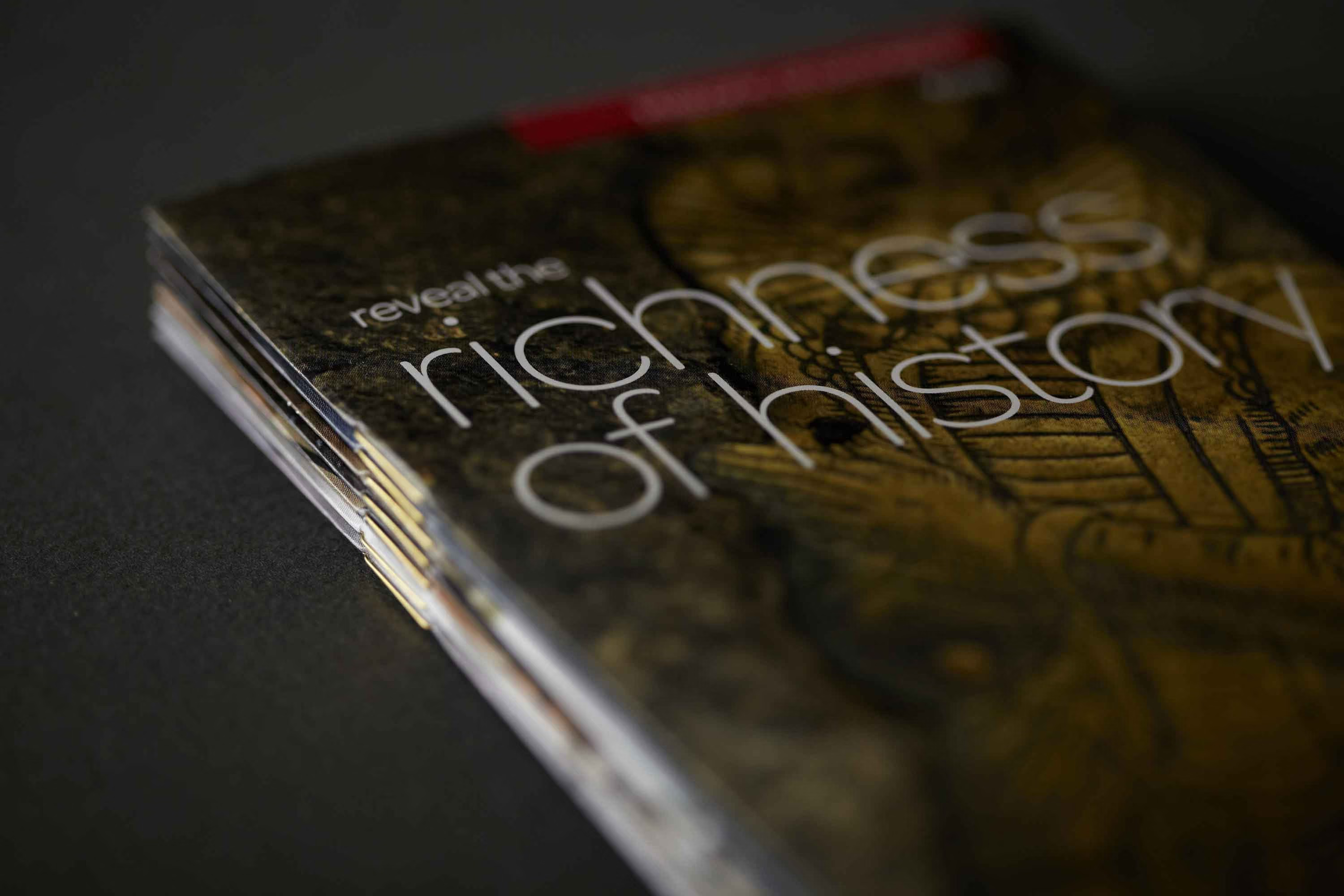
Leaflets were designed to be eye-catching and practical, giving visitors what they need at a glance while encouraging exploration. Posters carried the message with stronger visual presence, helping CCT show up more confidently in public spaces. The website became a responsive gateway to the churches, built for clear navigation and richer content. Wayfinding brought the same clarity into the buildings themselves, guiding visitors without distracting from the architecture. A branding agency’s job is often to join the dots, this system does that across every touchpoint.
The result:
A cohesive, user-first identity that makes CCT easier to discover, easier to visit, and easier to support
CCT now has a unified brand presence across leaflets, website, posters and wayfinding, which creates recognition and trust. The system brings consistency without flattening the individuality of each church. Information is clearer and more navigable, helping people feel confident planning a visit or understanding what they are seeing on site.
The refreshed work supported increased visibility and engagement, with CCT and its churches better positioned to attract visitors and wider attention. Clearer communications also strengthened fundraising support by helping interest translate into action. Specific metrics were not supplied, but the intent and direction were designed to drive measurable growth.

Rooted in history, but designed for the future, the new identity reflects the enduring role these remarkable places play in people’s lives. It captures the beauty, craftsmanship and stories held within each church, while opening the door to new audiences and new possibilities. A brand that protects the past, celebrates the present and helps these spaces continue to inspire generations ahead.
 DISCIPLINES