Go Pass
A new Afriquia fuel loyalty brand built for faster, in-car payment.
Create a forecourt-ready brand that signals a new way to refuel, without fighting the realities of Moroccan service stations
Go Pass needed to feel instantly understandable at the point of use. In Morocco, pump attendants are the norm, so the identity had to introduce a different behaviour while still feeling native to Afriquia stations. The service is for everyday drivers and business fleets, but fleet customers needed extra confidence around control, security, and transparency. As a branding agency and branding consultancy, we were asked to set the strategy, then build a full identity system that could work across physical and digital touchpoints.
A clear strategy, then an identity system designed for speed, trust, and quick decisions from the driver’s seat


Research and benchmarking.
We looked at how loyalty and payment brands behave in high-traffic environments, then pressure-tested what would make sense on a Moroccan forecourt. The goal was simple, reduce hesitation. Every decision had to work at a glance, from inside the car, with people and vehicles moving around.
Brand strategy and messaging.
We shaped the positioning around convenience, speed, and security, backed by the mission and values. The line “The fastest way to pay” did a lot of work, it sets expectation, explains the benefit, and keeps the promise practical. Fleet audiences were supported through a clearer emphasis on transparency and control.
Identity build and system.
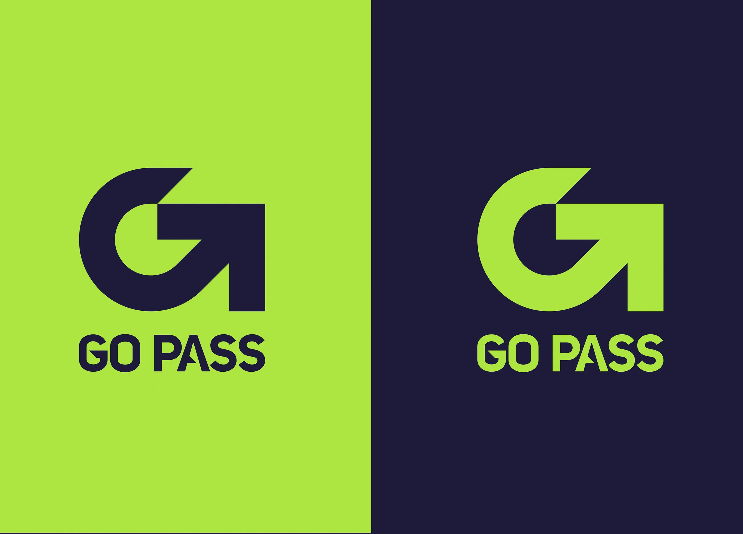
As a branding company, we created the core identity, then designed the full set of guidelines to keep it consistent across stations and screens. A custom font gave Go Pass its own voice and helped the system feel purposeful, not like a bolt-on sub-brand.

We designed a full custom font for Go Pass, built for legibility at distance and in motion. Colour and contrast were handled with the forecourt in mind, quick recognition, clear hierarchy, minimal noise. The graphic system focused on direct cues and simple shapes that can be read from a car. Tone of voice stayed plain-spoken and confident, with security and transparency communicated without over-explaining.
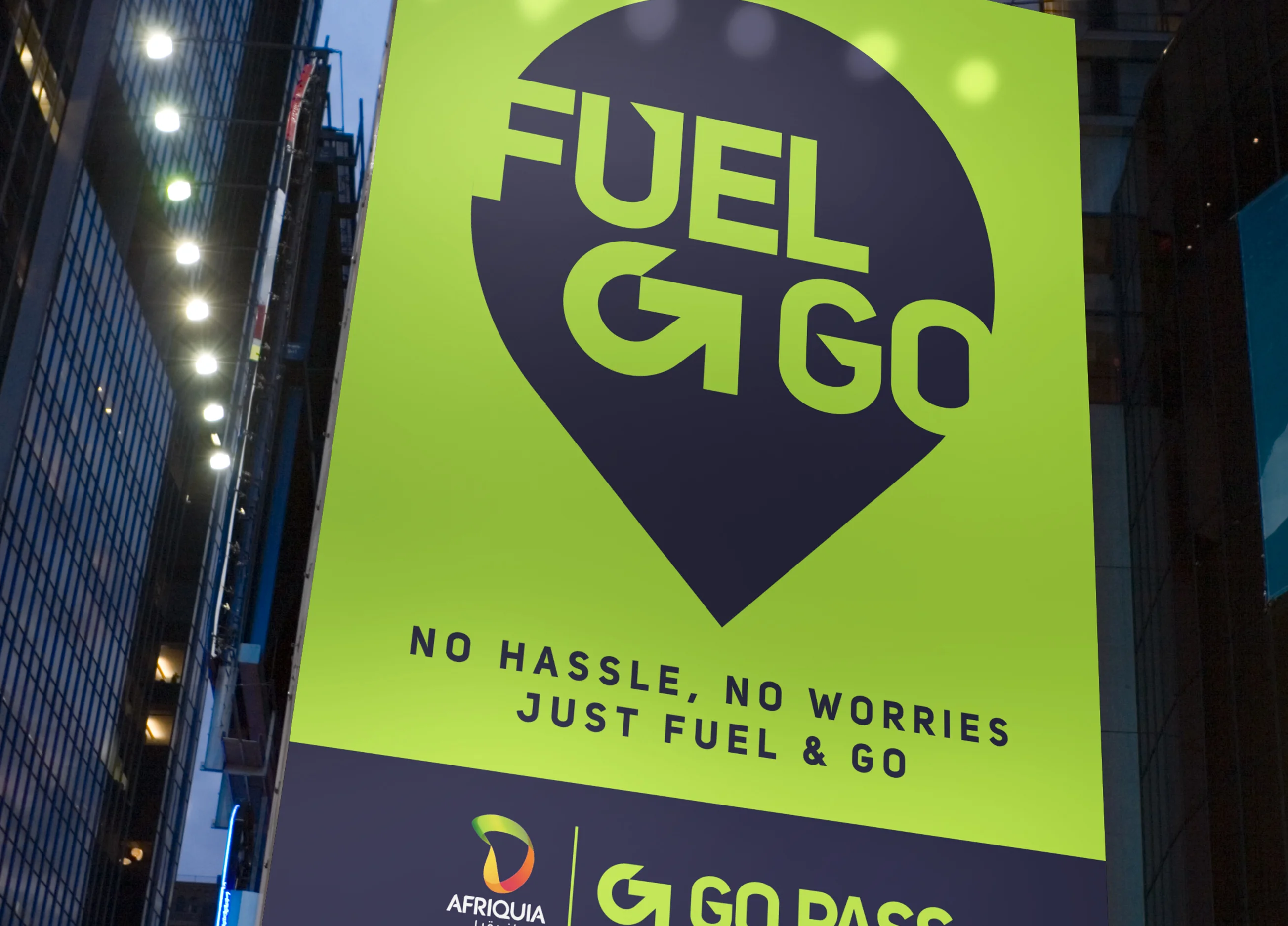
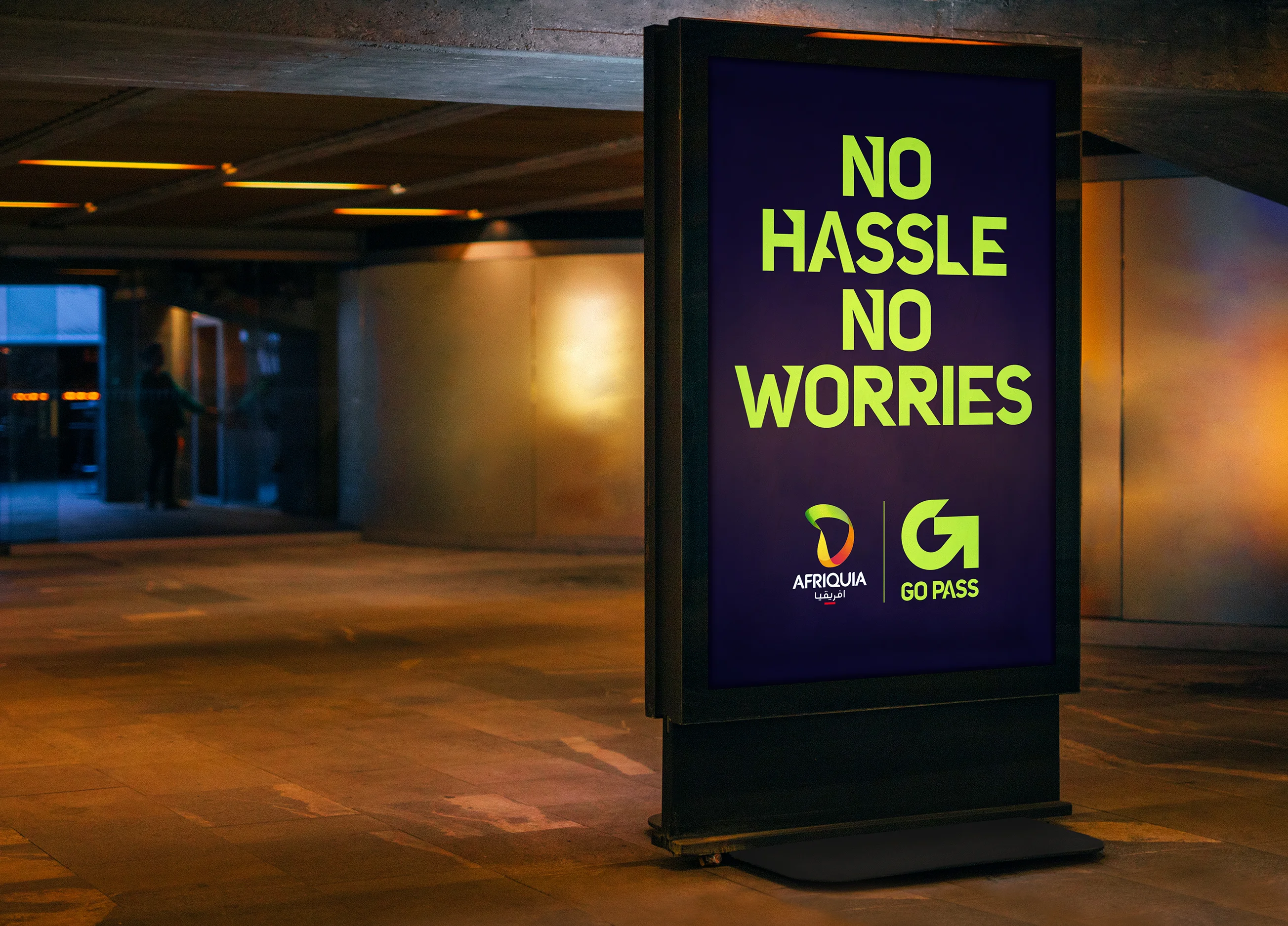
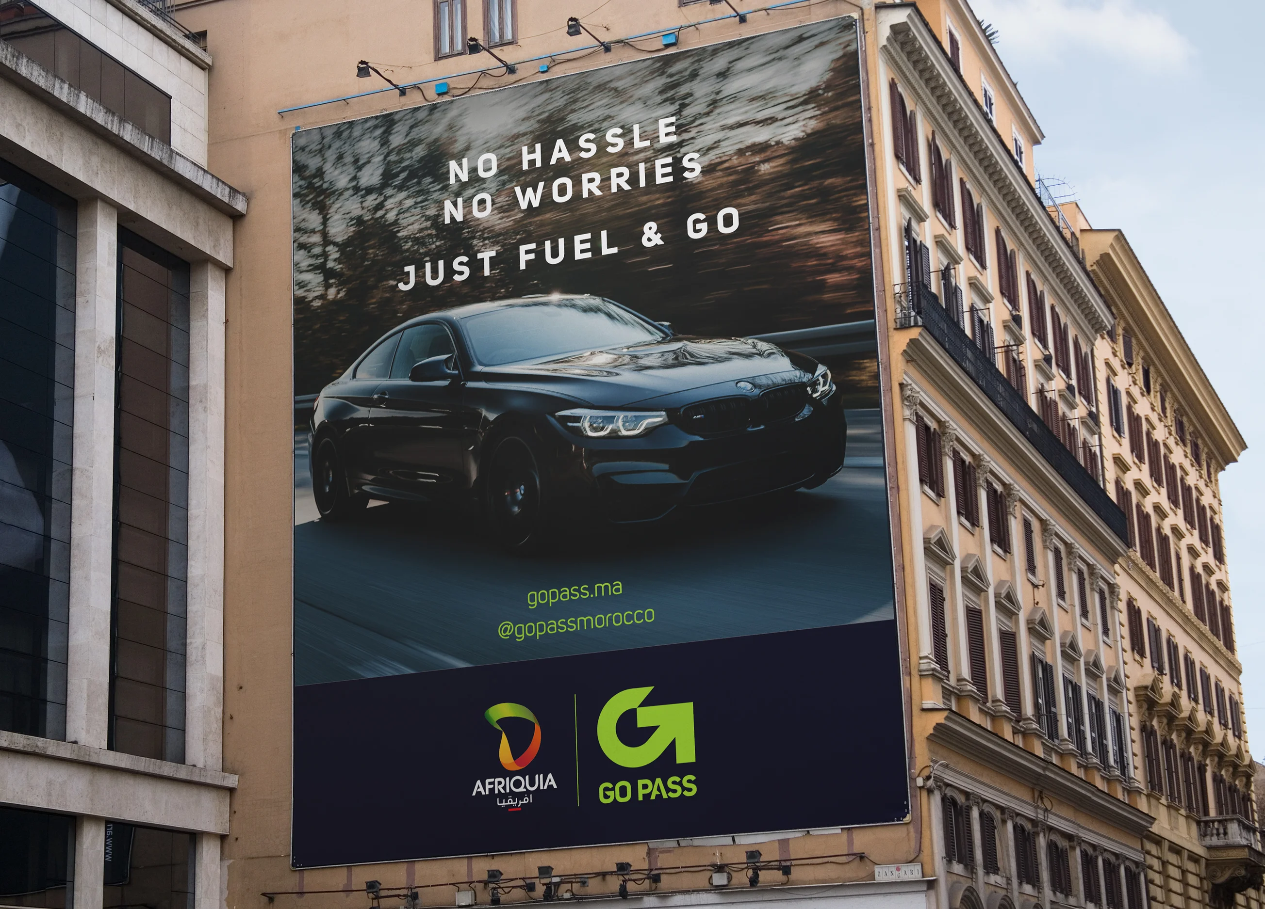
Built for the forecourt first, then carried through every touchpoint customers rely on.
Go Pass came to life where behaviour changes happen, at the pump. We designed pump graphics and floor graphics that guide drivers clearly, using visual prompts that support fast decisions from the car. Uniform design signalled the service immediately, so customers did not need to ask questions or second-guess the process. Print and digital design followed the same rules, clear information, consistent cues, and a focus on speed and security. Cards and customer communications rounded out the system for both everyday users and fleet customers.

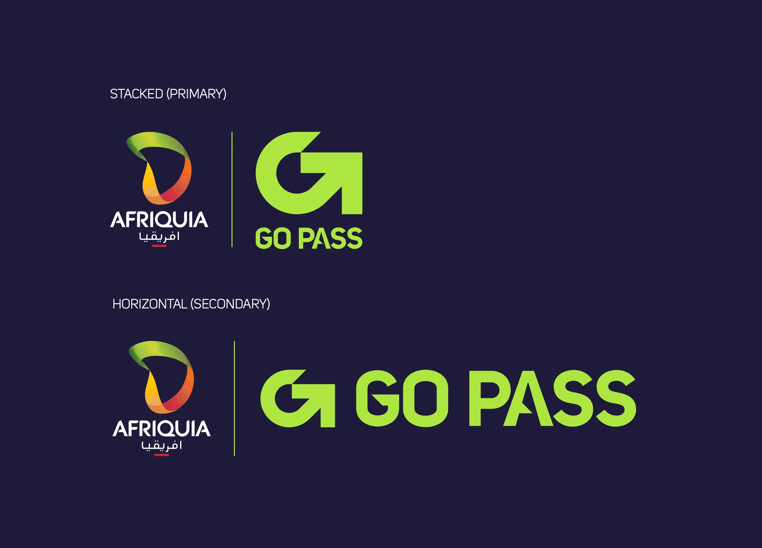
Bespoke font design
Go Pass now has a clear, ownable identity that fits naturally within Afriquia service stations while still signalling a new way to refuel. The system balances speed with reassurance, so consumers understand it quickly and fleet customers feel the promise of transparency and control. The custom font and guidelines give the brand consistency across physical and digital environments.
Delivered end-to-end in 2 months, covering research, benchmarking, brand strategy, brand creation, font creation, brand guidelines, signage and wayfinding, uniforms, digital, and cards. The result is a complete rollout-ready toolkit that can be applied consistently across stations and customer communications.
 DISCIPLINES