The impact of branded environments on brand design
When creating a branded environment, it is essential to consider how the brand will be implemented across key customer touchpoints from the outset of the design process.
Creating a powerful visual identity for a screen is one challenge, but making it work in the real world is another entirely. A branded environment, whether a retail store or office, must translate digital concepts into tangible experiences. This requires thinking early on about how brand elements like colour and typography will work across physical materials, from signage and wayfinding to interior finishes.
A successful brand is built on a clear strategy and positioning that aligns with its key market and identified opportunities—these elements should be informed by thorough brand research. However, when creating a branded environment, it is essential to consider how the brand will be implemented across key customer touchpoints from the outset of the design process. While a visual identity may look impressive on paper or digital screens, it must translate effectively into real-world environments such as physical spaces, signage, and wayfinding systems to create a seamless customer experience.
Brand colours that appear vibrant and dynamic in digital formats—thanks to advanced screen technologies—may present challenges in physical applications. Materials such as external-grade signage acrylics and vinyl offer limited colour ranges and factors like backlighting or exposure to weather conditions can alter or diminish colour quality. To overcome these challenges, it is crucial to evaluate the availability of colours in RAL standards, films, tiles, timbers, and even machinery during the early design phases. While colour limitations should not dictate branding decisions entirely, acknowledging them early helps brands plan for potential challenges and maintain consistency across both digital and physical spaces.
A successful branded environment balances a brand's visual identity with an atmosphere that reflects its values. This means thinking about the limits of physical materials from the start.
Balancing practicality with creativity is key—brands should not be restricted to a narrow selection of 'safe' colours simply because they are easier to reproduce across all touchpoints. For example, in our work with Mini Brahim, the brand's signature yellow posed legibility challenges when printed on white. To address this, we introduced a complementary dark grey, ensuring a versatile and recognisable identity across multiple platforms. Interestingly, backlit signage often defaults to white, regardless of a brand’s primary colour. Over time, consumers associate the brand's full colour palette with its identity, reinforcing recognition and loyalty.
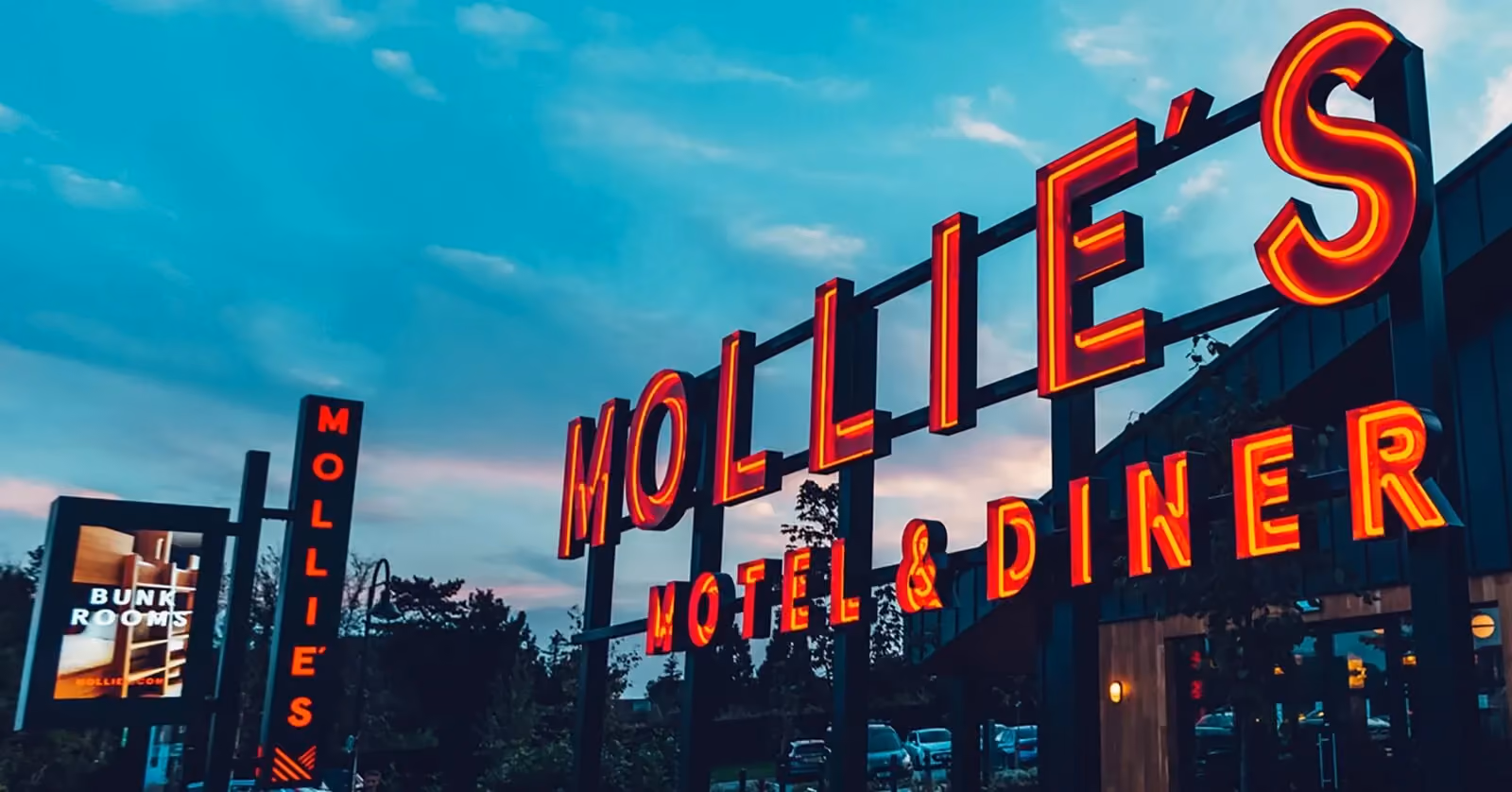
A branded environment extends beyond logos and packaging—it is a space where customers interact with the brand on a deeper level. Unlike printed materials, these environments must be designed to be experienced, shared, and enjoyed. While the logo and packaging establish the brand's presence, the environment serves as a backdrop that enhances key touchpoints. Consider our work with Mollie’s, a hospitality brand that utilises a red and grey colour scheme for its visual identity yet incorporates natural materials in its interiors to create a warm and inviting ambience. Similarly, Mobily's spaces feature white and timber finishes rather than its primary blue brand colour, reflecting the brand's core values rather than its visual elements.
On the other hand, Kool Smoothie’s interior design is a direct and vibrant representation of its brand identity, featuring bold and lively colours that align with the brand's personality. Striking the right balance between expression and functionality requires experience, skill, and a deep understanding of branding principles.
Should a branded environment always use the primary brand colours?
No, it’s not essential. While brand colours can be a direct form of expression, a more sophisticated approach often uses a complementary palette of materials and finishes. This creates an atmosphere that reflects the brand's values and mood, rather than simply copying the logo.
What factors affect colour consistency between digital and physical branding?
Colour consistency is affected by the difference between screen-based light (RGB) and printed or manufactured pigments (CMYK, RAL, Pantone). The material itself, whether it's acrylic, vinyl, timber, or paint, also changes how a colour looks, as do lighting conditions like natural light, artificial light, or backlighting.
How can a brand maintain its identity in a physical space without using its logo colour everywhere?
Brand identity is about more than just colour. A consistent experience can be built using typography, a distinct tone of voice on signage, and a carefully chosen palette of materials and architectural forms. These elements work together to show the brand's personality and values without having to rely so heavily on its main colours.
Final thoughts
A brand's physical presence is the ultimate test of its strategy. Translating a digital identity into a real-world environment requires a deep understanding of materials, spaces, and human experience. Success depends on thinking about the whole picture and considering every touchpoint, from pixel to place. This helps make sure the brand feels consistent and intentional wherever people experience it. Navigating this complexity is where strategic brand design proves its value.
At the end of the day, it is a complex area, sometimes a brand should be greatly influenced by the brand colours due to the amount of location-based colours required, and sometimes more sophisticated colours and materials palettes can be used to reflect the mood rather than the identity itself, and knowing how all this works cohesively in an environment, as well as how it co-exists in digital and promotional or packaging environments, and what the consumer comes away feeling, is an art in itself.
At Garden, we manage the entire branding process, from research and strategy through to design, interiors, signage, and wayfinding. With our extensive global experience and successful brand rollouts, we ensure that brand designs are not only visually appealing but also practical and adaptable to their environments. Our expertise enables us to guide clients through informed design decisions that support long-term brand growth and customer engagement.
By considering the complexities of branded environments early in the process, brands can achieve a seamless, impactful presence that resonates with their audience both digitally and physically.
 NEWS
NEWS