Electrical Safety First launches its new website and a brand ready for the electric era
Two years in the making, Garden's rebrand for Electrical Safety First gives the UK's leading electrical safety charity a bold new identity built for the electric era. A new brand mark, electric green colour palette, strapline and fully rebuilt website, all live now.
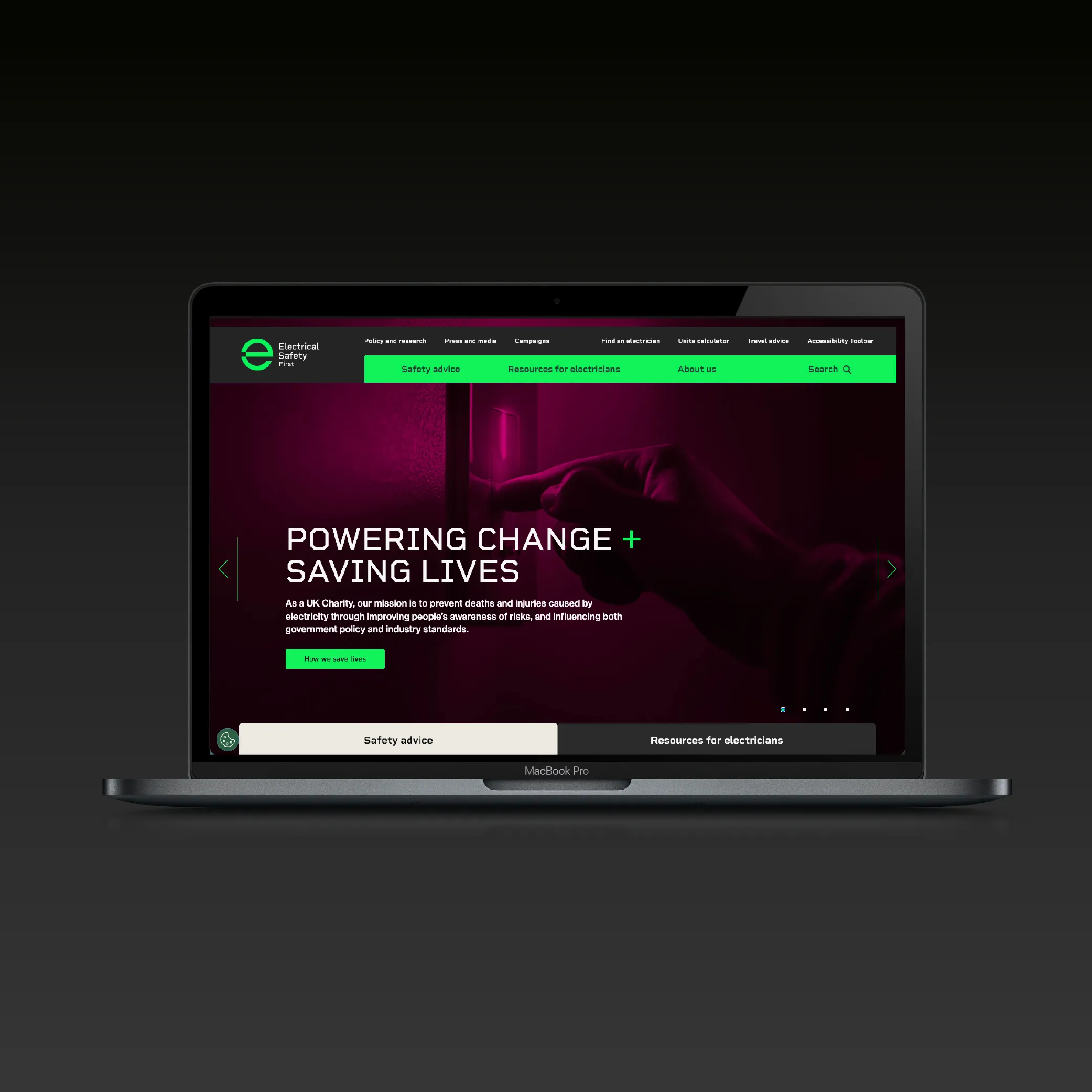
We are delighted to share that the new Electrical Safety First website is now live, marking the latest milestone in a rebrand project we have been working on with the charity over the past two years.
It is a launch that feels genuinely timely. With the UK's net zero target of 2050 accelerating the shift to electric vehicles, e-scooters and increasingly electrified homes, the public need for clear, trusted information on electrical safety has never been greater. More than half of all domestic fires in the UK are caused by electrical faults. Every year, people lose their lives or suffer life-changing injuries from electrical hazards that, in many cases, could have been prevented. Electrical Safety First exists to change that.
A brand with real urgency behind it
Electrical Safety First is a UK charitable organisation dedicated to protecting the public from the dangers of electricity. Its work spans awareness campaigns, lobbying for stronger safety legislation, educating landlords, and increasing public knowledge of product recalls and counterfeit goods.
When they came to Garden, the brief was clear: the brand had fallen behind the mission. A full audit revealed a fragmented identity, inconsistent colour use, varied illustration styles and a tone of voice that lacked cohesion. Unprompted recall was low across the UK, and the existing tagline simply repeated what the name already said. For a campaigning charity competing for public attention alongside organisations like Brake and Think!, that inconsistency was costing them cut-through.
The new brand identity
We carried out a full brand audit and research using Garden K-lab - leading to a new brand architecture and strategic positioning.
The rebrand starts with colour. Research, including AI-driven analysis of the wider charity landscape, showed that red was the most overused colour in the sector, particularly among safety and emergency organisations. We moved away from it entirely. The new primary colour is electric green, developed with a distinctive glowing effect that references the universal power-on symbol and signals something forward-looking rather than cautionary.
The new primary brand mark replaces the previous icon with a modern design that combines the letter "e" with that same globally recognised power symbol. The overall palette moves from the previous wiring-inspired mix of red, brown, blue, green, yellow and grey to a cohesive suite of electric tones designed to work consistently across digital, print and environmental applications.
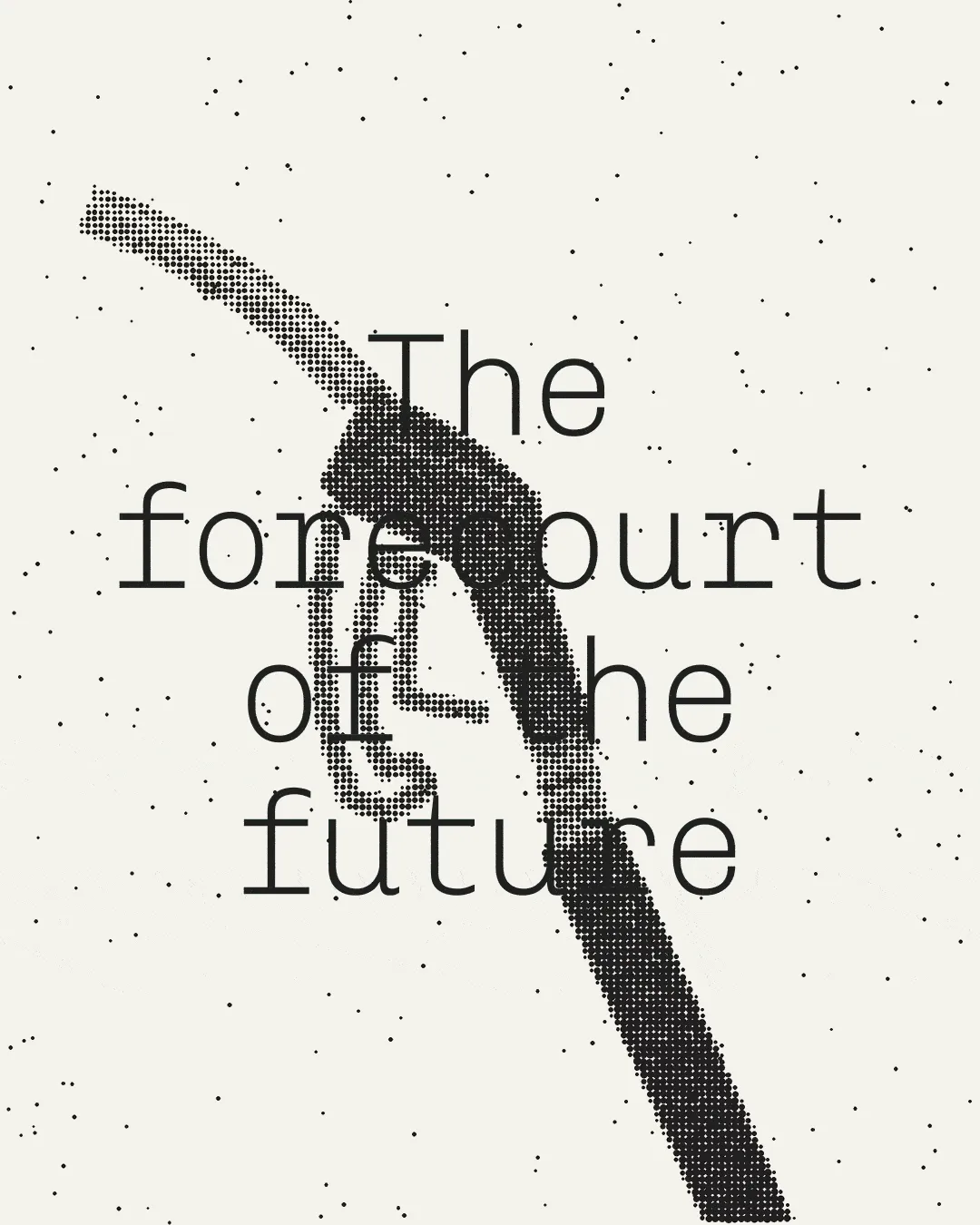
Photography now combines grainy black-and-white imagery conveying risk and danger with bold colour washes from the new palette, creating a visual tension that draws the eye and delivers the message.
The new strapline, "Powering Change + Saving Lives," captures the charity's three-fold mission: campaigning for legislative change, raising industry standards, and influencing consumer behaviour. The plus symbol reinforces the positive charge concept and gives the charity brand a visual shorthand that works across all formats.
The website as a living expression of the brand
The new website brings all of this together in one place for the first time. It is where the new identity, the new visual language, the new tone of voice and the new information architecture all operate as a coherent whole, built to serve four distinct audiences: the general public, landlords, manufacturers, and government.
For a campaigning charity, the website is the front door. It is where public awareness begins, where landlords find guidance, where manufacturers understand their responsibilities, and where policymakers see the scale and seriousness of the organisation they are dealing with. Getting it right matters.
The new site has been built to meet DDA and W3C accessibility standards, reflecting the charity's commitment to inclusivity. It is designed for clarity, for cut-through, and for a charity whose moment, given the pace of the electric era, has genuinely arrived.
The results, measured year on year across the period 30 June to 28 July, show a significant uplift in how people are engaging with the content. Average engagement time increased by 180 per cent, with desktop users showing an even stronger response at 223 per cent. Engaged sessions per active user rose by 16.74 per cent, the overall engagement rate increased by 13 per cent, and key event conversion rate increased by 100.87 per cent.
Numbers that point to the effectiveness of the redesign in turning visits into meaningful interactions, and a clear demonstration of what a stronger brand and a better site can do when they are built on a proven process. It is exactly the kind of outcome our brand engagement work is designed to deliver.
Source: GA4
We are proud of this work and respect the team at Electrical Safety First for their ambition, their rigour and their willingness to make bold decisions in the interest of the people they serve.
Visit the new Electrical Safety First website
To find out more about Garden's work in the charity and public sector, get in touch.
 NEWS
NEWS