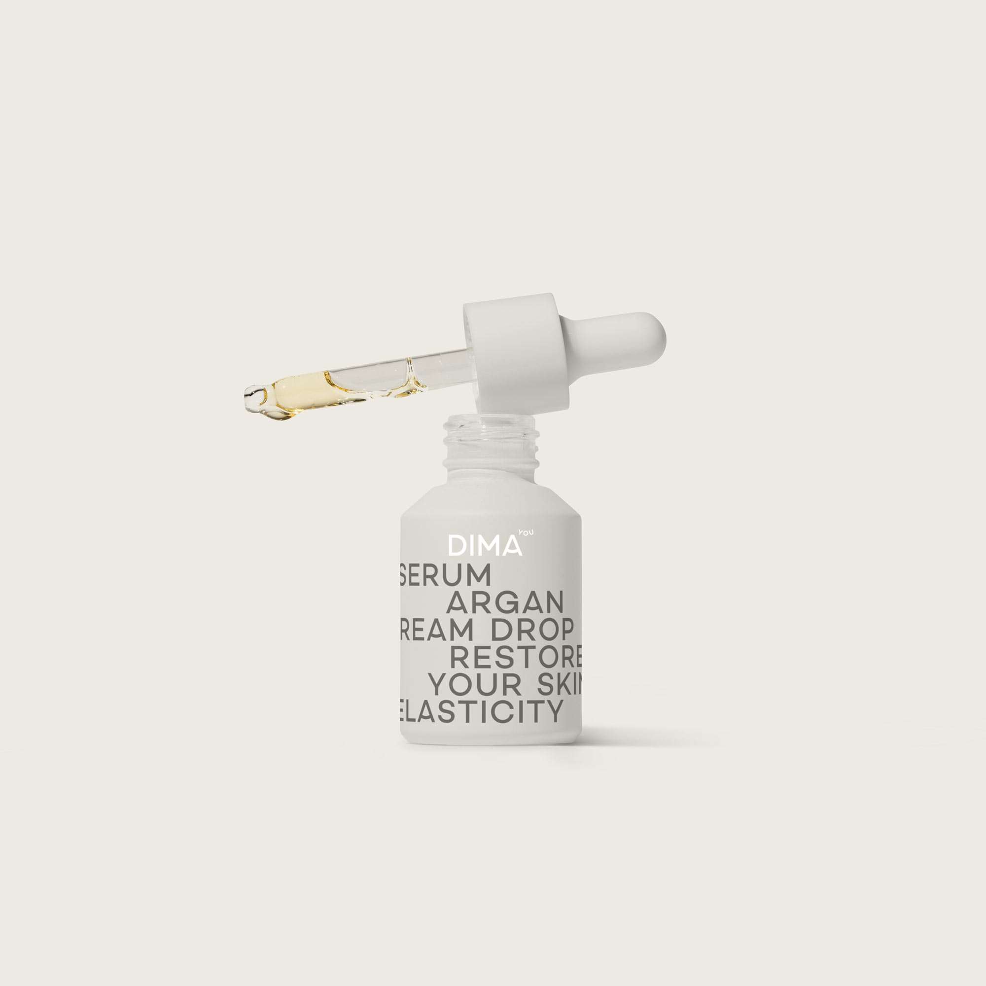
Dima You
Branding, packaging and interior design for a beauty and wellbeing brand
Dima You - beauty and wellbeing brand - the brief
Following the Covid pandemic, lifestyles across the globe changed significantly. People sought healthier, more balanced ways of living — embracing yoga, mindfulness, and nutritious diets to achieve better balance in mind, body, and soul.
Dima You is a distinctive lifestyle concept developed by our branding agency to promote happiness, wellbeing, and personal fulfilment. As a branding consultancy, we crafted a vision that champions a well-balanced life — from diet and exercise to everyday positivity and mindfulness.
The brand offers healthy food options, activewear, fashion, homeware and more, connecting physical health with emotional wellbeing. The name “Dima” means “always” in Arabic, and when combined with “You” it creates the uplifting phrase “AlwaysYou”. The bespoke wordmark features a subtle smile, expressing joy in a modern, understated way.
The brand lives in many ways, from being sold online, through to stores and restaurants, from health checking systems to activities and more, this is a lifestyle brand that touches people’s lives in every way.
The solution - An elegant brand based around happiness
Our branding company developed an identity that is warm, confident, and professional, while remaining authentic and emotionally engaging. Dima You needed to work seamlessly across diverse markets, from cosmetic branding and beauty products to healthy food packaging design and lifestyle goods.
We considered sector-specific expectations. For cosmetic packaging design, trust, results, and sophistication are key — so the identity leans towards refined minimalism. For healthy food packaging design, appetite appeal and vitality take the lead, with brighter colours and bolder visual cues.
A custom-designed font, incorporating smile-inspired details from the “you”wordmark, unifies the brand across all categories and strengthens brand recognition.
Packaging Design
The packaging design captures the brand’s positive, life-affirming energy. Bold, abstract typography wraps around the packs, creating a distinctive shelf presence.
- In cosmetic packaging design for beauty and wellness products, we used a muted, elegant palette to convey expertise and performance — a core expectation in cosmetic branding.
- In healthy food packaging design, the palette is vibrant, full of flavour cues, and almost edible in its visual appeal, signalling freshness, nutrition, and vitality.
Results & Reflection
The final identity is a modern, versatile brand system that adapts effortlessly between cosmetic branding and healthy food packaging design, always reflecting the brand’s core philosophy of balance and happiness.
By blending lifestyle values with commercial strategy, our branding agency and branding consultancy created a brand that works across product categories while maintaining a consistent tone of voice. Through typography, colour, and carefully considered design, Dima You shows how a branding company can build a credible, emotionally resonant identity that performs across markets.
Ceylon Tea
Stassen is a Sri Lankan tea giant, providing a versatile tea range across 80 countries and 5 continents, selling as bulk, tea bags, packaged teas and speciality packs. Founded in 1977 they are one of few tea companies allowed to express the Cylon lion on their packs, legitimately providing full leaf pure Cylon tea of the highest quality.
Stassen came to us with an understanding that they needed help, they came with an open mind and willingness to embrace a new and exciting brand for their tomorrow. From brand strategy through to brand creation, packaging design across 48 SKUs, copywriting and final artwork. A 12 week process that realised an exciting and vibrant rebrand.

Cocolina
In the shimmering landscape of Qatar, where tradition and modernity dance in a delicate balance, a new opportunity emerged. The market yearned for a space that could offer more than just coffee and pastries – it craved an experience, a sanctuary, a moment of respite from the rapid pace of life in this ambitious nation.

Kool Coffee
We crafted a bold, confident brand identity for Kool Coffee, combining thoughtful brand creation with design innovation to attract busy coffee lovers and position it as a household name. Drawing inspiration from the Kool Smoothie brand, we created a look centred on self-expression and boldness, empowering customers to feel ready to take on their day. This new identity includes packaging design, environmental design, and brand guidelines, all seamlessly integrated under the Kool Smoothie umbrella.


Kool Life Packaging
A cool healthy food brand launched across Morocco. What started out as a smoothie bar supplying the cool surf folk living the beaches of Morocco, turned into a cool retail brand now selling in the Kool Smoothie cafe as well as supermarket chains across Morocco, enabling all people to live the surf live anywhere any time.